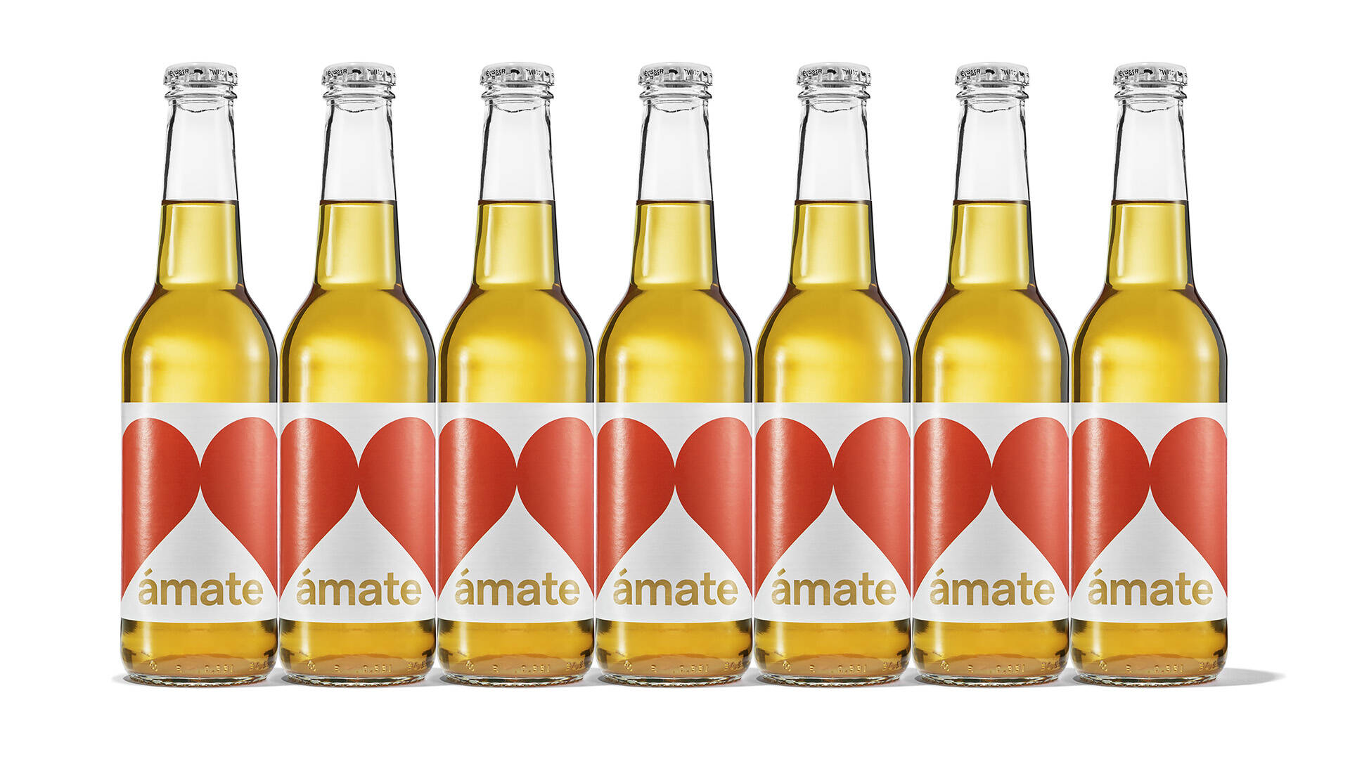
Label Design (in a row)
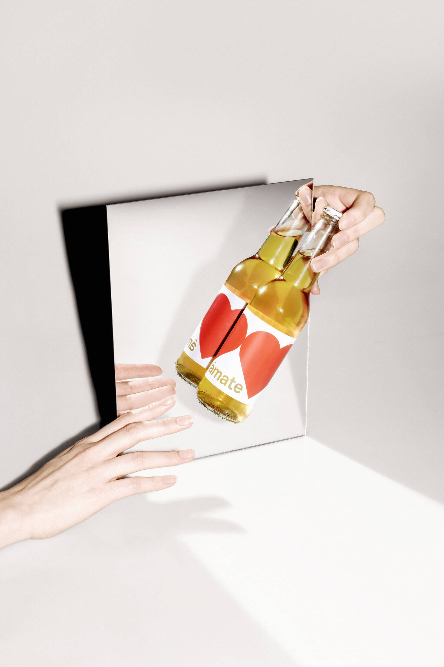
Visual No. 1
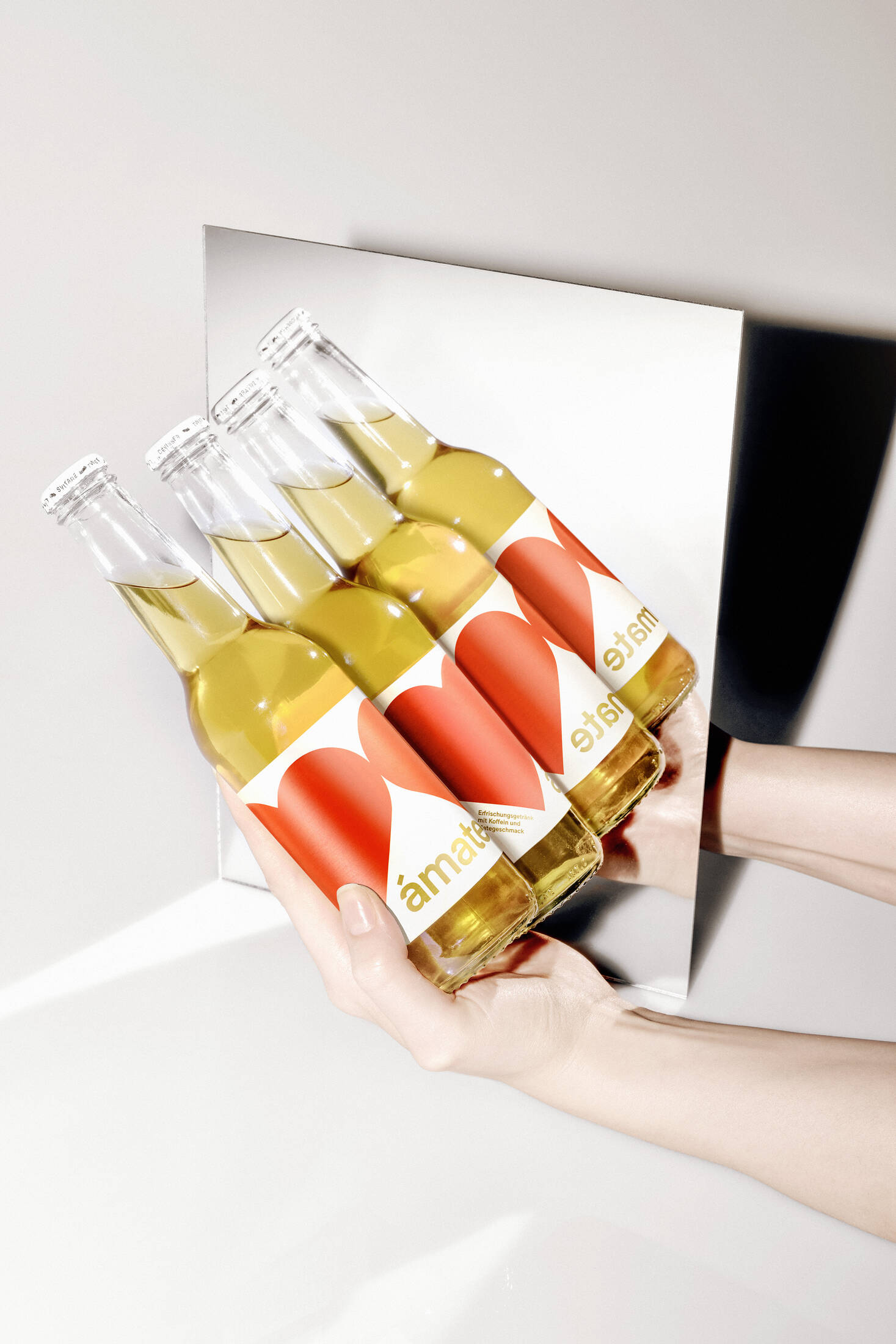
Visual No. 2
Visual No. 3
Poster
Instagram Preview
Packshot
Description
Neu Creative Agency has developed the naming, design and visual identity for Switzerland's latest mate drink "Ámate".
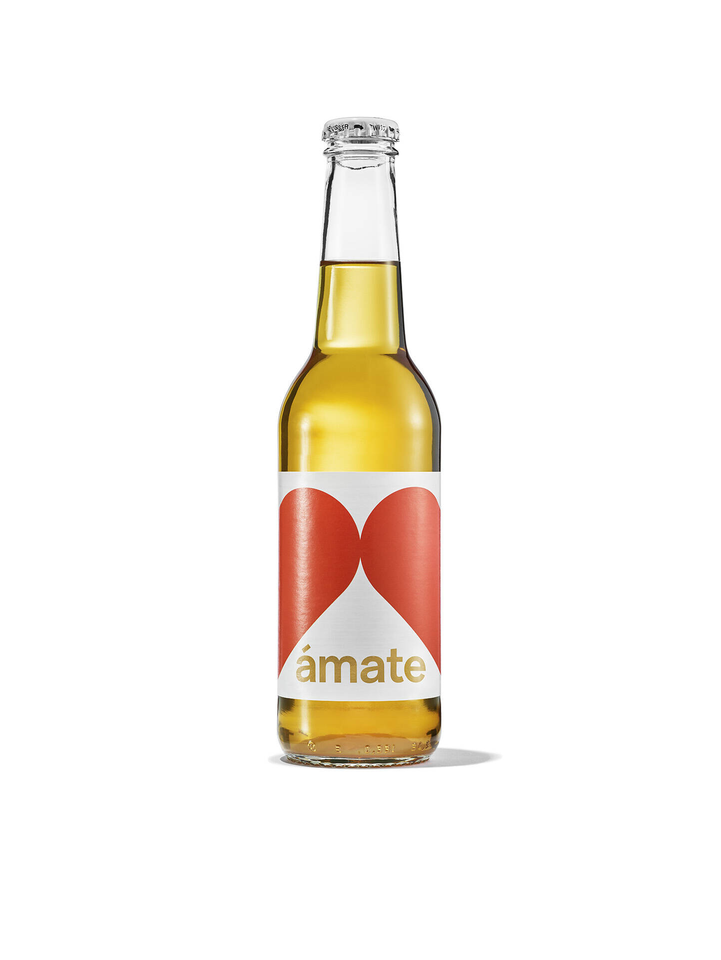
Mate is a traditional South American drink made from the leaves of the yerba maté plant. "Ámate" contains the word "mate" on the one hand, and it means "love yourself" in Spanish.
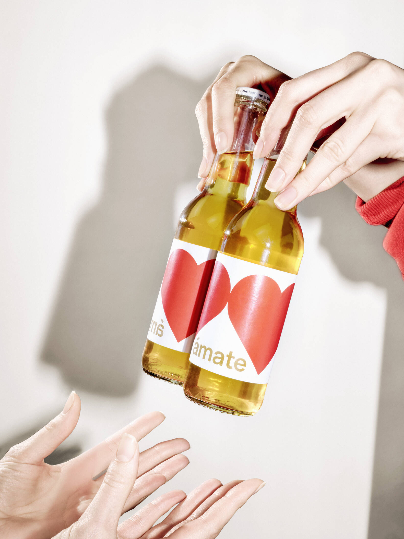
The iconic design of the bottle also stems from this idea: only those who love themselves can love others - the two red hearts reflect this duality.
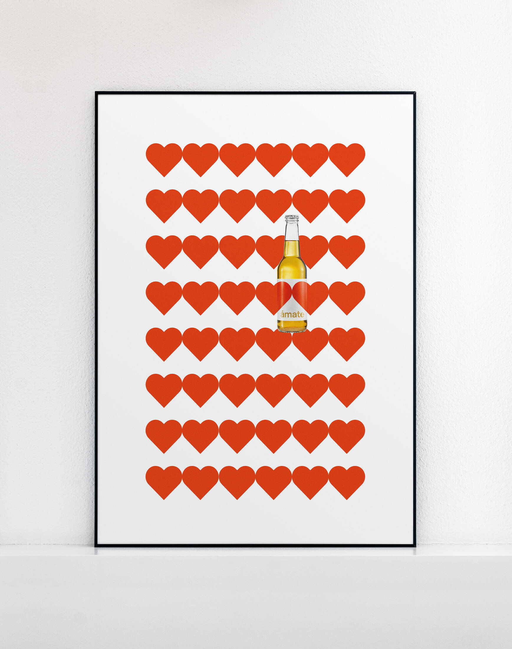
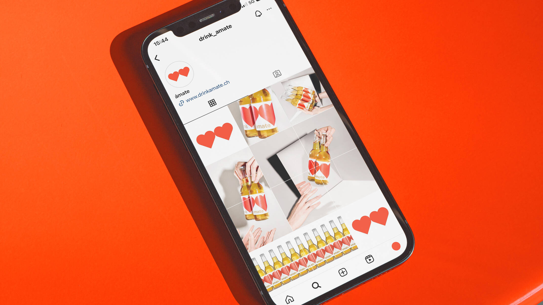
The visuals and animations in the communication of "Ámate" also play with the graphic interpretation of love and self-love. This is particularly evident when more than one bottle comes together: Stringing several "Ámate" bottles together creates a chain of hearts: self-love grows into love for others, which is also passed on.
At the same time, this additional dimension ensures maximum attention on the shelf at the POS and at the club bar. This is fully intentional, as "Ámate" is initially intended to establish itself in the club and bar scene in order to conquer the Swiss market. Ámate" is distributed by Zollywood AG. With a lot of love.
This professional campaign titled 'Love yourself.' was published in Switzerland in March, 2024. It was created for the brand: Ámate, by ad agency: Neu Creative Agency. This Design medium campaign is related to the Drinks (Non Alcoholic) industry and contains 7 media assets. It was submitted about 1 year ago by Owner / Creative Director: Nico Ammann of Neu Creative Agency.
Credits
Advertising Agency: Neu Creative Agency
Art Directors: Nicole Vizcardo, Finn van Grondel, Pian Gumpp, Maison Fitzgerald, Sandy Pfuhl, Nico Ammann
Photographer: Oliver Nanzig, Gregor Brändli
Retouching: Lorenz Wahl
Client: Zollywood AG

