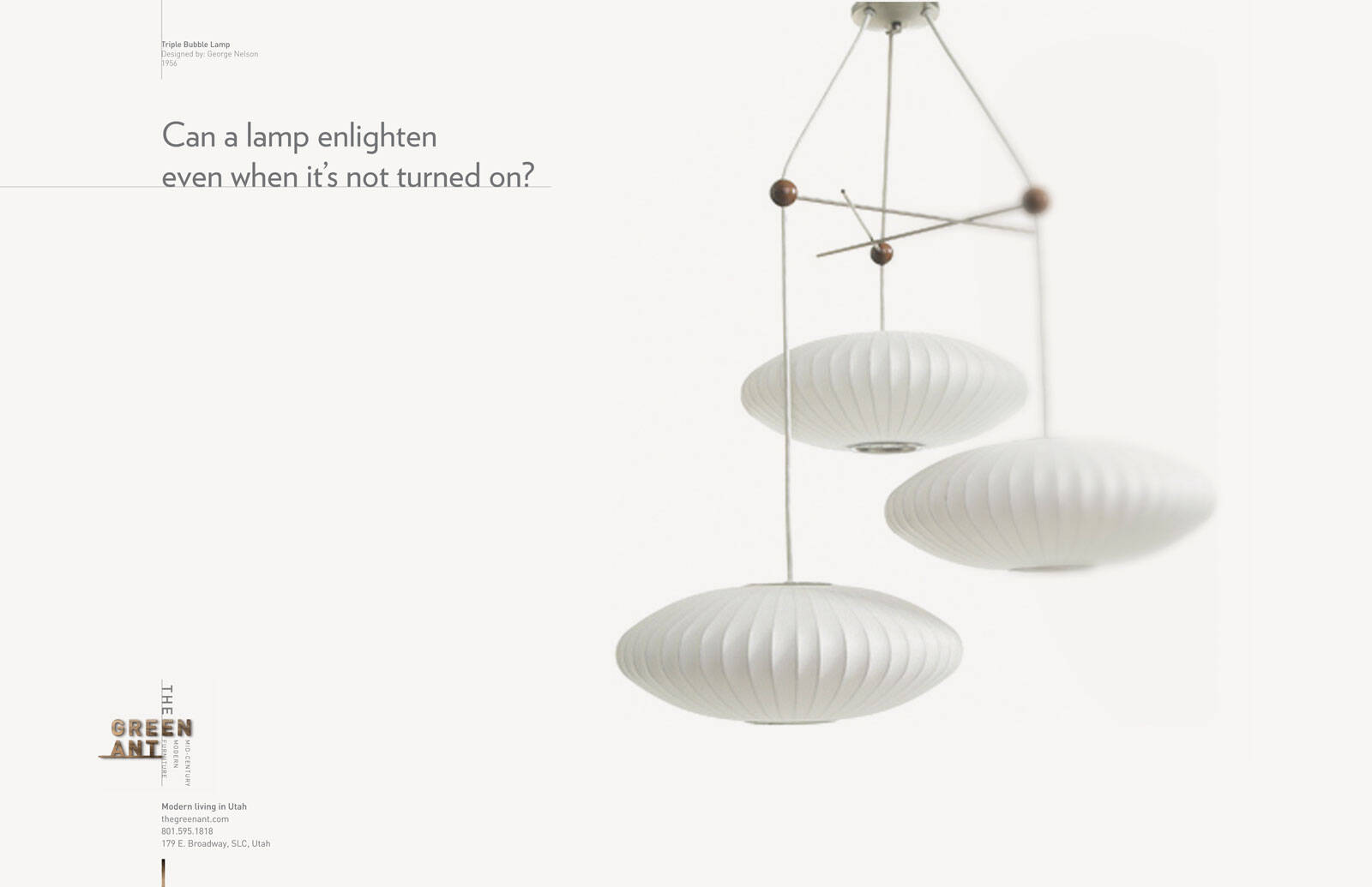
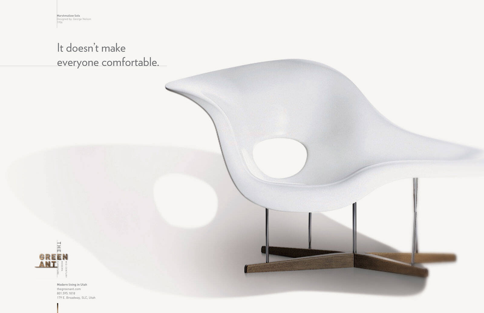
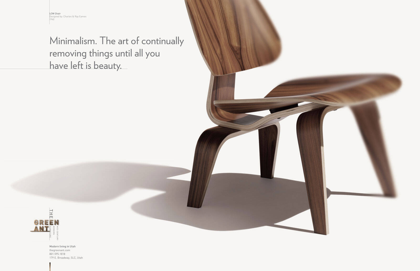
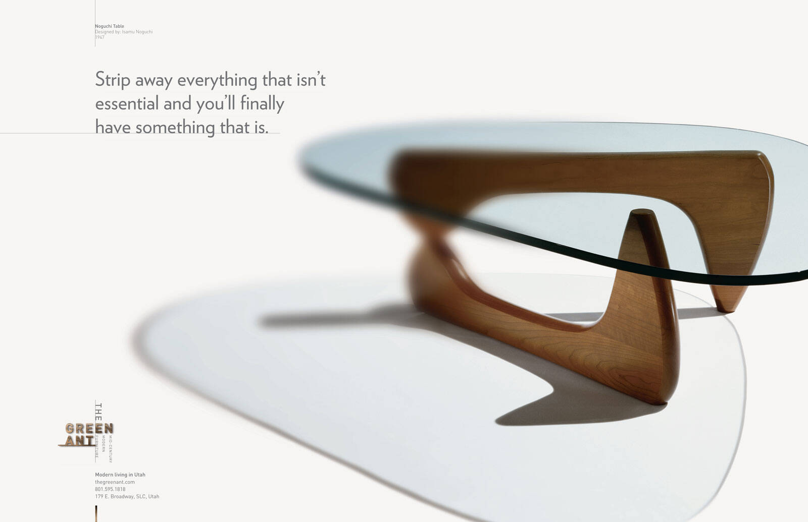
Ads of the World

Ads of the World™ an All Creative World site

The Green Ant: Minimalism

The Green Ant: Minimalism
Your rating: None Average: 6.2 (34 votes)

Minimalism. The art of continually removing things until all you have left is beauty.

Advertising Agency: Richter7, Salt Lake City, USA
Creative Director: Dave Newbold
Art Director: Dave Larson
Copywriter: Gary Sume
Photographer: Stock
Published: August 2010

24 Comments

Guest's picture

That's actually a very old chair design - cira, what? 1950s?

Anyone know? I think it is in the NY Museum of Modern Art

Guest's picture

Says 1940 top-left

AdCracker's picture 248 pencils

Excellent concepts.

Excellent copy.

Excellent photography.

Excellent art direction.

This campaign is an example of the way ads should be developed. Concepts first. Then photography. Rather than head directly to iStockPhoto.com

> AdCracker - interactive tools to trigger ad ideas.

Guest's picture

Read the credits...the Photographer only has one name... STOCK.

Billoughsby's picture 5117 pencils
8

Eames RAR molded plywood chair. Nice series of ads

"Ubi hubave lubearned thubat ubanuby fubool cuban wrubite uba bubad ubad, bubut thubat ubit tubakes uba rubeal gubenubiubus tubo kubeep hubis hubands uboff uba gubood ubone."
-Lubeo Buburnubett

razorsharp creative's picture 186 pencils
4

I have to respectfully disagree with the comments above. The picture and the copy aren't connected. It's a picture of a chair, yes a simple even perhaps "beautiful" chair, but I don't see where things where "removed" to achieve the result. The copy is communicating the act of removal to achieve beauty, but the picture doesn't.

-Richard Todd Aguayo (razorsharp creative)
http://razorsharpcreative.com

Dzsoi's picture 4987 pencils

I agree. Chair is not something you can make spectacularly simplier really. There is nothing removed here. Or do you consider the arm-rests as removed? Then what about the back-rest? You should remove that too. Both are there for comfort reasons. This concept just doesn't make much sense with these products.
Even the design is not the simpliest as it has been put together from 5 pieces.

atb2005's picture 13682 pencils
6

@razorsharp creative

Pictures and copy are connected. In this instance, many things could be added to a chair. But as the picture shows, the chair is pretty basic, yet beautiful.

I agree this is a nice series of ads. Good job, guys!

razorsharp creative's picture 186 pencils

A basic chair is not a chair that has been simplified, or minimalized...as the ad is trying to communicate. If I showed you a picture of this chair without the ad attached you'd think it was just "a chair", and not a chair that has been crafted to be minimal. If the legs were removed (like the other ad with the dining room table) and a single piece of wood extending down from the seat was used instead, then perhaps you would get the impression that something unique has been done to the chair. But there are a lot of chairs without arms, and they don't scream of being "minimalized". Which is what the ad is trying to communicate which is why I feel the ad doesn't work as well as it could have.

-Richard Todd Aguayo (razorsharp creative)
http://razorsharpcreative.com

atb2005's picture 13682 pencils

You are over-thinking it way too much. This campaign was not created for ad people; it was created for regular folks and they won't dwell on whether there's a solid link between copy and image, which I still believe is there. Instead they would just admire the chair, which does look nice, I have to say. Please read the comment below by CommandZ.

Dzsoi's picture 4987 pencils

I think you are wrong. Average people think straight and practical usually, not abstract and symbolic. If the headline says 'we've removed things', they are looking at the visual and ask themselves: "Really? What have you removed? Can't see a part removed. Anyway... don't forget to buy chips, soap, pasta..."
If the ad's intention was to make people admire the chair, just skip the copy.

atb2005's picture 13682 pencils

Ok

Jaap Grolleman's picture 6306 pencils

I love the whole campaign but I think the photoshop is bad. Look at the leg of the chair closest to the copy. Should have added more shadow there, it's floating in the shade now.

JopyCunior's picture 169 pencils

It's a good series. Not overstating, very plain, simple, clear. I would add, a bit old-fashioned, classic advertising... which is not a minus.
I'd like to underline 2 things.
1) This is not minimalistic design
2) Minimalism does not cut off the excesses, minimalism hides the message inside. We think about Donald Judd's cubes, but that's not "cutting off", it's hiding. There's a misunderstanding in the relationship of minimalism between art and design. For instance, minimalistic objects (in art) should not have a usable purpose.
3) This copy line is not original (as the one with the noguchi table), although this is not a crime. but it's a version of Michelangelo's motto about sculpture: "Every block of stone has a statue inside it and it is the task of the sculptor to discover it", which sounds pretty much the same to me. Not a criticism, just trivia.

Sushi lover's picture 895 pencils

I like everything except the photography,

Dream needs to be big!

CommandZ's picture 1368 pencils

Yes, picture and copy are connected. The classic simple lines of the Eames chair are the net result of "the art of continually removing things until all you have left is beauty." The only thing I don't care for is the fake selective focus done in PhotoShop with a gaussian blur filter. Would of much preferred this be done in camera. It's really bad on the Noguchi table.

sirvan's picture 28132 pencils

The photography's fine, but the lines are weak and the retouching is heavy-handed. I like the type, though.

+++

"I love some things, and don't love some other things."

silvi's picture 4174 pencils

Somebody can give me a spanish translate of the copy, please? Thanks.

Anonymous Author's picture 1549 pencils

That is because there is beauty in decay. Good looking ad btw.

Write a wise saying and your name will live forever – Anonymous.

http://www.anonymousauthor.co.nz
www.twitter.com/@anonauth

shahidali's picture 3674 pencils
10

Superb copy and awesome art direction. Top class thing. Hats off, team.

shahid

Dharmesh aka danny's picture 316 pencils
6

Mr. Gary Sume, it is a good copy, but the visual is somewhere doesn't seem to be a great art work.

Dharmesh Padia

Guest's picture

Photoshop work is really lame.

thedesignaddict's picture 4074 pencils

Photoshop is way over the top. Headline is boring and forgettable.

Guest's picture
5

The photo is bad. If it had forethought and wasnt picked from stock, then why didn'y they just shoot with a large aperture to begin with. The blurring is sloppy and doesn't make sense...kind of like when you have multiple light sources, but mono-directional shadows. Also dislike "T H E" placed vertically at the bottom. Is it part the company name? Why isn't in the same style as the logo and why aren't your vertical grid markers the same weight? The wooden ones at the bottom are weird.

Ads of the World advertising archive and community showcases fresh creative campaigns daily from around the world. Read more

Recommend us on Google