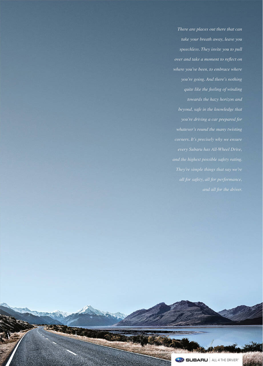
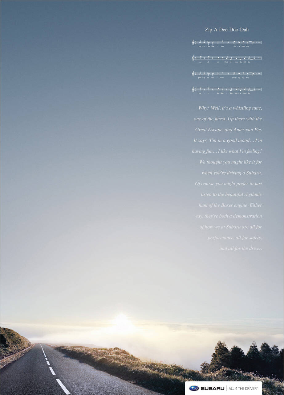
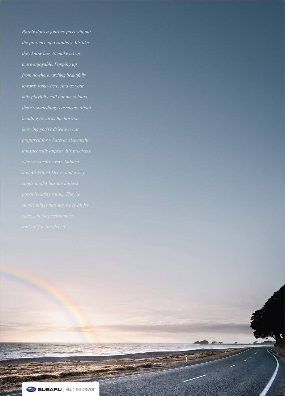
Subaru: All 4 the Corners
Average: 4 (20 votes)

Advertising Agency: Leo Burnett Sydney, Australia
Executive Creative Directors: Andy DiLallo, Jay Benjamin
Art Directors: Gary Dawson, John-Henry Pajak
Copywriter: Gary Dawson
Retoucher: Eye Candy Pictures/Cream
Designer/Typographer: Masataka Kawano
Via: bestadsontv

14 comments

akshaysrikar's picture
426 pencils
akshaysrikar

Copy = Beauty.

TommyO's picture
1878 pencils
TommyO

I wouldn't know, I gave up in the middle.

mosho's picture
300 pencils
mosho

same here gave up
i don't like long copies

robbierae's picture
84 pencils
robbierae

i love long copy. but the art director of this ad doesn't

keithstoeckeler's picture
425 pencils
keithstoeckeler

I like the copy, but seems like the cigar band should be a true cigar band and run the entire bottom. Just bottom-right as it is cuts the image.

Phil Lestino's picture
1564 pencils
Phil Lestino

Nice sky...is it open top car? Copy is very ordinary.......

Guest's picture
Guest

The copy is excellent. It's too rare !

Guest's picture
Guest

Probably not in a "contemporary style" and therefore hard to judge it.

However this reminds me of an old and famous jack daniel's whiskey ad.

It's too rare, totally agree.

Guest's picture
Guest

LOVE the copy ..i like long copies..when they get it across just the way they should and dont sound verbose just for the sake of it..this one is nice and works really well with the art.. to think of it, it actually looks like a pretty piece of art..more than just an advert! ..dunno if thats good or bad for the brand though :O

Guest's picture
Guest

i like them too. They have a level of sophistication, and in true tradition of long copy, they're actually quite short.

advartco's picture
8 pencils
advartco

like a vespa ad

michelangelo's picture
662 pencils
michelangelo

it could've been done better with a little more effort from the typographer

Guest's picture
Guest

i like the copy if it involves you and it does and the negative space gives a real good feel to the whole ad ...

flurl's picture
93 pencils
flurl

Copy started out great, I was actually excited for an ad about a car that outlined the BENEFIT of the product not the features. The sensation of driving to those places you couldn't before. The exhiliration of the wild.

Then, perhaps ironically, it swerved and power slid into a brick wall, reminding us that this is just another ordinary car ad that's gonna list some more features. Seems like the copywriter went out to lunch and the art director finished their paragraph.

Good ad. Unoriginal though.