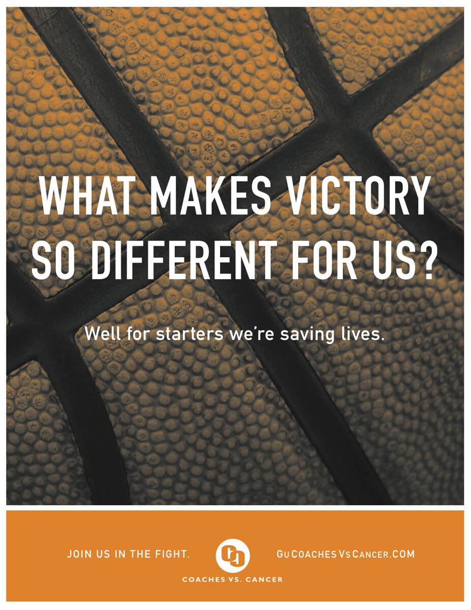
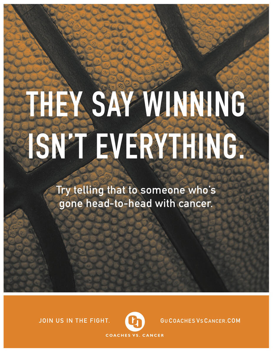
Coaches vs. Cancer: Head-to-head

Coaches vs. Cancer: Head-to-head

Advertising Agency: BHW1 Advertising and Design, Spokane, USA
Art Director: Allison Baskerville
Copywriter: Jason Corbin
Illustrator: Thomas Manley
Published: February 2008

Your rating: None Average: 2.6 (16 votes)

Comments

alvinpck's picture

Best lines of the series.

...
http://alvinpck.deviantart.com/gallery/

bad art direction! what a shame because the thought of the headline is very nice!

Kick-ass lines on this execution! Love them!

Similar lines for the Nike paralympics. Infact it feels like a total rip-off.

---
It comes just like that!

Could you show the original one?

I think this idea fits much much better for cancer than paralysis, mental disorders etc.

1. You can't defeat paralysis (etc.), that is not a battle. You have to
deal with that, live the fullest/happiest life possible.
2. The fight against cancer is a real life-and-death situation.
Paralysis (etc.) is usually a constant condition - it doesn't get
better or worse.

It is not Paralysis,it is paralympics. The olympics for all physically challenged or impaired. Will try and get the ads. And they were a lot lot better than this one. Both Art and copy. This ad stinks far away from it being original.

---
It comes just like that!

I know what paralymic means. Paralysis was just a typical example.

Nice line, art direction doesn't do much for me.
--
brandon

www.brandonknowlden.com

jazarah's picture

interesting, I like it

http://jazarah.net/blog/

How does the art direction let it down? Is it because it's easy to read? There's no need for crazy filters and fonts.