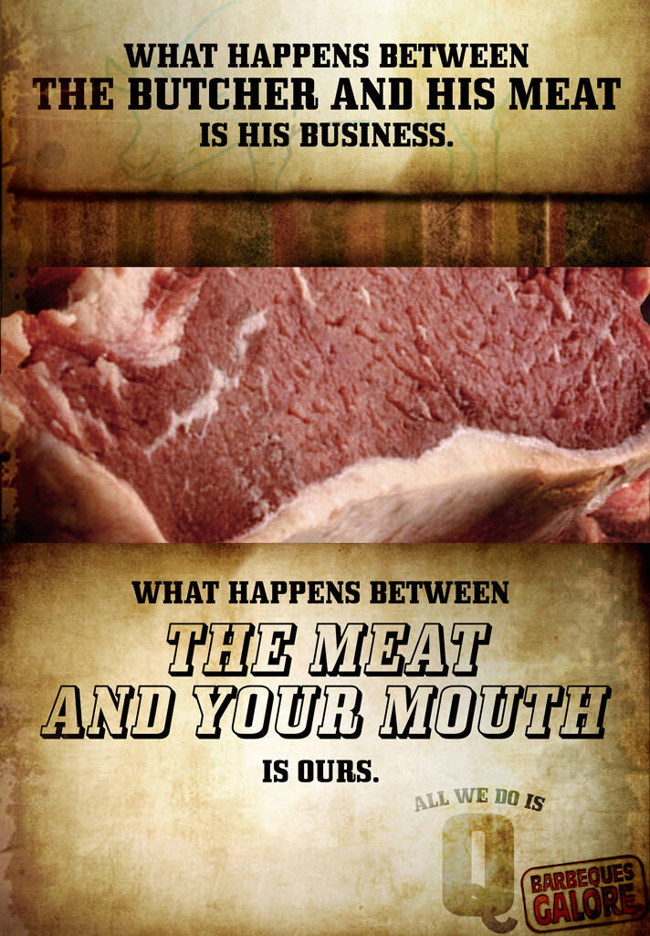
i agree with cperry. these are probably student ads and if not, you gotta figure it's someone who hasn't been doing it that long. whoever you are who made these, keep trying. there are some nice things happening here (the lines) and while the art direction needs work, it's a start.
Submitted by onestepahead on Thu, 2008-07-24 00:13.
frits, where do you get these ideas from??? ...lmao
as for the ad, i see a mob mentality here. everybody is having a go at these poor guys.Hey its not that bad. Sure thing the meat should not have been shown, or there is no trigger (call for action line)there for the TG, or there are too many fonts happening... apart from that the ads look okay to me. The copy of this particular one seems quite good to me. ( no Frits, not the way u deciphered)
it looks like the same font is being used. and it looks like butcher paper on a butcher block. I think the intention of these is that you take some time with them and they are obviously posters...probably for the store. There seems to be grease in the paper, etc. These are gritty and layered pieces, not the typical visual solution work people are probably more familiar with commenting on.
Again, it seems to me that a lot of people on here are way too anxious to tear down other people's work. Who took their Bitter pills today?
Comments
THe intentions were there but the art direction and the copy are sloppy and awkward.
Eh.
if the art direction and the copy are sloppy and awkward I hardly think the intention was there.
i agree with cperry. these are probably student ads and if not, you gotta figure it's someone who hasn't been doing it that long. whoever you are who made these, keep trying. there are some nice things happening here (the lines) and while the art direction needs work, it's a start.
show a butcher's table or something else besides a close-up of meat.... that's one of the things that don't make this ad work
The copy is on its way. Keep refining.
-Natalie
www.topolewski.net
With "What happens between the Butcher and his meat"
I get an unfortuanate image of the butcher wanking off.
ugh. Curse my sick mind.
Besides, the butcher's process with the meat is imporant to people who enjoy well-cut meat.
Student work!
Need more felling to go Pro.
After the butcher had it's way with it I wouldn't touch it with my mouth.
ew.
frits, where do you get these ideas from??? ...lmao
as for the ad, i see a mob mentality here. everybody is having a go at these poor guys.Hey its not that bad. Sure thing the meat should not have been shown, or there is no trigger (call for action line)there for the TG, or there are too many fonts happening... apart from that the ads look okay to me. The copy of this particular one seems quite good to me. ( no Frits, not the way u deciphered)
it looks like the same font is being used. and it looks like butcher paper on a butcher block. I think the intention of these is that you take some time with them and they are obviously posters...probably for the store. There seems to be grease in the paper, etc. These are gritty and layered pieces, not the typical visual solution work people are probably more familiar with commenting on.
Again, it seems to me that a lot of people on here are way too anxious to tear down other people's work. Who took their Bitter pills today?
Post new comment