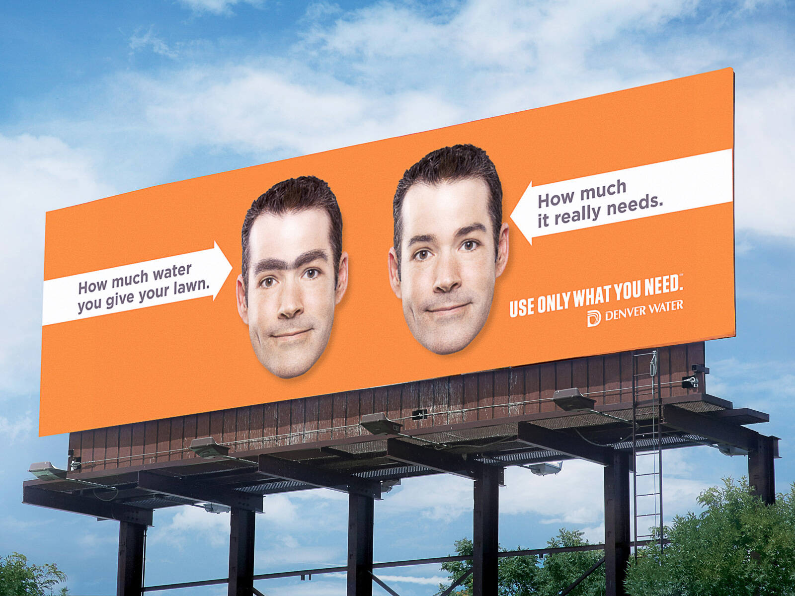
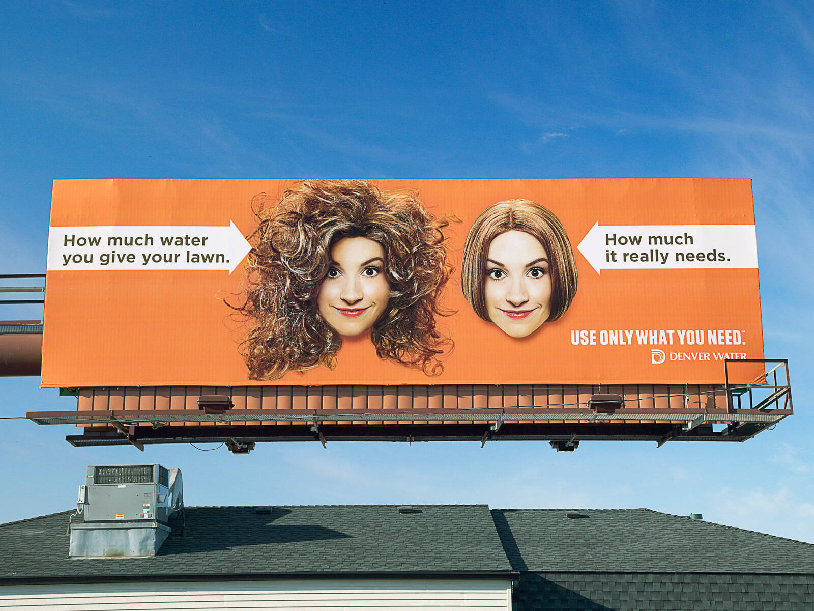
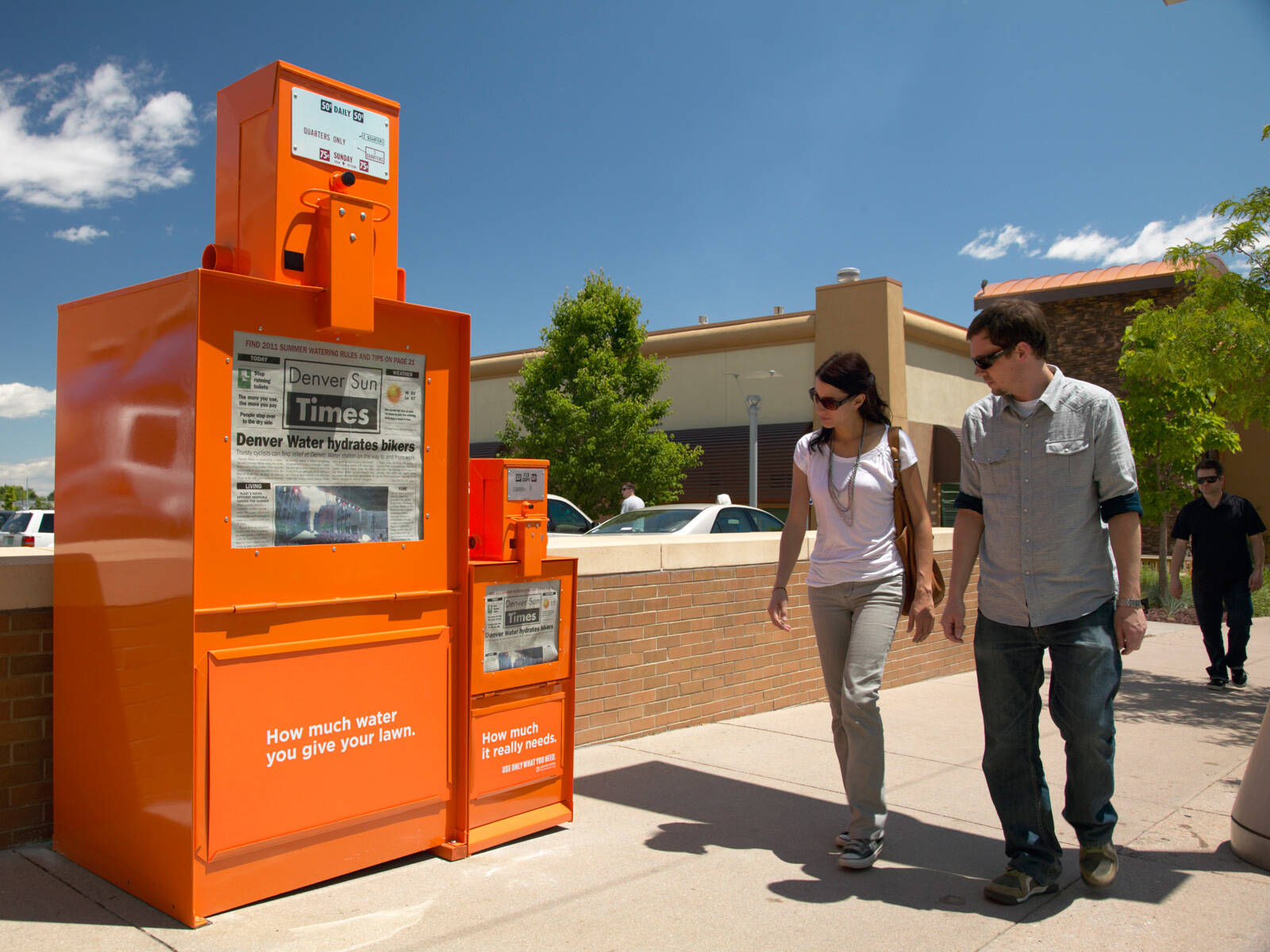
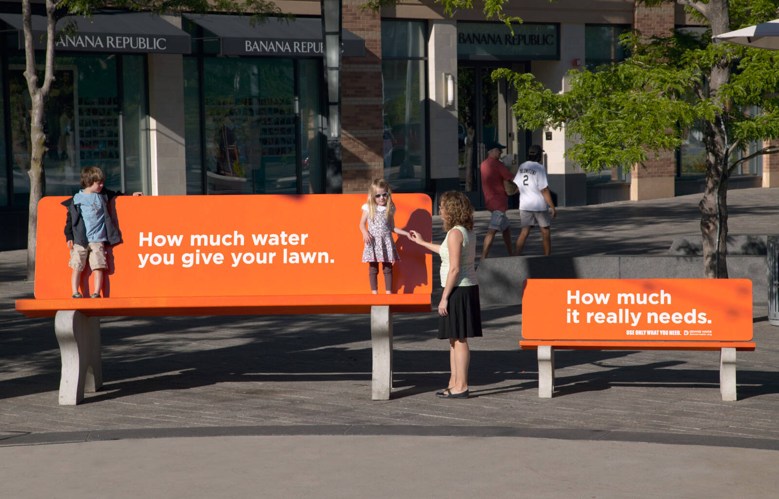
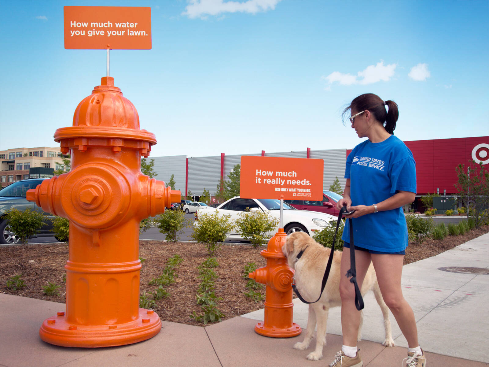
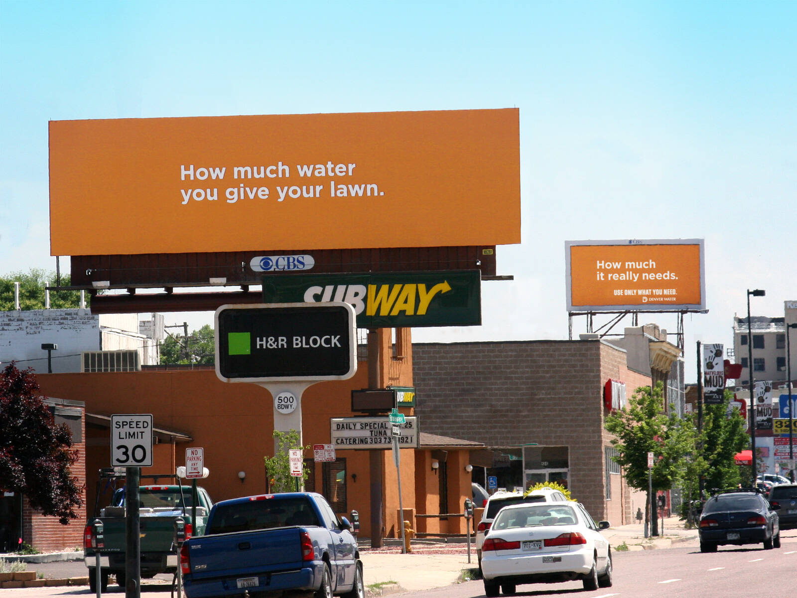
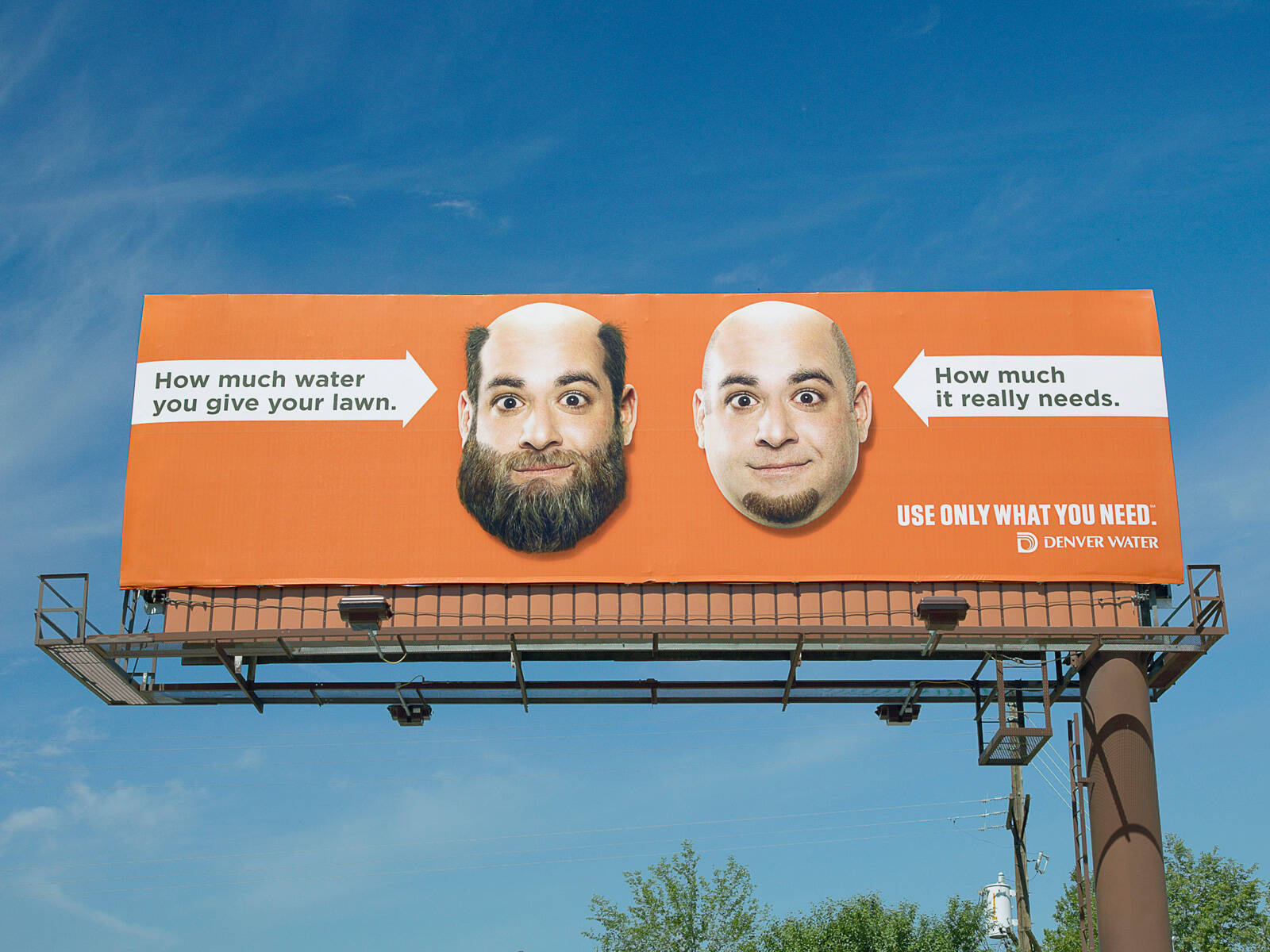
Denver Water: Beard
Advertising Agency: Sukle, USA
Creative Director: Mike Sukle
Copywriter: Jim Glynn
Art Directors: Andy Dutlinger, Mike Sukle
Retouching: Matt Carpenter
Photos: Richard Feldman
Production: Heather Popenhagen, Tim Sukle
Advertising Agency: Sukle, USA
Creative Director: Mike Sukle
Copywriter: Jim Glynn
Art Directors: Andy Dutlinger, Mike Sukle
Retouching: Matt Carpenter
Photos: Richard Feldman
Production: Heather Popenhagen, Tim Sukle
Ads of the World advertising archive and community showcases fresh creative campaigns daily from around the world. Read more
If you need a logo for your company or product you can get it done with us.
In our logo store you can pick from over 28,000 pre-made logos that will be customized to your name for free or you can post a contest for us for just $250 and our designers from all over the world will submit dozens of logo design suggestions to your specific needs.
3 Comments
Em Think I know what your trying to say but visually to me
more hair = more growth = more water
Do you think any of these ideas were tested before they became a campaign? Because I'm struggling with all three but not in a good way
Edit - Let me take that back, found the physical objects ones here http://wc.vg/rsKdq7 & here http://wc.vg/pOMAxC they make sense, it's the billboards that don't
http://we-convince.com
There is absolutely nothing confusing or hard to get about these images. They are saying you don't need that much hair (metaphor for garden) to look pretty. Go for the minimalist look, which requires less water. It's all meant to be facetious. Now whether you find it funny is another thing.
The above comment is right.
You could go down the 'right tool for the job' route.
For example a nail in between a regular hammer and an over-sized hammer.