



Description
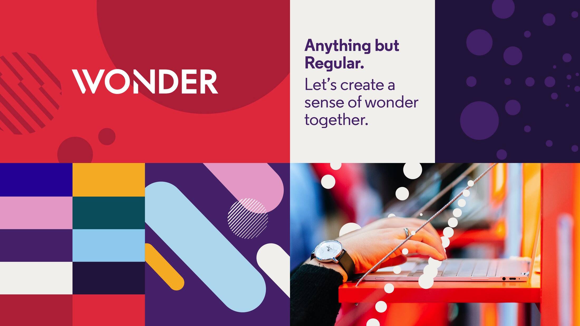
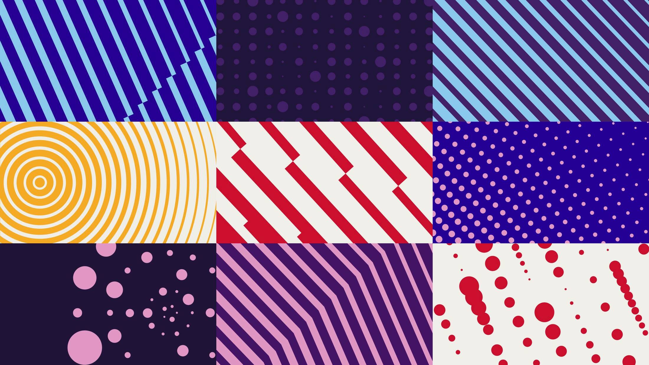
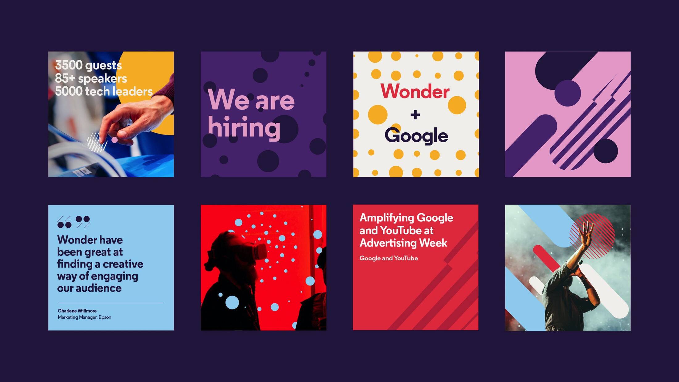
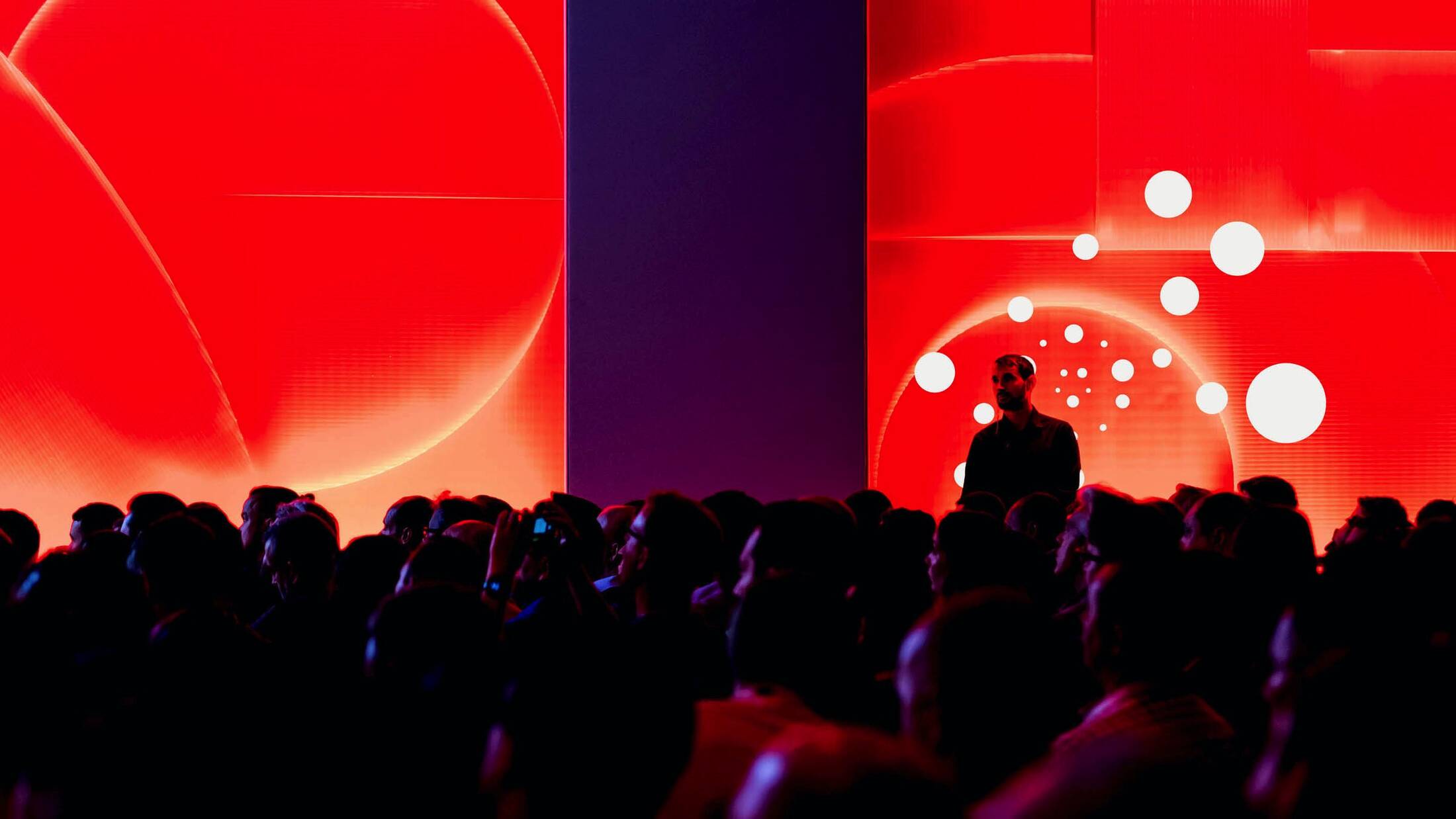
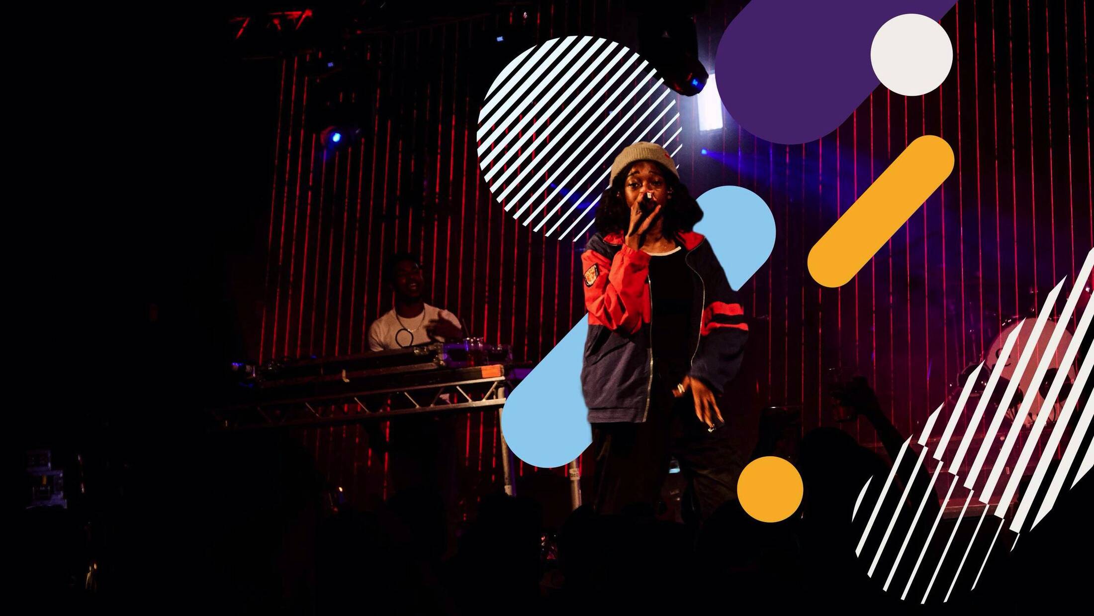
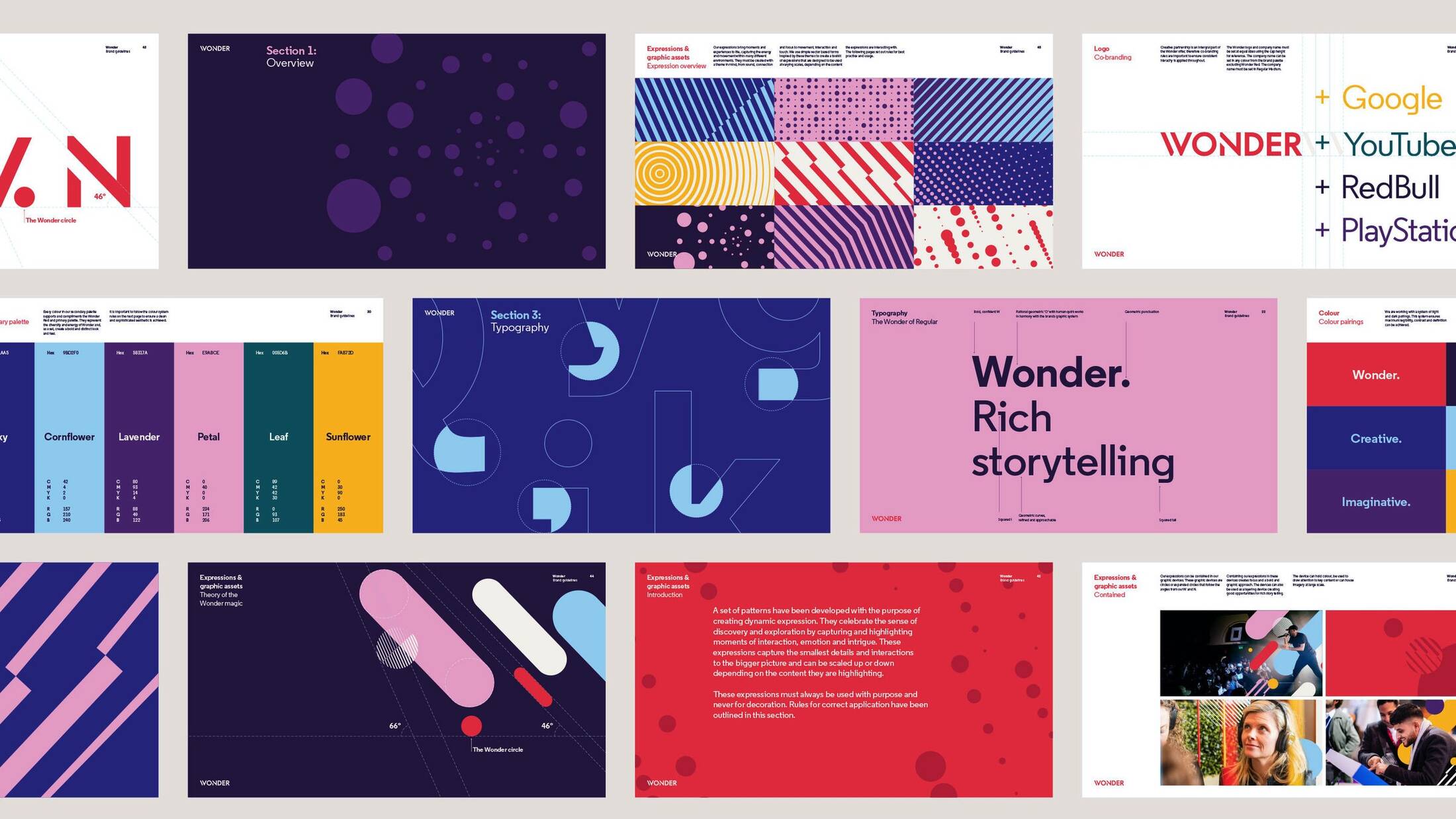
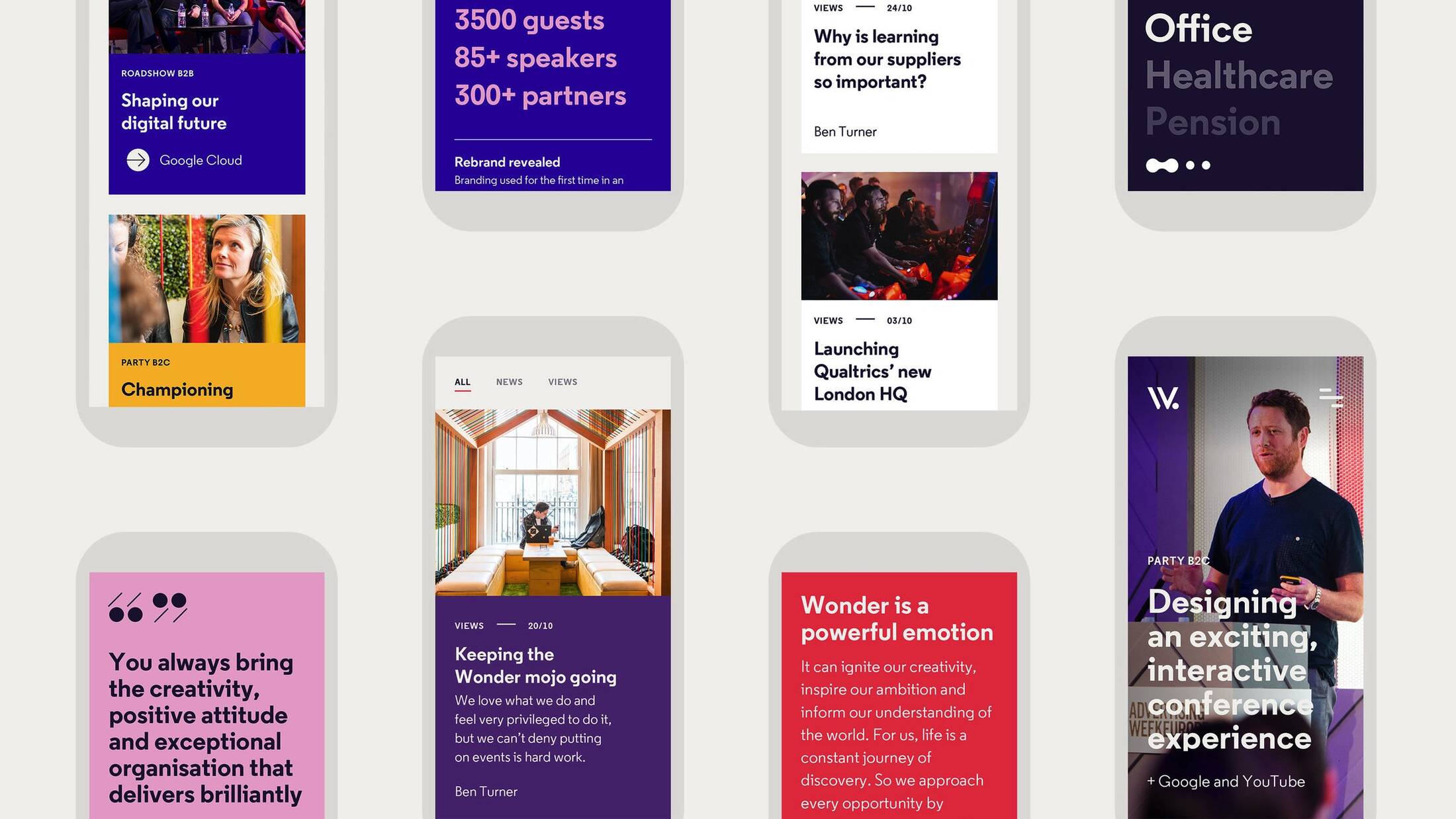
Creative events agency Wonder reveals today its new brand refresh, designed by Studio Output. The project shows how an existing brand identity can be transformed to thrive across digital platforms. Creating a sense of wonder together - Wonder is an independent creative events agency founded in 2012. It has worked with leading brands such as Google, Nike and Android. Although firmly established within the tech industry, Wonder saw an opportunity to refresh its creative identity as it expanded its portfolio and projects into more creatively driven sectors. With ambitions to grow even further, Wonder didn’t need a complete rebrand, but sought a bold refresh to reflect this new purpose. Adapting for the digital world - Wonder approached Output in 2018 after seeing its work adapting brands like Auto Trader and BBC Sport for the digital age. The challenge here was to build a new design system, while keeping aspects of the identity recognisable to a loyal and established customer base. “Wonder has a well-loved logo that didn’t need changing, but the broader identity lacked the energy and edge to gain cut through in the creative market. Wonder’s purpose is all about helping its clients to create a sense of wonder, and this needed to be made clearer through its communications”, says Johanna Drewe, Associate Creative Director at Output. Output refreshed the brand for success by creating a design system that builds strong, flexible foundations for all sorts of storytelling, from physical marketing assets through to the agency website. Setting up to thrive - Output wanted to design an identity that brings to life the look and feel of a Wonder event. “The digital experience had to do justice to the scale and flair of a Wonder production, and the level of detail that goes into them. We needed a digital design system that has personality, movement and a sense of craft,” says Drewe. Using the existing logo as a base, and the concept of ‘A window into another world’, Output has built a new brand expression and flexible visual toolkit. It’s an identity with bold and bright colours, dynamic patterns, and interactive elements that create moments of intrigue. Layered graphics represent Wonder’s tailored and scalable approach. “We’ve long believed that discovery, insight and the power of a holistic approach are the key to crafting meaningful and authentic experiences – our new identity reflects this creative thought process perfectly,” says Ben Turner, founder and MD at Wonder. The new identity can be experienced on Wonder’s site and digital channels from today.
This professional campaign titled 'Wonder Brand Refresh' was published in United Kingdom in November, 2019. It was created for the brand: Wonder, by ad agency: Studio Output. This Digital medium campaign is related to the Professional Services and Recreation, Leisure industries and contains 14 media assets. It was submitted almost 5 years ago by Steve Penney of Red Setter.
Credits
Advertising Agency: Studio Output, London, United Kingdom of Great Britain and Northern Ireland


