
Description
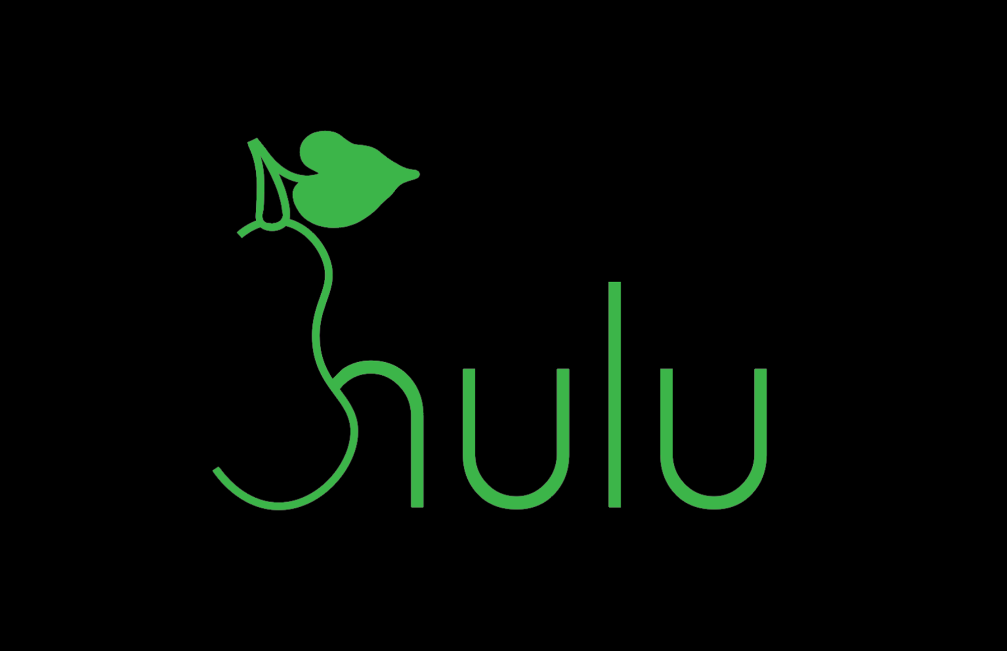
Hulu entered the market in 2007. Since then, their logo hasn’t seen any changes. The owner called the brand Hulu which means “bottle gourd” in Chinese, and in China, a bottle gourd represents harmony and value. Fascinating, right?
The owner’s overall mission was to connect people to the stories they love by offering astonishing experiences. However, I couldn’t help but notice that his original logo doesn’t convey harmony at all. Therefore, I decided to take this symbol of harmony to the next level by representing a bottle gourd in the logo. After all, it is the number one contributor to the brand’s meaning.
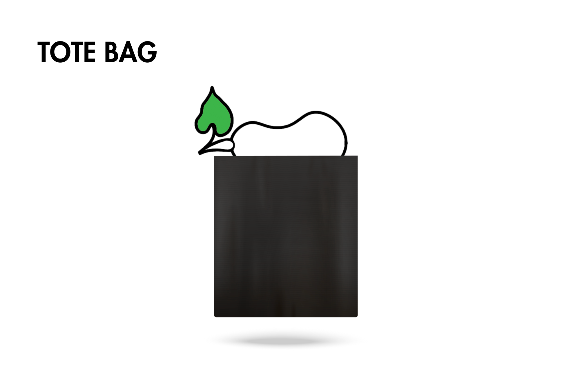
This student campaign titled 'Reinventing Harmony. ' was published in United States in December, 2023. It was created for the brand: Hulu, by ad school: S.I. Newhouse School of Public Communications. This Design medium campaign is related to the Media industry and contains 3 media assets. It was submitted over 1 year ago.
Credits
School: S.I. Newhouse School of Public Communications
Art Director: Juliette Keller
Instructor: Mel White