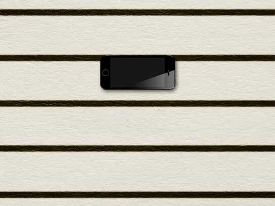
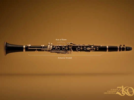
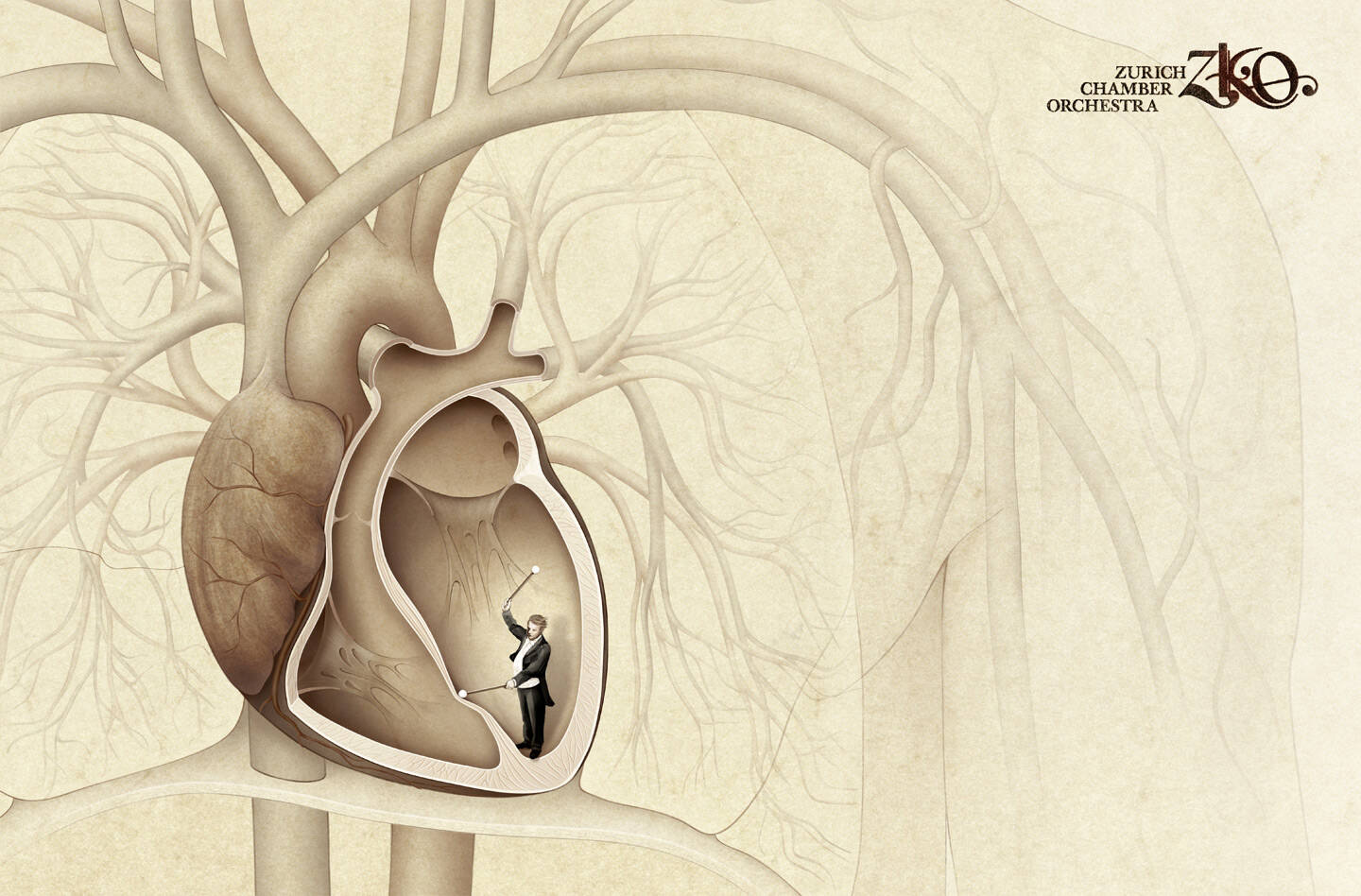
Zurich Chamber Orchestra: Goosebumps
Advertising Agency: Euro RSCG, Zürich, Switzerland
Creative Director: Axel Eckstein
Art Director: Rob Hartmann
Graphic: Isabelle Bühler
Illustrators: Nadja Stadelmann, Andrea Ulrich
Published: December 2008
Advertising Agency: Euro RSCG, Zürich, Switzerland
Creative Director: Axel Eckstein
Art Director: Rob Hartmann
Graphic: Isabelle Bühler
Illustrators: Nadja Stadelmann, Andrea Ulrich
Published: December 2008
Ads of the World is an advertising archive and community. The archive showcases campaigns from around the world categorized and updated daily. In the forum you can discuss your professional life and post your work for critique. The blog features advertising stories. Read more
On Demand Videos: Video tutorials for advertising pros and designers providing tools and information you can trust — and use — on your very next project. Subscribe today!
Comments
what about the other filaments are they deaf?
The man who stops advertising to save money is like the man who stops the clock to save time
Nice, finally something different. Something unexpected. NIce idea!
I think the art direction fits the idea. It shows in a very clear way what this sort
of music does to you. Why overload everything with colour? It wouldn't make
it better. Choosing this kind of graphic language instead of flashy, overloaded,
colourful graphic sort of way is just perfect.
Isn't Swiss Design/Advertising famous in showing things in a very clear
manner?
Well done guys, keep going.
Message are very impure.
Is it a good thing or bad thing?
www.fikirbenim.blogspot.com
nice concept
10/10
dclxvi
nice
http://www.joelapompe.net / Facebook : Joe la pompe / http://twitter.com/joelapompe
cool
Outstanding!!!!!!!!
hairgasm?
yes. I remember this campaign. It's great.
good1... pretty diffrent approach
Creativity is a natural extension of our enthusiasm
Bravo les suisses ! Wonderbach.
lovely art...
awesome creative - hatsoff - sagar - www.valayam.com
nice concept good illustrat
Nicely done. Thumbs (or hairs) up.
I remember this ad, too.
Very nicely done!
Wow. It's absolutely lovely. And I don't think it needs more people playing to be effective. Showing the other hairs 'limp', so to speak, makes the one that's on end stand out more.
Very good - raised a smile
i am going to share it with others
goos stuff!!!!!!
I don't like the idea. Too literal. But visuals are beautiful.
PORTUGUÊS: http://augustocorreia.carbonmade.com I ENGLISH: http://augustoinenglish.carbonmade.com
one of the best pieces this year.
Usually the hairs goes up when you are scared.
respect. what a nice ad.
Horrible.
Very nice idea.
great emotions. great advertising.
fantastic!!! well done rob and isa!!!!!
p.s. this actually won in cannes this year - bronze outdoor. ever so deserved!!
Post new comment