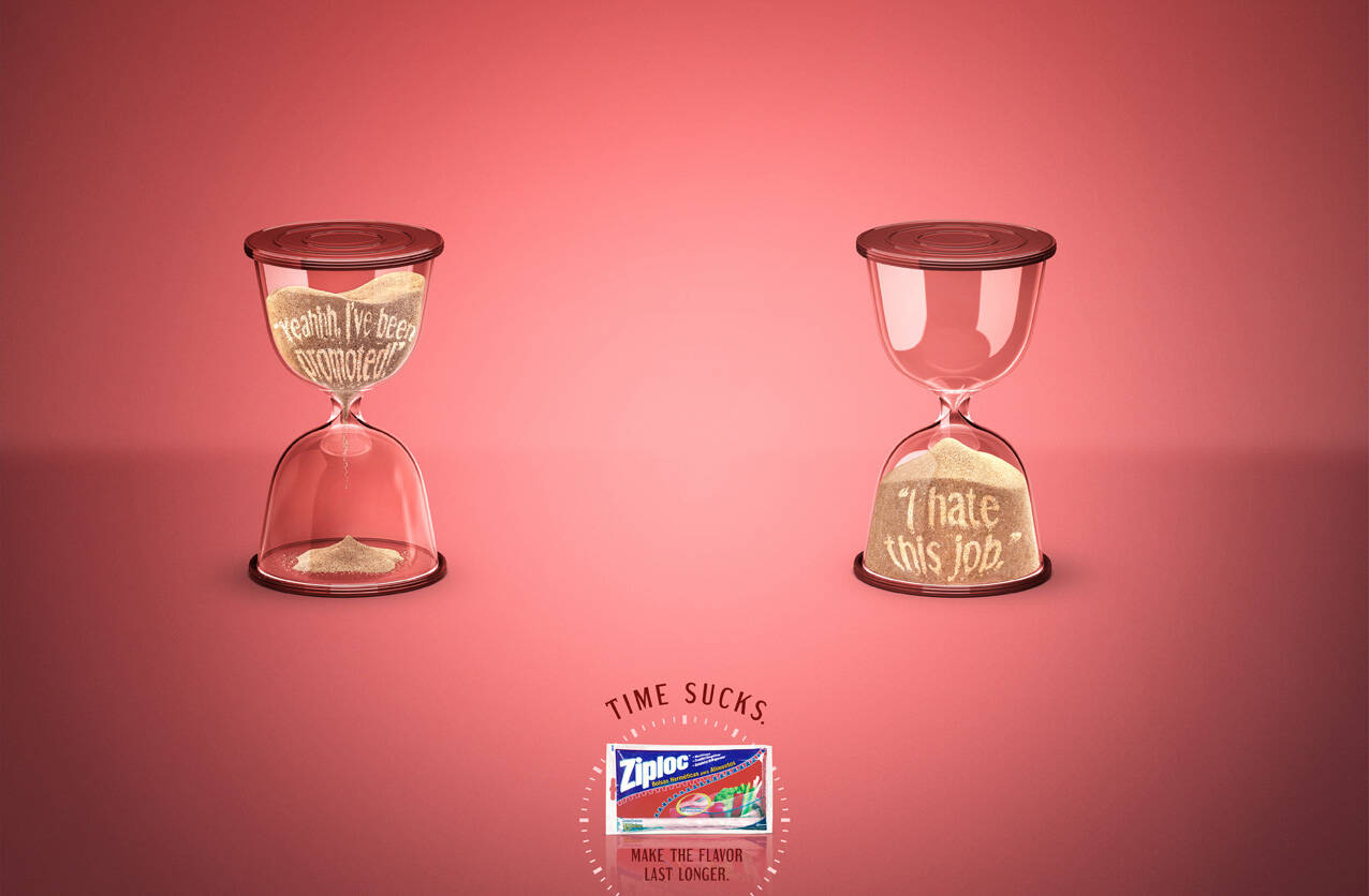
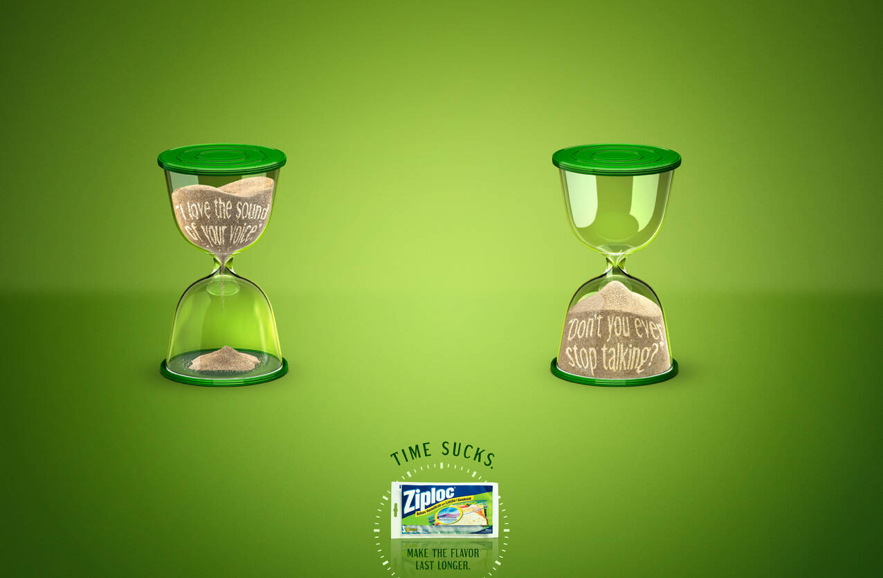
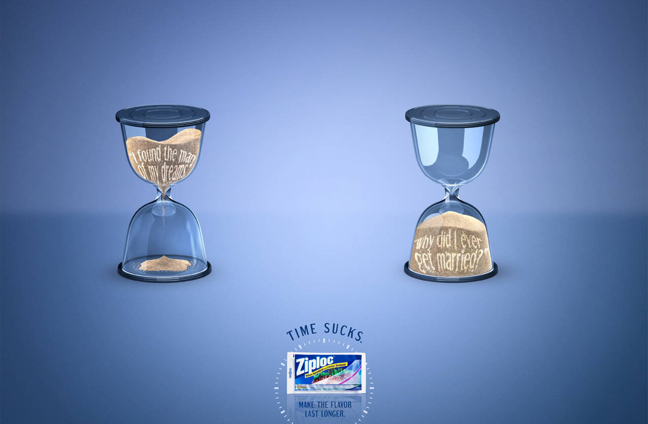
Ziploc: Promoted
Time sucks
Advertising agency: Giovanni+Draftfcb Rio de Janeiro, Brazil
Creative Directors: Adilson Xavier, Cristina Amorim
Art Director: Felipe Gomes
Copywriters: Fábio Penedo, Felipe Rodrigues, Daniel Japa
Photography: Estúdio Ícone
Published: May 2011


12 comments
not bad in terms of d idea connecting wid d message...i dont know abt time but d art work surely sucks...looks like work of a student...they shud hav left some sand in d top half of d hour glass in d 2nd representation indicating dat still time is left nd already he has started hating d job.. wud hav made more sense..
Concept is so so. Execution is terrible. I suppose this campaign targets the adults.
-------------------------------
www.scorchidentity.com
Brand Design | Logo Design | Brochure Design | Website Design | Branding Packages
art direction is awesome,
keep going.
"If you are irritated by every rub, how will you be polished?"
— Rumi
haha..but i agree with createwitty about the 2nd hr glass thing..
rubbishhhhhhh
NO great insight behind. Bad art direction. Copy is a cliche.
wow is this horrendous. thought (if you want to call it one) is based off a bad pun that doesn't really work. And that thought doesn't come close to paying off the tagline. The thinking is all over the place. Even if it did make sense, the hourglass lines are extremely bland.
The concept is interesting
www.yoshirosans.blogspot.com
I hate the copy.
I hate the copy.
Awesome idea. Execution can improve.
shahid
not sure about idea. also ziploc does definitely not make the food keep the flavor longer, it just keeps the food from turning bad, witch is not the same.