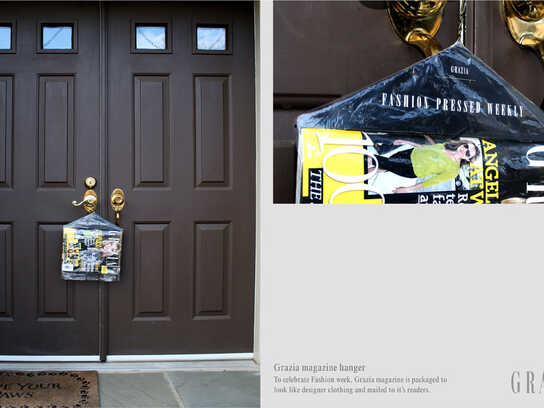
Ads of the World A Graphics.com site

YouthSPK: Blood

YouthSPK: Blood
Your rating: None Average: 7.3 (10 votes)

someone to spk2.ca

Advertising Agency: Cocoon Branding, Canada
Creative Director: Kyle Romaniuk
Art Director: Chuck Phillips
Copywriter: Lindsay Wright
Illustrators: Orville Laoag, Jared Frey
Photographer: Jerry Grajewski
Published: 2008

Comments

picopalqlea's picture 577 pencils

the perspective is really weird...

panasit's picture 687 pencils

I see wrist being slashed. I see an indifference face on her. I know it's supposed to be shocking. But I am not going to take time to read the bloody message.

-Tung
--good idea is enemy of great idea

sparky's picture 458 pencils

very emo :D

it kind of tackles how people cut themselves to let out internal angst but its not really an empowering message you are sending out. yeah, okay they want to say 'we get you' but it really wouldnt make me relate to it because at teh end of the day this looks too polished.

sneakyhands's picture 1843 pencils

just looks like she bleeds nail polish. also, you could say a lot more here by just showing less. right now, it feels like you're holding my hand when i just need to be pointed in the right direction. plus, she'll need to get in that bath tub if she doesn't want to be there all day.

Crisp One's picture 2033 pencils

bleeding hearts of the world unite....

does her neighborhood not have boys n girls club

SeanMartin's picture

This is borderline trivializing an important issue: not only is her expression bland and bored, but there's also the little detail of the perfectly clean razor blade. And the abbreviation needs serious work: my first read on it was "spike", not "speak".

pscs's picture 444 pencils

emo.

Chesh's picture 17 pencils

I don't like these ads but I'm guessing the bland expression in her face means that she's considering cutting herself. She has some scars but no one is that fresh. I also think that beacause the razor is clean. The imaginary blood (the nail polishy blood) is trying somehow to let the viewers know what she feels but I don't think many people would even care to read.
In the other ad, the tears look fake because (again, my guess) they are transmiting some deep feelings the girl has (if a teenager can have any). She has those thoughts and she can't express them freely so she's crying inside and that's what the very fake tearpool is showing us.

Those are just guessings and if you have to make that many assumptions in advertising... well... it's just not working.

JxCxZOMBIE's picture 142 pencils

emo to the ass.

Hell yeah!!

mok's picture

very emo. The copy is hard to read. I wouldn't take time to read it.

risrani's picture 10 pencils

Look at the size of that toiltet!!!

She could fit in there!!

Post new comment

We highly appreciate your comments. When commenting please acknowledge the following guidelines: Be respectful and helpful. Do not spam or link drop. Please note that guest comments do not appear immediately.

 
  • Allowed HTML tags: <a> <em> <strong> <cite> <code> <ul> <ol> <li> <dl> <dt> <dd> <blockquote> <img>
  • Lines and paragraphs break automatically.
  • Web page addresses and e-mail addresses turn into links automatically.

More information about formatting options

Ads of the World is an advertising archive and community. The archive showcases campaigns from around the world categorized and updated daily. In the forum you can discuss your professional life and post your work for critique. The blog features advertising stories. Read more

On Demand Videos


On Demand Videos: Video tutorials for advertising pros and designers providing tools and information you can trust — and use — on your very next project. Subscribe today!