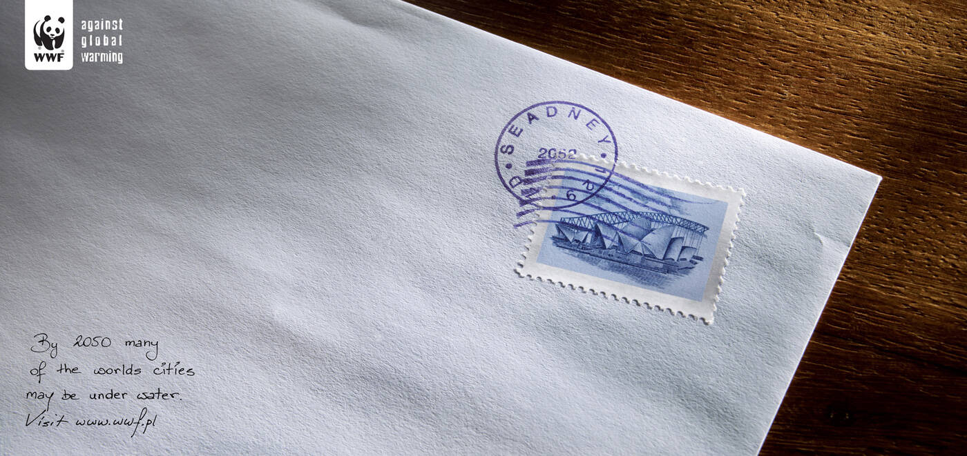
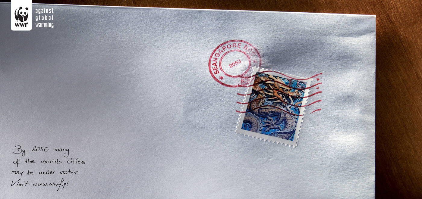
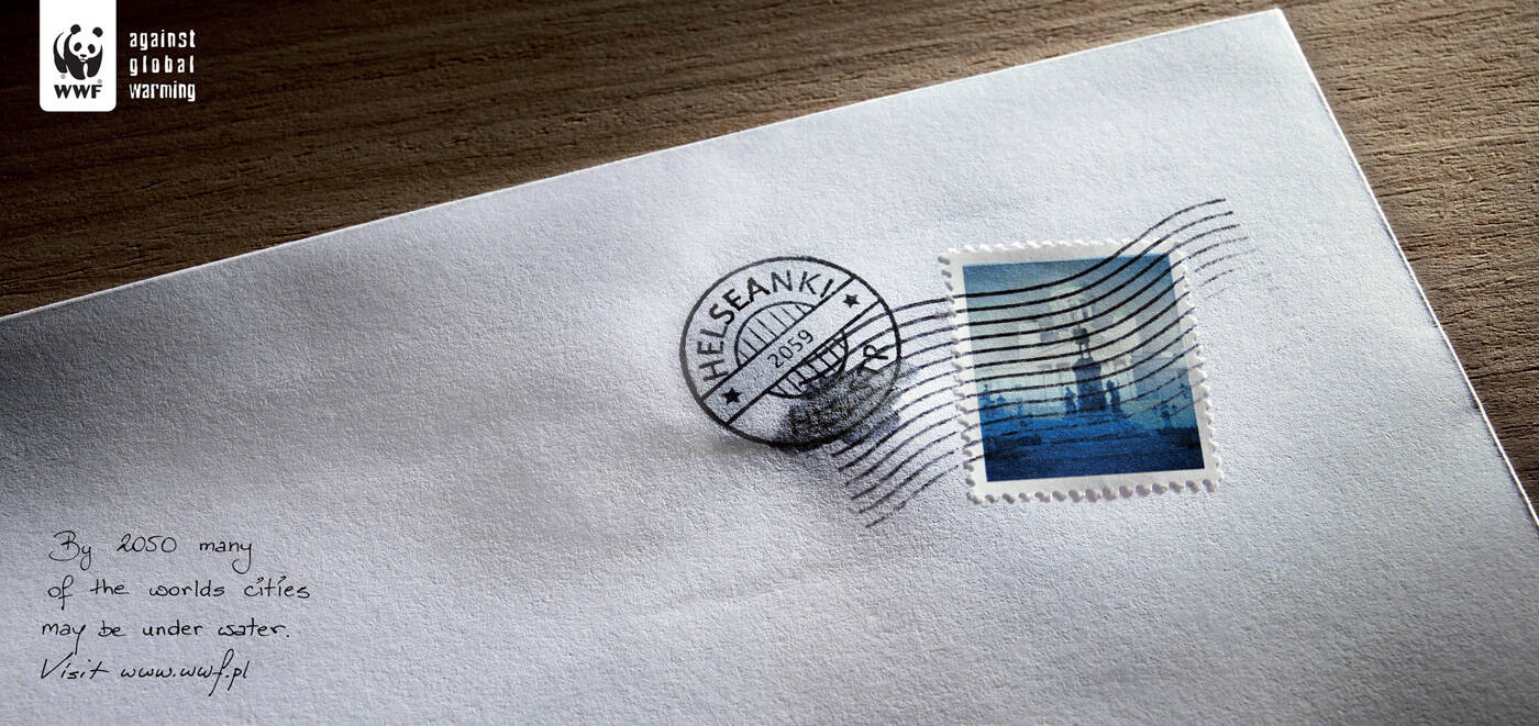
WWF: Seangapore
By 2050 many of the worlds cities may be under water.
Advertising Agency: Euro RSCG 4D, Warsaw, Poland
Creative Director: Jacek Szulecki
Art Director: Rafal Michalek-Czerepak
Copywriter: Anna Krolewicz
Photographer: Jacek Wolowski
Published: October 2008


19 Comments
its not clear
seamply seally.
seally.
hahahhahaha great comment
yeah, that really is crap advertiseang.
www.matt-roach.com
It's creating different perception
But difficult seen
İyi Reklam, Kötü Reklam
www
www.fikirbenim.blogspot.com
i think it is great. but the problem lies in the fact that the message cannot be gathered because the words are just too small. :( good idea though!!
nice one
I totally agree with comment on one of the other ads...absolutely no reason for this to be on a letter. Would make more sense if call to action was about writing government. But then that leaves the pun problem. And yes, these puns are a problem. Maybe get rid of the puns and make it a visual allusion in the stamps...like a wet dragon for Singapore or something like that. These just aren't working for me on any other level than that they look interesting as thumbnails.
Nice visuals, forced concept. A letter in 2053? Doubt it.
www.storytellerscreative.com
..............................................
. . . . . .. . . . . . . . . . . ,.-‘”. . . . . . . . . .``~.,
. . . . . . . .. . . . . .,.-”. . . . . . . . . . . . . . . . . .“-.,
. . . . .. . . . . . ..,/. . . . . . . . . . . . . . . . . . . . . . . ”:,
. . . . . . . .. .,?. . . . . . . .......... . . . . . . . . . . . . . . . . . . .\,
. . . . . . . . . /. . . . . . . . . . . . . . . . . . . . . . . . . . . . ,}
. . . . . . . . ./. . . . . . . . . . . . . . . . . . . . . . . . . . ,:`^`.}
. . . . . . . ./. . . . . . . . . . . . . . . . . . . . . . . . . ,:”. . . ./
. . . . . . .?. . . __. . . . . . . . . . . . . . . . . . . . :`. . . ./
. . . . . . . /__.(. . .“~-,_. . . . . . . . . . . . . . ,:`. . . .. ./
. . . . . . /(_. . ”~,_. . . ..“~,_. . . . . . . . . .,:`. . . . _/
. . . .. .{.._$;_. . .”=,_. . . .“-,_. . . ,.-~-,}, .~”; /. .. .}
. . .. . .((. . .*~_. . . .”=-._. . .“;,,./`. . /” . . . ./. .. ../
. . . .. . .\`~,. . ..“~.,. . . . . . . . . ..`. . .}. . . . . . ../
. . . . . .(. ..`=-,,. . . .`. . . . . . . . . . . ..(. . . ;_,,-”
. . . . . ../.`~,. . ..`-.. . . . . . . . . . . . . . ..\. . /\
. . . . . . \`~.*-,. . . . . . . . . . . . . . . . . ..|,./.....\,__
,,_. . . . . }.>-._\. . . . . . . . . . . . . . . . . .|. . . . . . ..`=~-,
. .. `=~-,_\_. . . `\,. . . . . . . . . . . . . . . . .\
. . . . . . . . . .`=~-,,.\,. . . . . . . . . . . . . . . .\
. . . . . . . . . . . . . . . . `:,, . . . . . . . . . . . . . `\. . . . . . ..__
. . . . . . . . . . . . . . . . . . .`=-,. . . . . . . . . .,%`>--==``
. . . . . . . . . . . . . . . . . . . . _\. . . . . ._,-%. . . ..`..
Meh.
Thought's kinda nice; I think it'd still work without the "sea". Unnecessary element - and a (bad) pun at that.
If i didn't see the title of this page, i wouldn't at all notice the "sea" thing at all...
The "sea" thing is not necessery. Everything is to small. I like the photo.
:)
Wow a pun. Revolutionary stuff.
I'd love to sea your crappy ideas, bloody idiots!!!!
So what? Give me a call to action!
trzy grzyby w barszcz?
"sea" thing, wave on the stamp and wet stain on it.
Not too much?
And even than - too less to make it well.