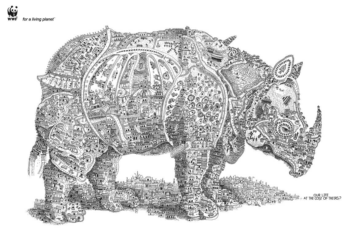
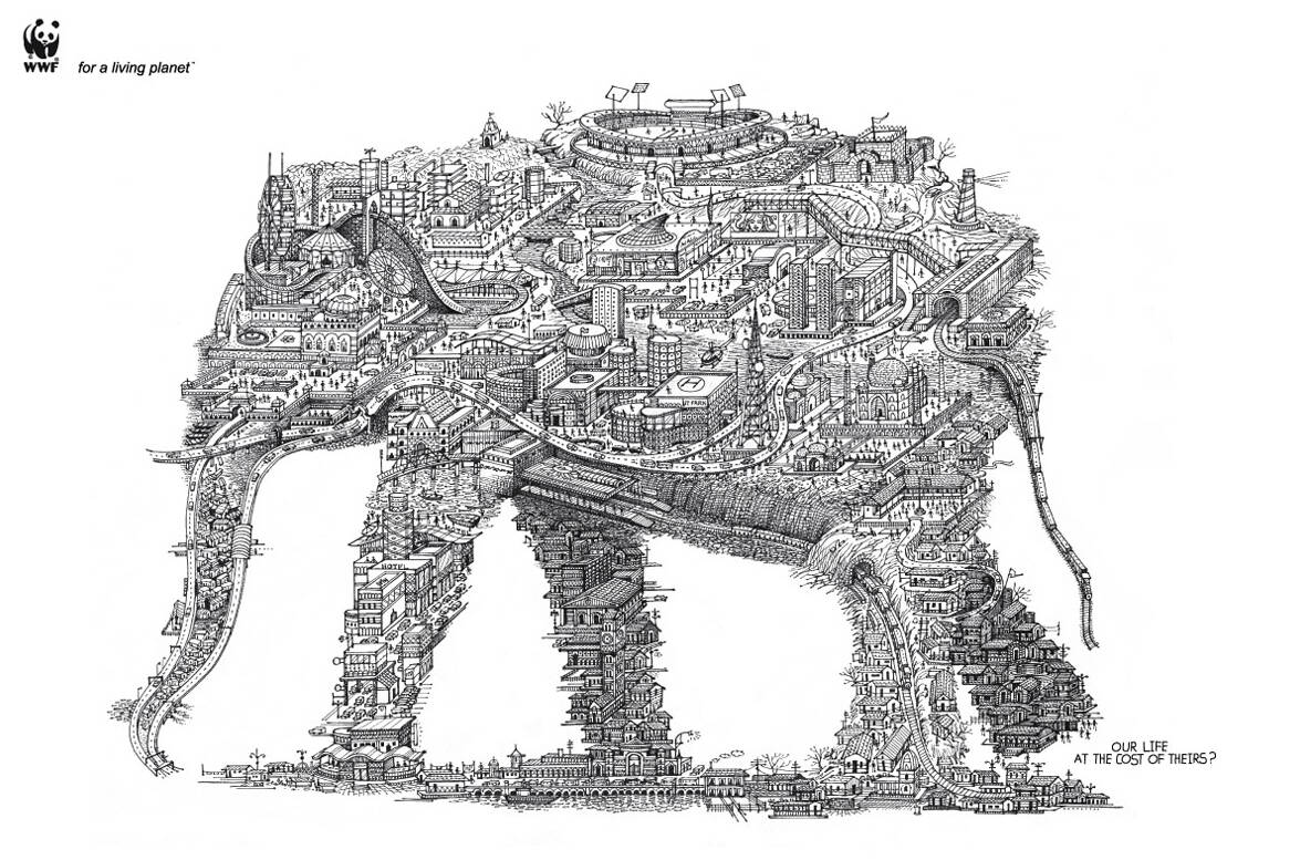
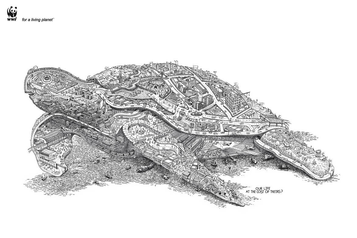
WWF: Rhino
Our life at the cost of theirs?
Advertising Agency: Ogilvy & Mather, Mumbai, India
Executive Creative Director: Piyush Pandey
Creative Director: Sumanto Chattopadhyay
Art Directors: Mayur varma, Mandar Wairkar
Illustrators: Swapnil Nilkanth, Nishikant Palande
Copywriters: Sumanto Chattopadhyay, Karn Singh, Mandar Wairkar


Comments
Great illustrations. Too bad the message is so convoluted.
i know what you mean: http://www.youtube.com/watch?v=S2CLT0_QdbE
纯粹画面表现,创意太牵强
Claro que sí, es como dice él.
Of course, he is right.
--
----------
http://cientocincuentapordia.blogspot.com/
Great illustration. Full stop.
nice work.
Seen before a lot of times.
http://adsoftheworld.com/media/print/national_council_on_problem_gambl...
un recurso se puede utilizar mil veces, si el objetivo y la idea es diferente, el recurso no es la idea
La idea es igualita, mira bién.
yep.joellepompe material. the illustration idea at least.
are you crazy? this has nothing to do with the ad from india!
not even close son...this illustration is sick.
great illustrations. weak ad.
Agreed
---
http://jakephillips.wordpress.com
---
Website: http://jakephillips.net
Blog: http://jakephillips.wordpress.com
looks great and the message works, but i feel they could've pushed the tag a little harder. it might just be me, but tags that start with 'for', to blatantly tell me what a product does, always seem half baked.
message is not that strong, but the art is really good, I guess my mother could like it but it´s certainly not an award winner
Harping on the same thing again and again. Please, tell me something I don't yet know. But then again, maybe the line should be "Our life at the cost of their award medals".
you can't say this is similar to that gambling addiction one just because an image is made of other images relevant to the message.
nice
doesn't make sense, 2/10
Hey whitefag! Good to see you're still complaining.
Now come on, try a bit here ... how doesn't it make sense? Why is it not working? What is so bad it only deserves a 2 out of 10 from you?
What do you 'think'? Or am I asking too much?
i think it makes perfect sense. the ad ins't verry strong though, fabulous illustrations
once the wheel was invented, the only creation left was the second wheel.
Nice & simple ad + great illustrations! Just wondering...why are there 3 copywriters for one line?
一般
not again
Is this from Piyush? Bad...
more Asian scam
路过~~~~
bohat alla!!!!!!!..........mean awesome!!!
amazing illustrations.
http://karanraghav.blogspot.com/
really nice illustration
nice ilus, no idea
zoom in, read the line.. then think
I think Sumanto should stop taking credit for work he wasn't even aware of! Stop bullying the kids, dude!
http://www.flickr.com/photos/andycouncil/sets/72157611521331789/
those illustrations are ugly compared to the wwf ones.
also they miss a message.. the line in the ads is nice.
illustration is good but I can't see the idea easily. lost in the houses.