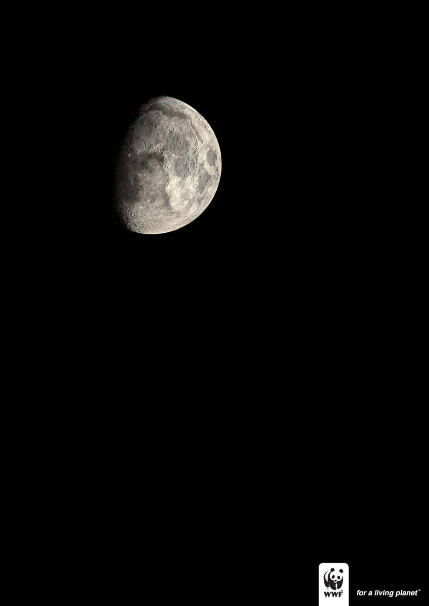
Ads of the World is an advertising archive and community. The archive showcases campaigns from around the world categorized and updated daily. In the forum you can discuss your professional life and post your work for critique. The blog features advertising stories. Read more
On Demand Videos
On Demand Videos: Video tutorials for advertising pros and designers providing tools and information you can trust — and use — on your very next project. Subscribe today!


Comments
nice retouch
half of the earth is africa?
from guangzhou/canton china
Nice. I get two ideas from this:
1) Planet will look like this if pollution doesnt stop.
2) We will have to go to live to the Moon (and that would be our planet).
Anyway...
"Oh! that's Earth, i thought its moon" to get such reactions the copy isn't supportive.
not getting it
http://jazarah.net/blog/
good photoshop work.
i just don't know why it doesn't have such a strong impact on me.
my first glance was blank...
the line could have added some more impact
that is my thought.. the headline is very weak!
--
Everartz
| Everartz |
Art direction and old school death metal.
www.everartz.blogspot.com | myspace.com/inkill
Nothing they can do about the line, it's the offical logotype for WWF. Unless they force in a line to it.
...
http://alvinpck.deviantart.com/gallery/
nice artwork. Africa is half the size of the planet because the ad is done in South Africa... duh.
this a picture of moon not an ad!
very poor
stoned is better than bored
I like it. Although it's not really telling me what to do.
poor poor poor idea,give me sth new please.
Don't really like it. I mean, what's the message? Ads are supposed to catch your attention. You walk by this thing, "Oh, it's the Moon. Very nice." and you keep walking. No headline, no message, no impact, no nothing.
Post new comment