Wonderbra: Magnet
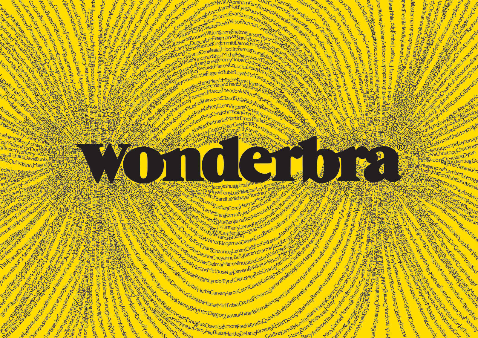
It is a proven fact that a Wonderbra bra is to males as a magnet is to iron. So, the print ad “Magnet” focuses on the Wonderbra logo’s special magnetic field. When taking a closer look, the reader understands that the iron fillings are actually male names. No two names are alike in this extraordinary magnetic field, and in all, more than 3.500 names have been used.
Advertising Agency: XL, Athens, Greece
Creative Director: Michalis Lagos
Art Director: Thodoris Korkontzelos
Copywriter: George Gabriel
Published: November 2011


20 Comments
Terrible. I guess we now know why Greece is bankrupt.
ha! burrrrrrn
Don't really like it. It's not sexy. It looks like a lot of stalkers.
What hath God wrought
Conceptually bad and unattractive to look at.
this is my concepts for wonderbra
http://newcreatives.com/work/1281430598/1310046013.jpg
http://newcreatives.com/work/1281430598/1281434753.jpg
1st one: iirc there was a similar campaign for... uhm... a tv-station that would introduce shorter ad breaks inbetween films? Different concept, i know, but that was the first thing i thought about. Also, im not sure if the Wonderbra logo is distinctive enough for that approach. Other than that: nice and clean.
2nd one: Not sure about it. Maybe too many safety pins, but it looks like not only her breasts got bigger (which wouldnt even be the case since wonderbra sells pus-up bras which work with nokage thats already there)
who cares? ima play some tunes instead http://www.mixcloud.com/hoozn/
i'm sorry dominantic14 but either this campaign or yours are simply bad
for sure, just a silly student posters! but i believe that you, jponino, have a great works for this brand and you just don't wanna show it for us;)
you're concepts are fine, don't worry.
Yeah they're pretty decent, especially the second one.
well first of all, i'll never do the mistake to choose a client like wonderbra or viagra in my portfolio ! everything has been done and is better than any of the idea we could have, so no i don't have anything to present to you for this client ;)
secondly, do you really think you got the best of wonderbra with what you've done? come on ! tell me that you've been engage in a big agency with that ! :)
i didnt said that my conctpts are best, but i'm trying to find a new ways, and i cant understand you, if you are a creative, for you it should be interesting to find somethig new & fresh. And if you cant imagine, so this is one & only mistake.
Think more & be happy!
Too much read in required and the execution is too one dimensional. Might work better if the iron filings formed the shape of a Wonderbra so there's some viewer payoff at least.
Not wonderbra ad u wud like to see
liked the back idea..one of mr domi... but not well executed...weak art..
busy.
Too cerebral and unsexy. You were thinking with the wrong head Michalis!
Quite simply, this idea was generated with the wrong head. Missed opportunity (if it actually ran).
Good attempt for a product like lingerie. At least, it is different.
Dharmesh Padia
I saw before much better works from wonderbra. It looks carelessly job.
it starts bad: you had to explain a print ad in 2 paragraphes..
I'm not so sure I get it?