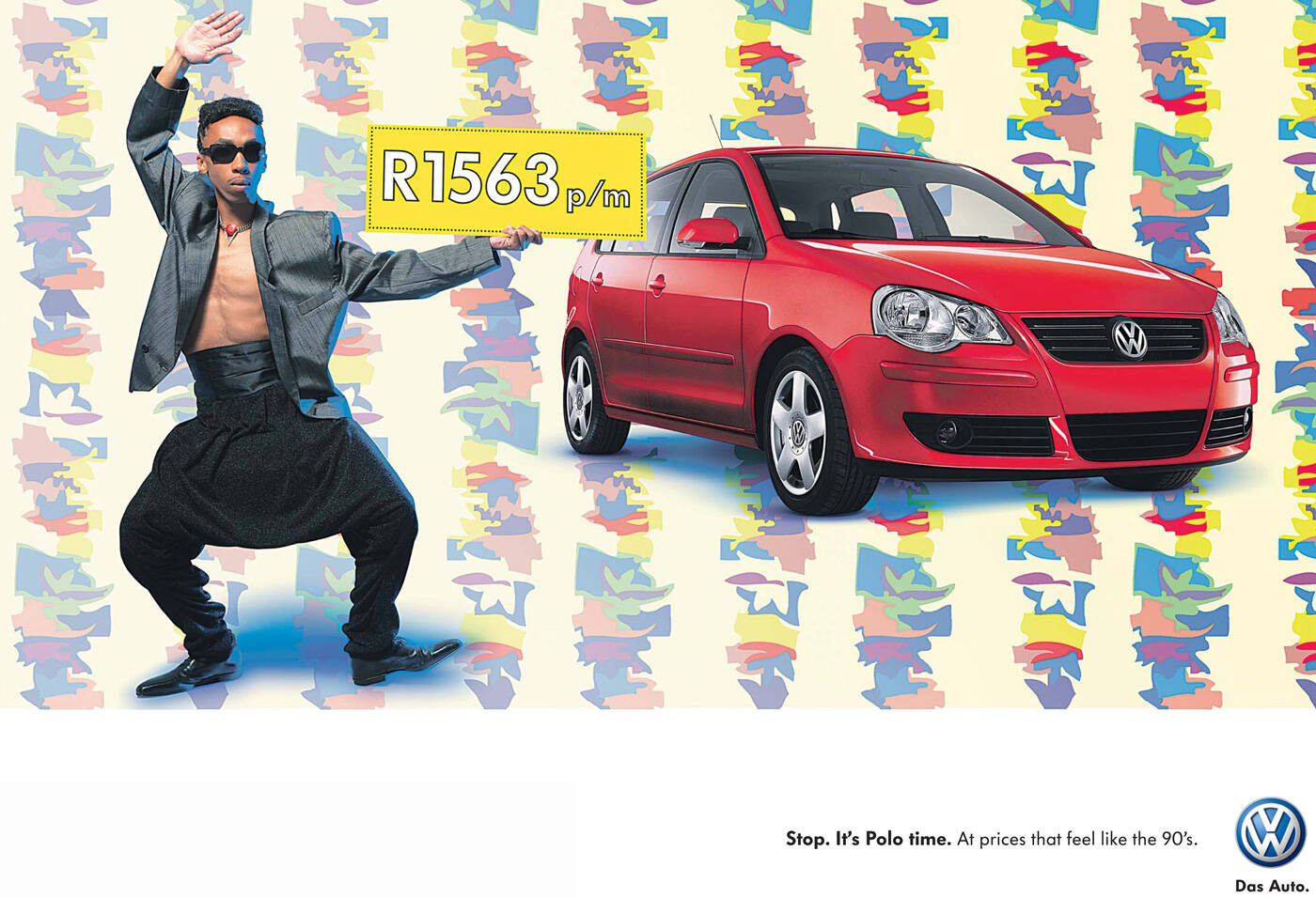
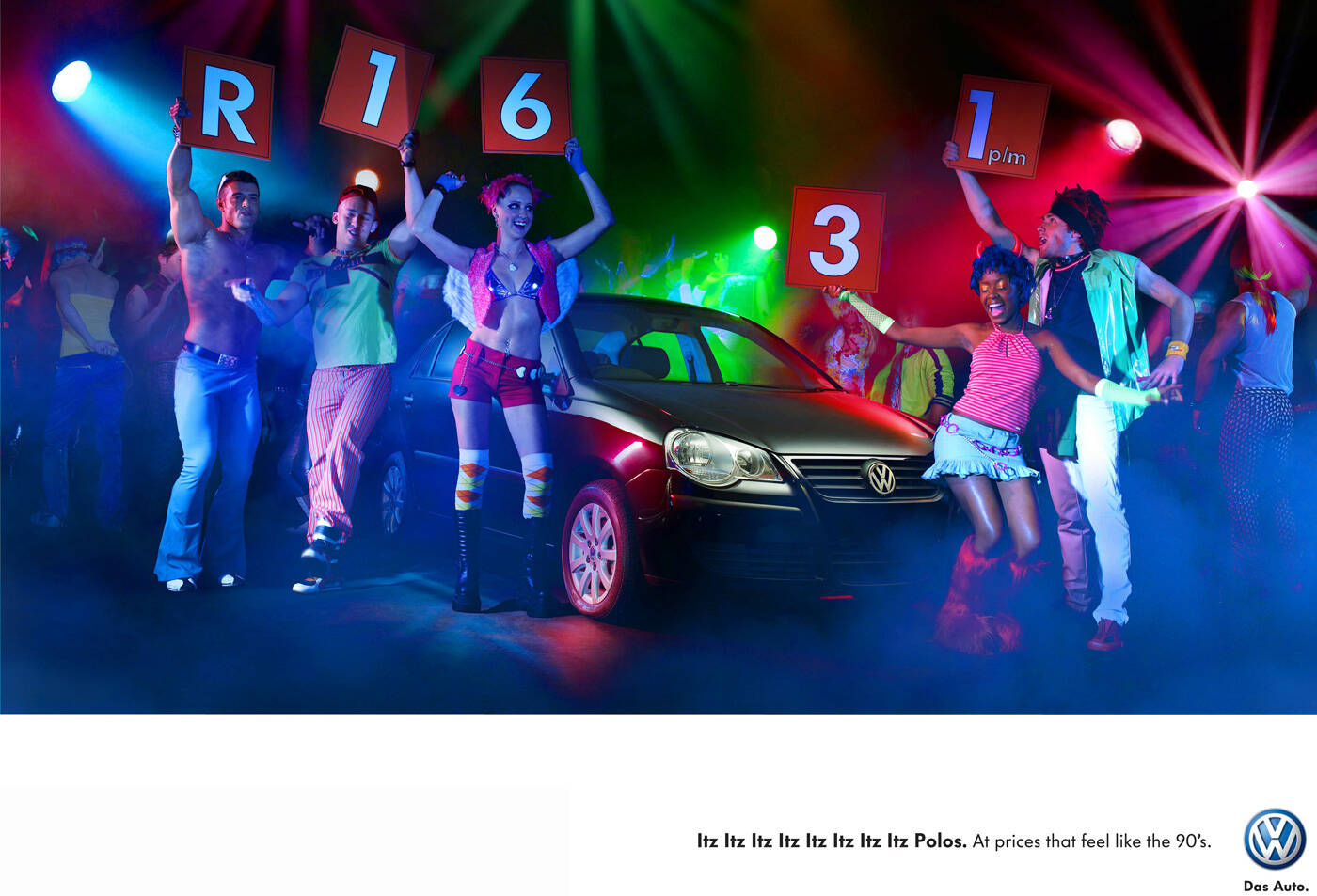
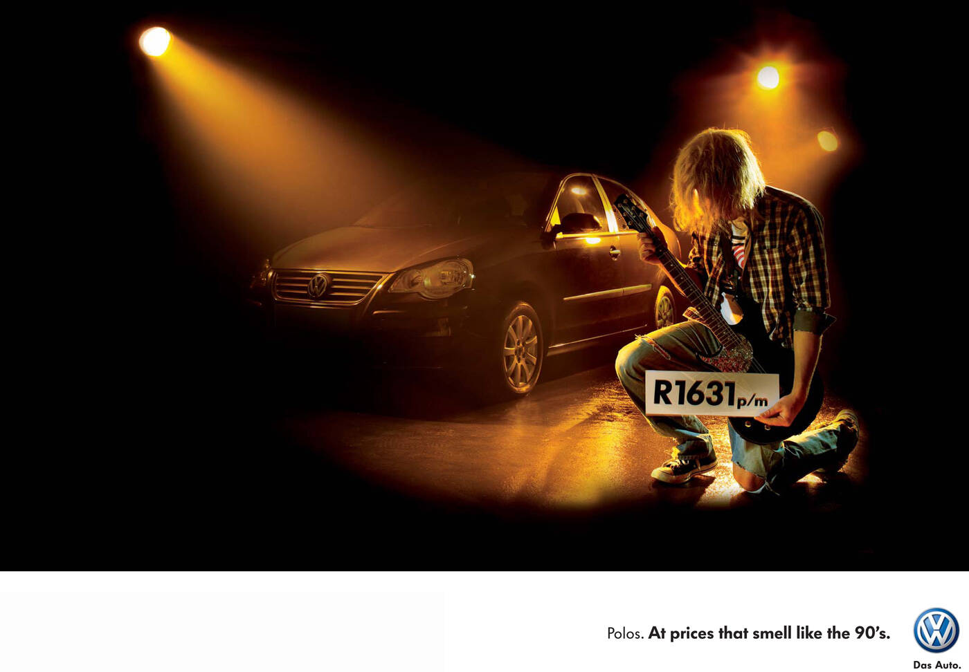
Volkswagen: Feels like the 90's, 3
Advertising Agency: Ogilvy, Cape Town, South Africa
Creative Director: Chris Gotz
Art Director: Jennifer Macfarlane
Copywriter: Cuanan Cronwright
Photographer: Clive Stuart
Published: September 2008
Advertising Agency: Ogilvy, Cape Town, South Africa
Creative Director: Chris Gotz
Art Director: Jennifer Macfarlane
Copywriter: Cuanan Cronwright
Photographer: Clive Stuart
Published: September 2008
Comments
sorry, but prices feeling like the 90s is overall a pretty weak concept. well price advertising usually is weak, but with a quality product like VW there are dozens of better ways to get someone to try and buy. also, the nirvana ad is the strongest. second would be hammer, this one, except there's no "it's" before "hammer time". lastly, the rave is just bad.
dunno'bout the prices but it's feels like the 90-s
The least they could have done is make the car appealing. It looks like an illustration out of an old Popular Mechanics magazine.
www.storytellerscreative.com
..............................................
www.storytellerscreative.com
Yikes. You really wanna tie your car to a failed performer who got thrown out of his house because of debt?
Really bad choice there.
ACCOUNT EXECUTIVE/CLIENT/OVER-ANALYZER ALERT!
OOOO!!! HIDDEN COMMENTATOR WHO THINKS HE'S BEING CUTE ALERT!!!
mc hammer!
love it !! it looks so shit that it actually looks cool :-)
and that awful blue dropshadow... excellent !
DUH. Blue dropshadows were definitely "in" in the 90's right? Oh, wait, no that was the 80's. And it was EYE shadow.
www.radiant3.com
They're going for the 'so bad it's good' route.
very very bad
I like this, especially how cheesy the little lines are haha, not amazing but nice.
its not bad idea, workd ok.
http://adsoftheworld.com/media/print/jet_star_asia_kolkata?size=_original
kinda similar to this...
it's really cool
Post new comment