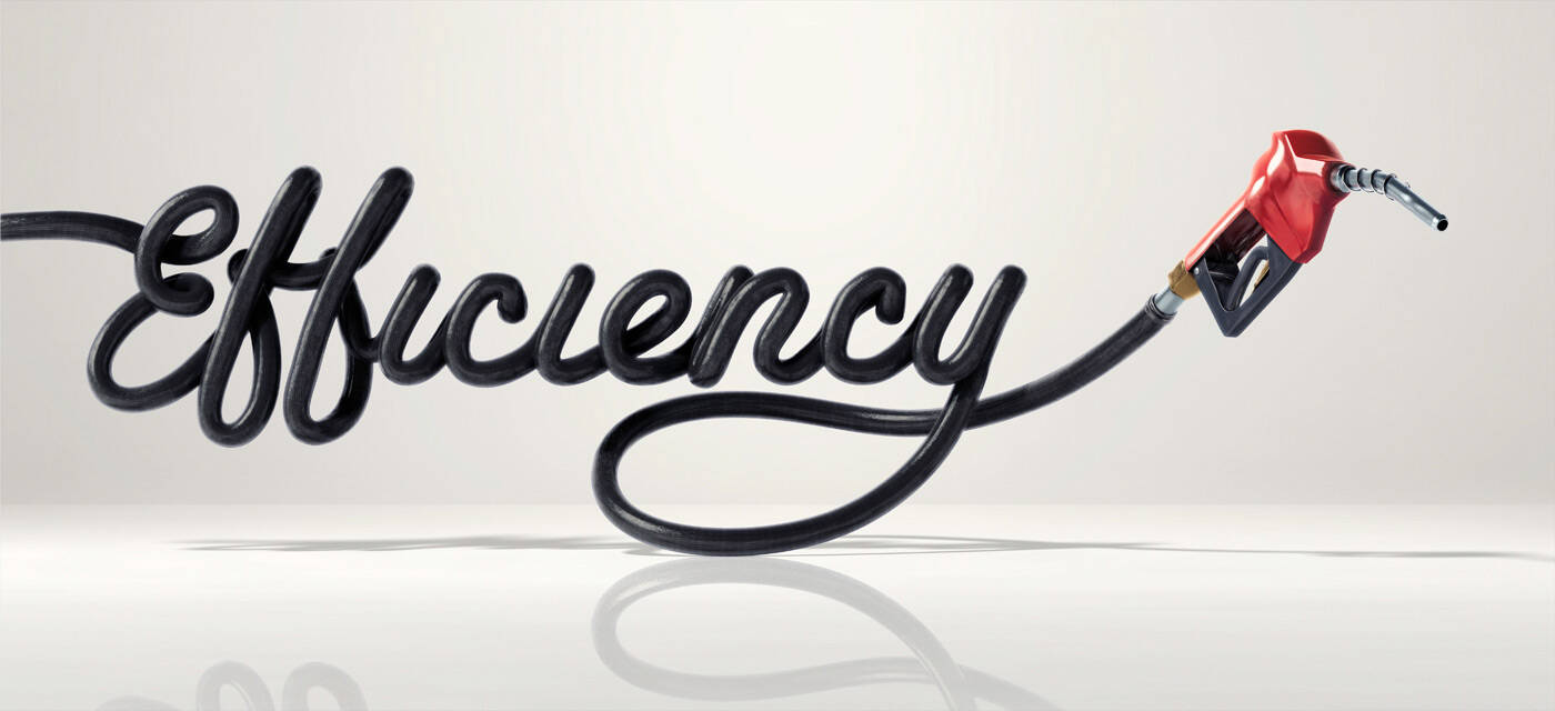
Ads of the World

Ads of the World™ an All Creative World site

Toyota: Efficiency

Toyota: Efficiency
Your rating: None Average: 6.9 (37 votes)

Advertising Agency: Saatchi & Saatchi LA, USA
Creative Director: Ryan Jacobs
Art Directors: Joshua Gilman, Michael Gurman, Cindy Rowe
3D: Electric Art
Creative Director: Bruce Bigelow
Typography: Ilovedust UK
Creative Director: Mark Graham

15 Comments

Guest's picture

i love this, so simple.. but theres no toyota logo anywhere,.. where are these being displayed?

bknowlden's picture 3680 pencils

i remember this from about a month ago, it just wasn't for this brand...

Blashyrkh's picture 18347 pencils
bknowlden's picture 3680 pencils

that's it, thanks for the link...

jsptrck404's picture 426 pencils

beautiful art direction. nice work, Ilovedust.

| think small |

alexander_bickov's picture 3321 pencils

I love this typography idea

Guest's picture

WHY IS THERE NO CLUE AS TO WHO THIS AD IS FOR. I gather from the credits it is Toyota. ARE THEY MAD???

Guest's picture

DIG IT! but unfortunately, as a first time viewer, i don't know what brand this is advertising. the only give-away is the agency name. so i assume it's for toyota.

skotopes's picture 2 pencils
A stranger abroad's picture 435 pencils

No, there's no brand name. That is fine if these are posters at a Toyota dealer rather than media advertising. So not necessarily crazy.

If they are dealer posters, they are way better than most dealer posters. Otherwise, they are not great ideas, just typography. But would be good at POS.

mikeelrapido's picture 1943 pencils

Simple and great, good message!

<---------------SexInAds------------------>

http://www.facebook.com/sexinads
http://sexinads.tumblr.com

Guest's picture

there is no fking idea, its design 'as it is' in this space

Guest's picture

complete rip off of audi by bbh

ultraboon222's picture 220 pencils

These are displayed on billboards that have the logo on the installed on the outside of the billboard. I saw this one right before the Lincoln Tunnel going into NYC and there was "moving forward" small on the bottom right hand corner. It was obviously Toyota because the logo was about a quarter the size of the on built above the board itself. Cool to see in person.

Too many cooks in the kitchen....

AKH's picture 29 pencils

1960'S IDEA. We are in 2010...

Ads of the World advertising archive and community showcases fresh creative campaigns daily from around the world. Read more

Recommend us on Google