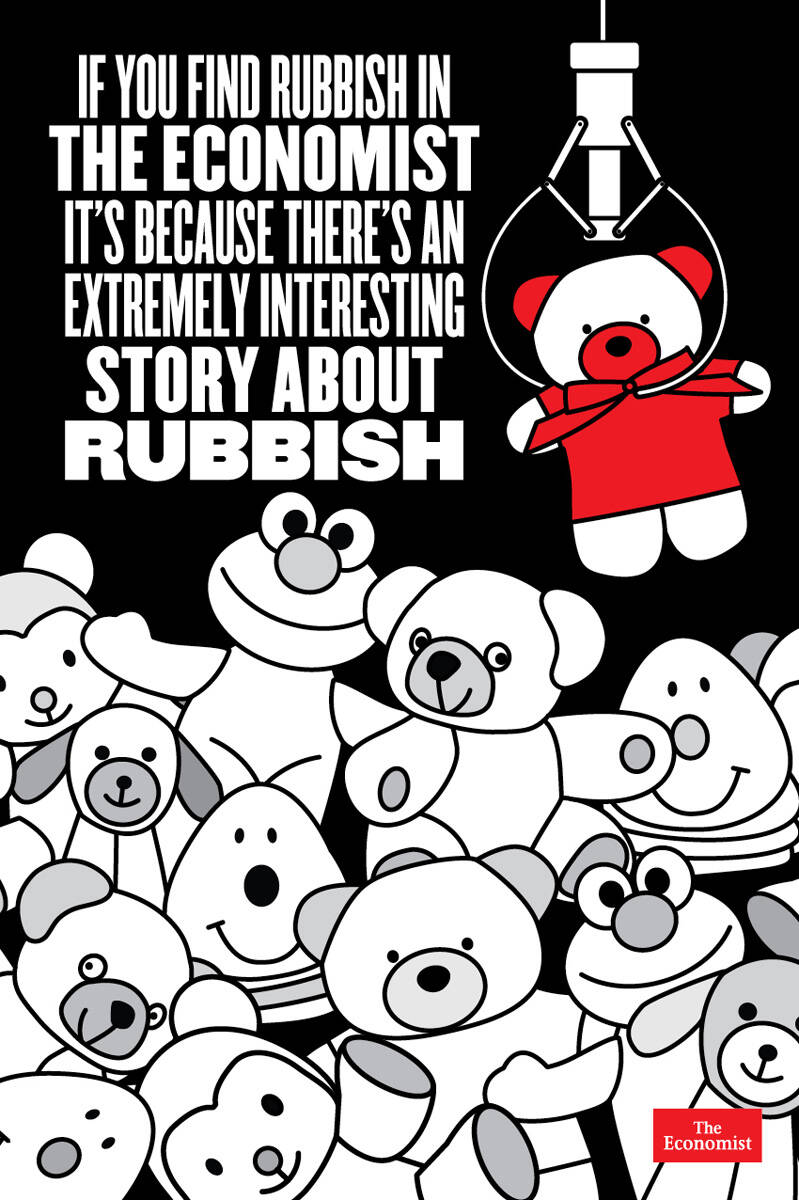
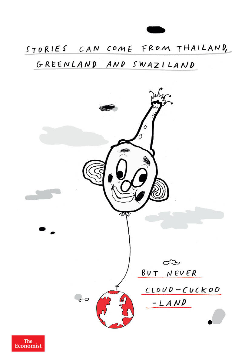
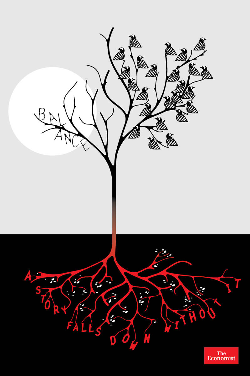
Advertising Agency: AMV BBDO, London, UK
Executive Creative Director: Paul Brazier
Art Director: Paul Cohen
Illustrator: Anthony Burrill
Copywriters: Mark Fairbanks, Tim Riley
Submitted by Pacific Blue on Tue, 2008-05-06 08:02.
BTW If The Economist is going to change the "Red and White copy text" guidelines, they should take care of the ilustrations a little bit more.
The Ilustration doesn't reach the average of "excelence" the brand suggests.
But hey, that's only my humble opinion.
---------------------------------------
Art Director since 2001
The Economist suscriptor from 2005.
---------------------------------------
Submitted by Pacific Blue on Tue, 2008-05-06 09:51.
I think is about how carefully The Economist journalists and editors choose the articles and reports on every Isssue.
We are "flooded by information", so it takes a time and effort to select the important and relevant information to write about.
That's why they show this insert a coin to the hookermachine for picking up the right bear.
Is a very powerful insight, and If you are a stedy long time The Economist reader you know is true.
The visual here isn't working for me, either. I love the line.
Somehow I feel this needs to be "topical" in the visual, rather than using some childish, cheesy visual "metaphor."
If they had picked, let's say, Paris Hilton, and do a funky, stylized version of her portrait along with her personal line of perfumes and/or fashion items that she designed. Then, the line makes perfect sense. She's a big white trash and the whole world knows that. But at the same time, she's an entrepreneur, too. And the "article" would naturally be about this socialite's impressive foray into perfume marketing or something along those lines.
I know that would never happen. But just a little visual idea. Because right now, it definitely ain't happenin'...
Comments
Extremely adorable copyline. I Like it.
Badddd work. It is light years away from the smartness of an Economist Ad line in tone and manner.
BTW If The Economist is going to change the "Red and White copy text" guidelines, they should take care of the ilustrations a little bit more.
The Ilustration doesn't reach the average of "excelence" the brand suggests.
But hey, that's only my humble opinion.
---------------------------------------
Art Director since 2001
The Economist suscriptor from 2005.
---------------------------------------
How does the line tie to the visual?
People say Economist ads are good so I like them, but not this time.....I don't read the Economist.
That's an ad right there.
Boom-shanka
"Make a name, or be defamed"
I think is about how carefully The Economist journalists and editors choose the articles and reports on every Isssue.
We are "flooded by information", so it takes a time and effort to select the important and relevant information to write about.
That's why they show this insert a coin to the hookermachine for picking up the right bear.
Is a very powerful insight, and If you are a stedy long time The Economist reader you know is true.
But, hey that's my humble opinion.
Insight might be wrong word for what they have here.
Shouldn't all Newspapers choose the right things to report on?
i know they all don't, but they should right?
So they're saying they do it right. Which is what they should be doing anyway.
If the whole point is that everyone else is crap, and all they have to do to be the best, is the "bear" minimum then we have a big problem.
But that's just MYYYYY humble opinion.
"Make a name, or be defamed"
Good copy. Smart!
I like what it says... the ilustration is rubbish...
i like this one better.
weak
The visual here isn't working for me, either. I love the line.
Somehow I feel this needs to be "topical" in the visual, rather than using some childish, cheesy visual "metaphor."
If they had picked, let's say, Paris Hilton, and do a funky, stylized version of her portrait along with her personal line of perfumes and/or fashion items that she designed. Then, the line makes perfect sense. She's a big white trash and the whole world knows that. But at the same time, she's an entrepreneur, too. And the "article" would naturally be about this socialite's impressive foray into perfume marketing or something along those lines.
I know that would never happen. But just a little visual idea. Because right now, it definitely ain't happenin'...
I guess the whole point of having a rubbish illustration is to support the concept.
www.garciarobles.net
I think the line works perfectly without the illustration.
Personally I'd whip in the old crumpled paper effect on the Economist red, then go off in time for dinner and a movie.
pleASE DO NOT DEFAME THE ECONOMIST by producing such trash for it
Would have worked without the visual.