Sydney International Food Festival
Flags, Brazil, Flags, Australia, Flags, France, Flags, It...
Agency: TBWA
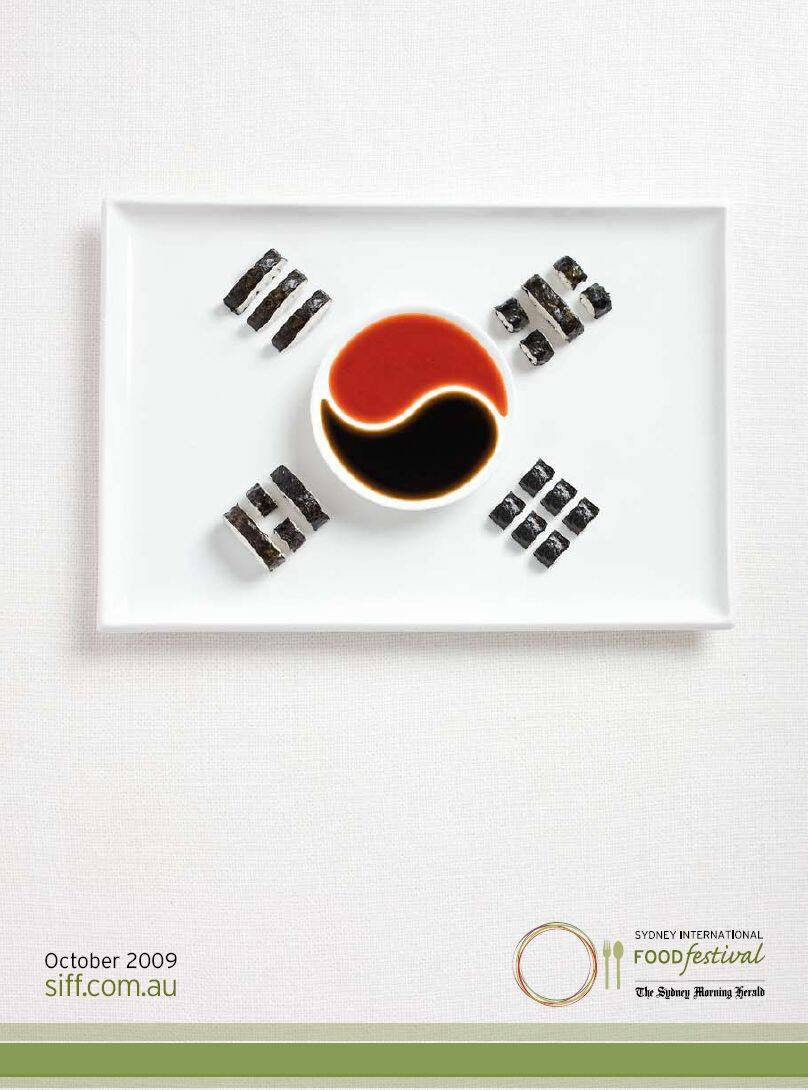
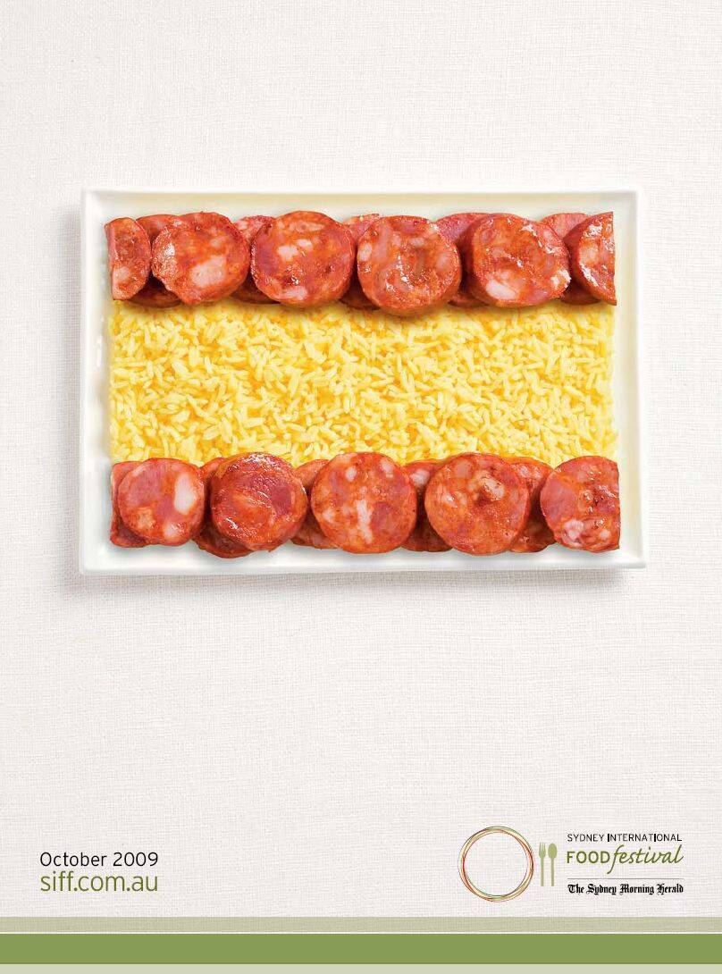
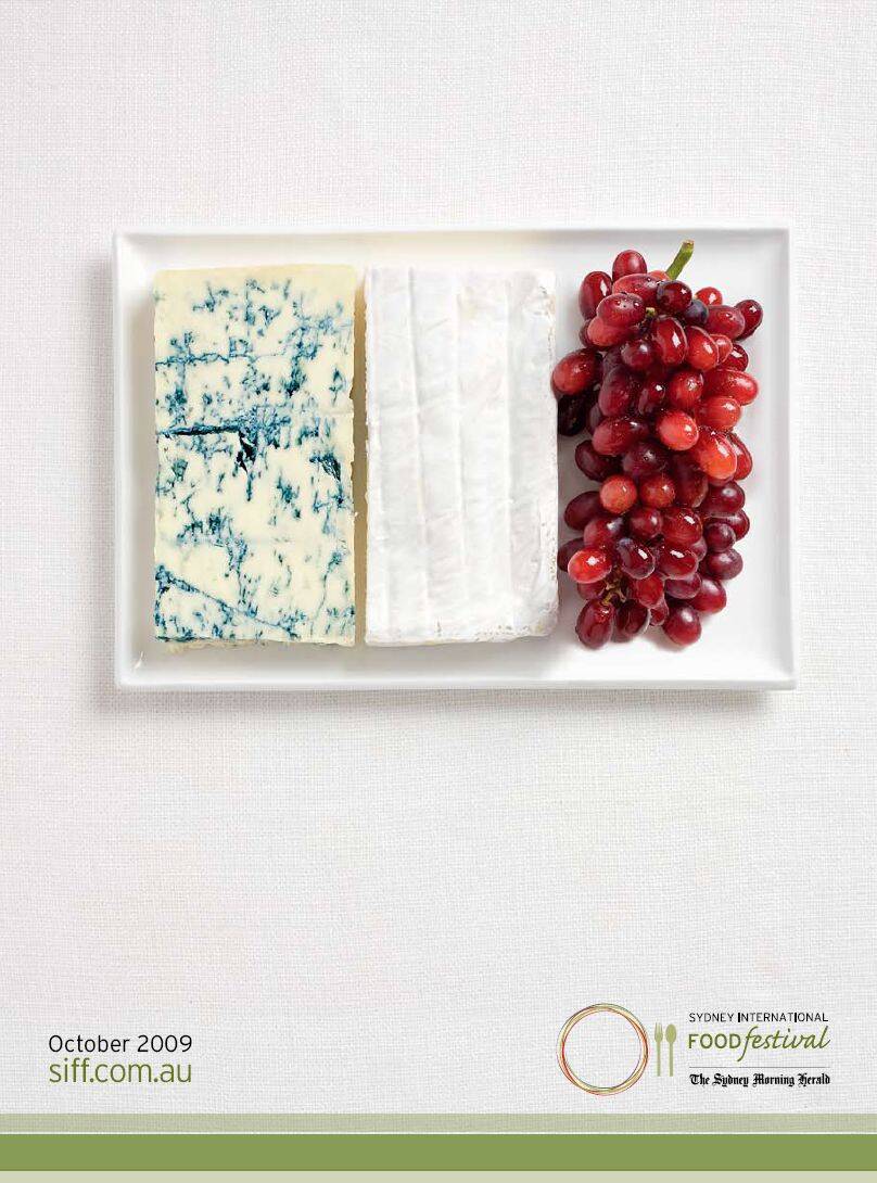
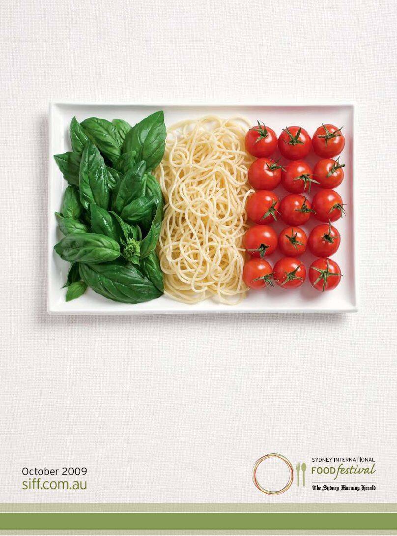
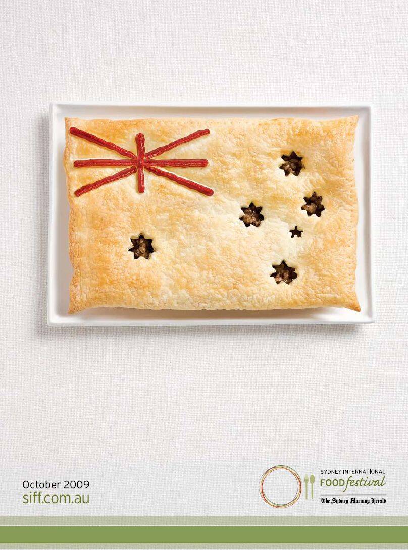
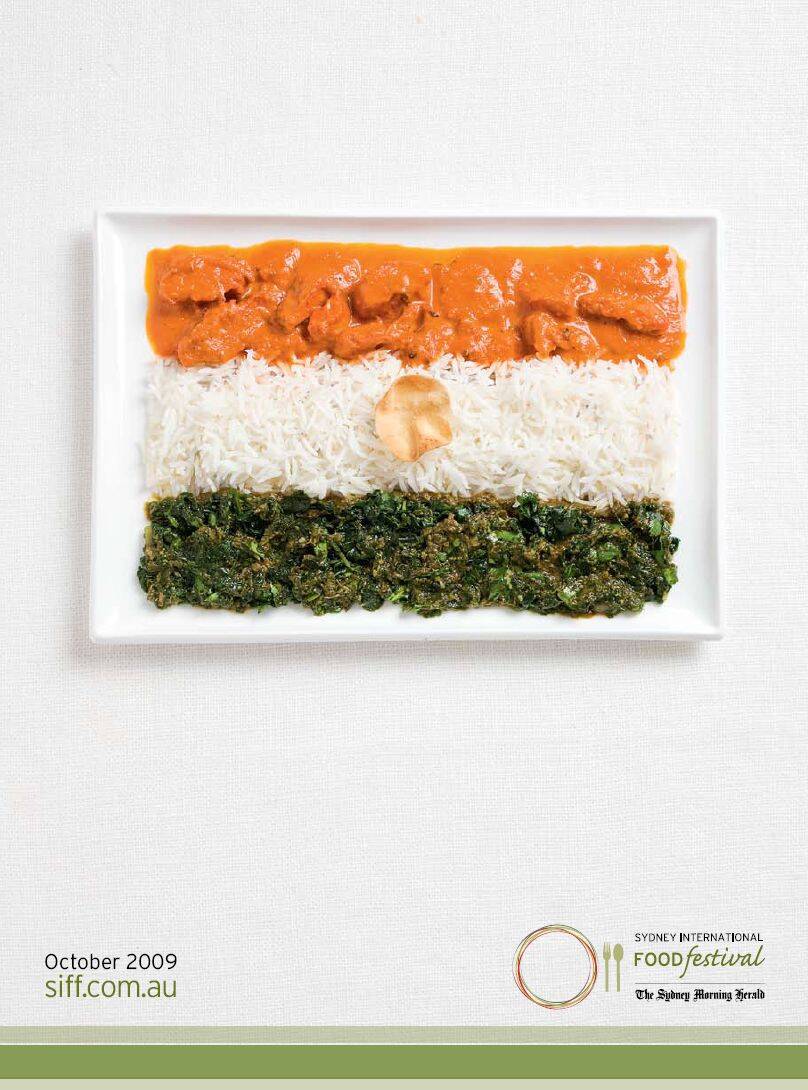
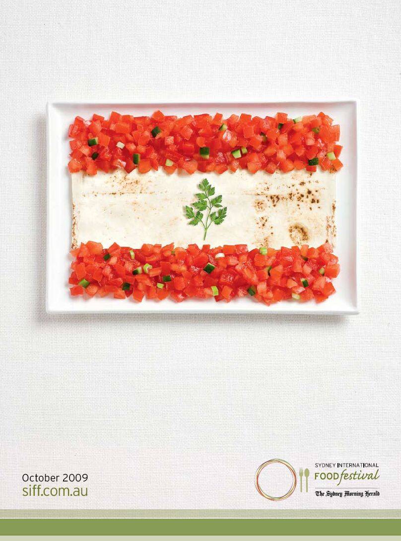
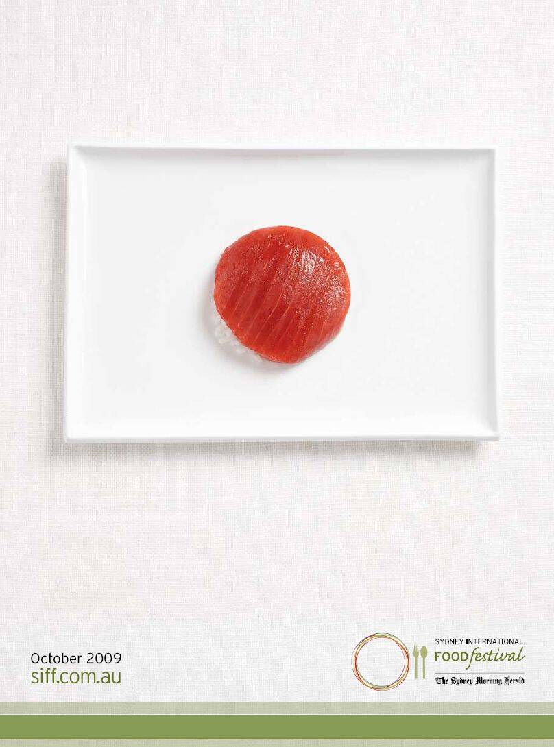
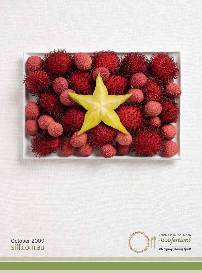
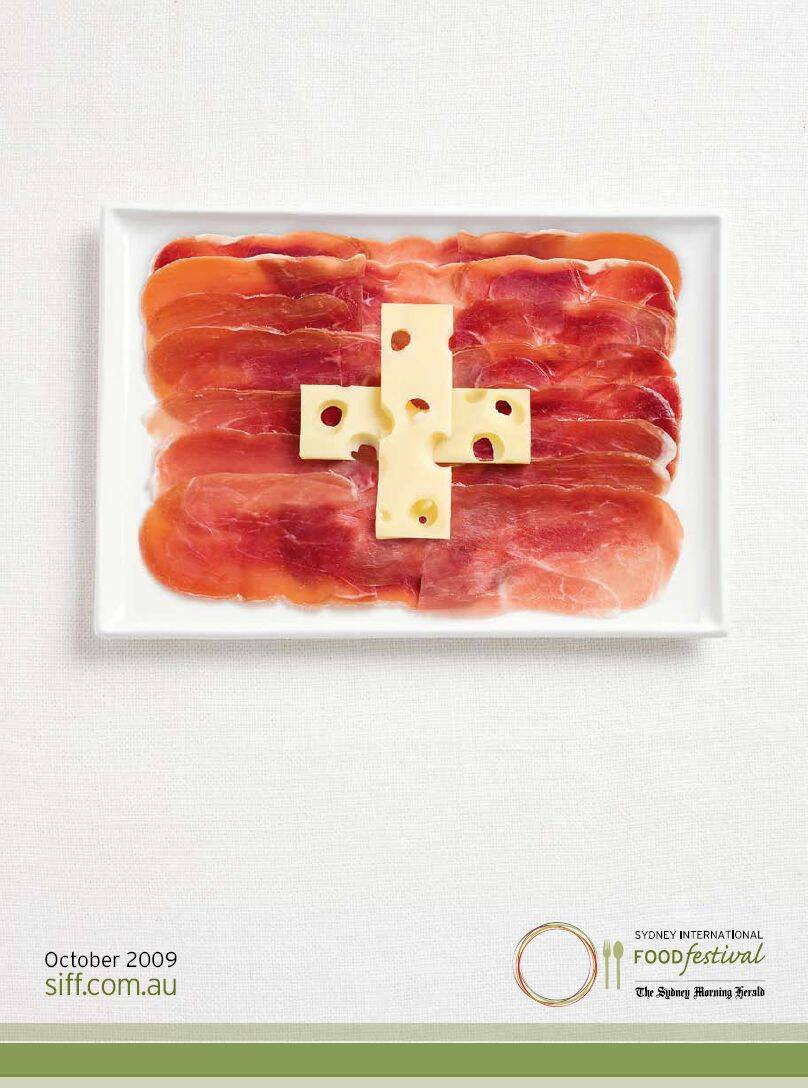
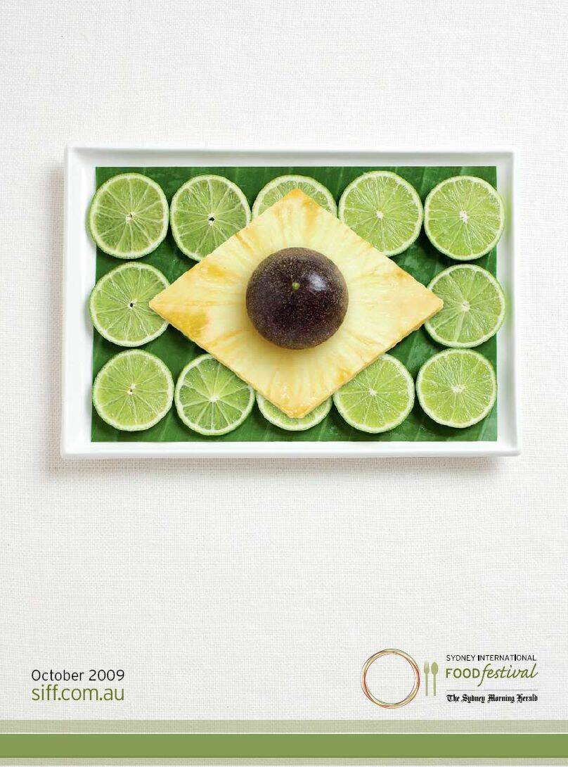
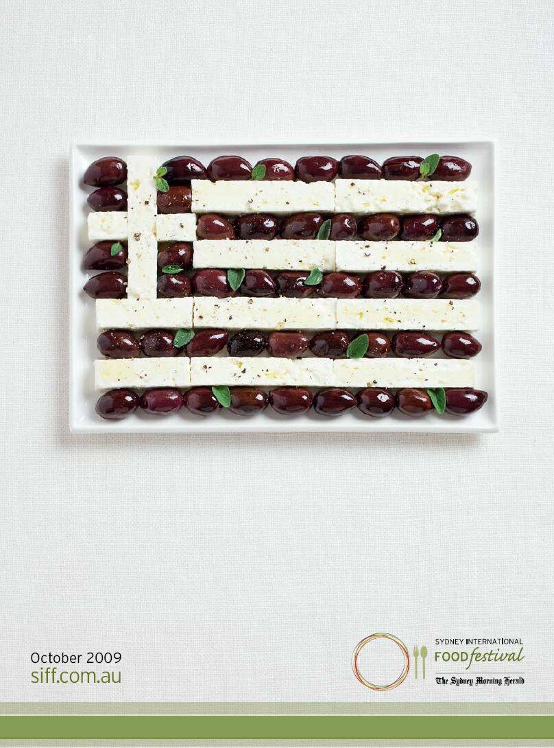
This professional campaign titled 'Flags, Brazil, Flags, Australia, Flags, France, Flags, It...' was published in Australia in September, 2009. It was created for the brand: Sydney International Food Festival, by ad agency: TBWA. This Print medium campaign is related to the Food industry and contains 12 media assets. It was submitted over 14 years ago.
Credits
Advertising Agency: WHYBIN/TBWA, Sydney, Australia
Executive Creative Director: Garry Horner
Creative Director: Matt Kemsley
Art Director: Miles Jeffreys
Copywriter: Tammy Keegan
Photographer: Natalie Boog
Retoucher: Nick Mueller
Food Stylist: Trish Heagerty