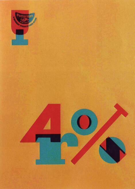
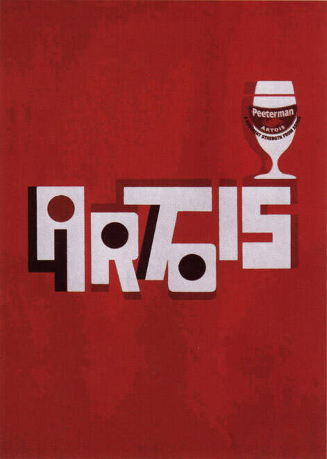
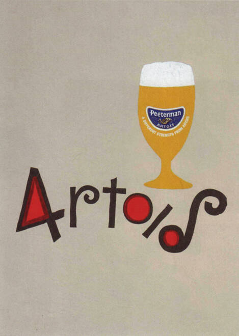
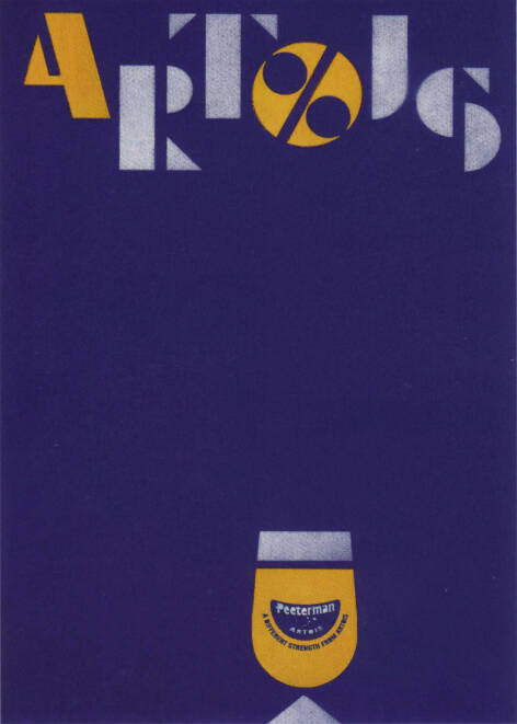
Stella Artois: Peeterman Artois, 4
Peeterman Artois. A different strength from Artois.
Advertising Agency: Lowe, London, UK
Executive Creative Director: Ed Morris
Art Directors: Carl Broadhurst, Simon Morris
Copywriters: Peter Reid, Patrick McClelland
Photographer: Laurence Haskell
Typographer: Dave Towers


8 Comments
I don't know what these are supposed to be but they don't make me thirsty.
I'm loving the old school style. Very eye-friendly.
agree, i think they are just trying to establish the look for that particular brand
"A different strength from Artois"? Do they mean "A different strength THAN Artois"? And even then, I don't really get it. Is it a stronger beer? They should just say that.
I think 4% is a weaker strength. In Canada this is weaker than a light beer, which are normally at least 4.5%. Generally here, most typical beer is 5% to 8%.
I think what threw me off is the punctuation. Maybe it should be "A different strength, from Artois." I thought they meant is was a beer that's different than Artois - not that it was a new beer brewed by the Artois company. I got it after reading your comment.
I'm not entirely sure this campaign makes sense, no matter how many times I look at it. :)
nice art direction. the idea, not so much.