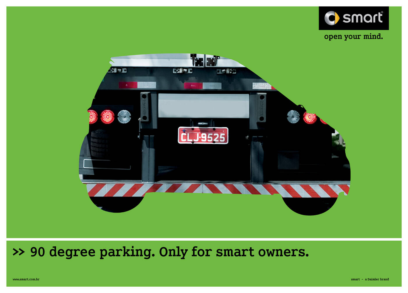
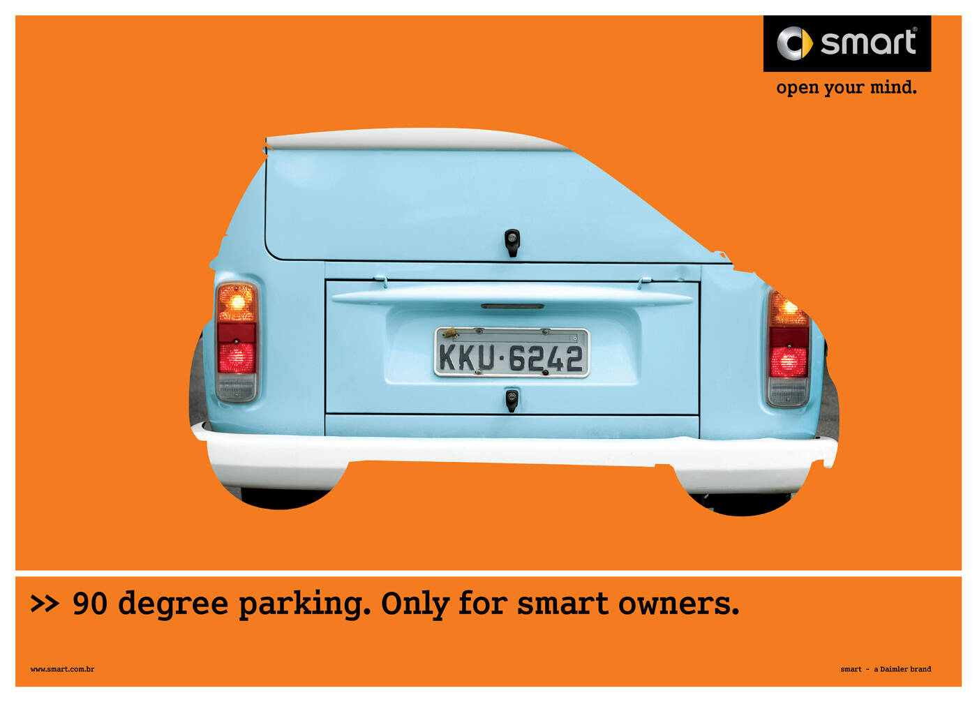
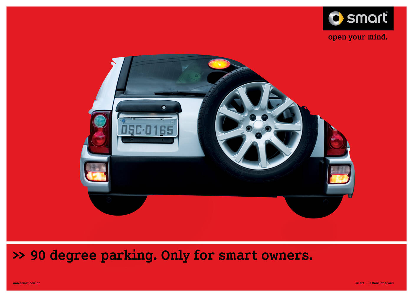
Ads of the World

Ads of the World™ an All Creative World site

Smart: 90 degress, 2

Smart: 90 degress, 2
Your rating: None Average: 7.5 (49 votes)

90 degree parking. Only for smart owners.
Smart. Open your mind.

Advertising Agency: Ponto de Criacao, Brazil
Creative Directors: Ana Paula Marques, Margit Junginger
Copywriter: Margit Junginger
Art Director: Nando Zenari
Photographer: Luis Moretti
Producer: Richard Denami
Art Buyer: Silvana Santos
Account V.P: Cristiano Corrêa
Advertiser's Supervisors: Dimitris Psillakis, Jefferson Ferrarez
Account Manager: Eliana Rocca
Planner: Juliana Nappo
Media Director: Lusia Nicolino
Project Manager: Francine Novo

9 Comments

Guest's picture
9

I love it. nice art direction. simple, modern.

TommyO's picture 1878 pencils

Nice visualization.

Blashyrkh's picture 21230 pencils

Only one ad is enough.

Jaap Grolleman's picture 6401 pencils

What is this 90 degree parking? -.^

bmeza88's picture 54 pencils

I don't understand the execution. I think I don't know what 90 degrees parking means. It means parking in reverse where all the cars park in parallel?

Ramezani's picture 313 pencils

i like

Guest's picture

so why does the smart allways compare with the good old VW Transporter and not with comparable cars?

gbl's picture 431 pencils

just amazing ads.

bzdesign's picture 2 pencils

The impeccable craftsmanship of this design conveys an idea of quality and sophistication.
By correctly using the principals and elements of design with its composition this ad becomes an excellent example of good design. The use of color, shape, space, line and balance and repetition is very professional. As a result the ad is fun and visually appealing to the consumer.
The complimentary color scheme used in this advertisement is very effective. When orange and light blue are compared in the same image it creates a sociable fiery hot combination. The color of orange really pops with a medium blue. Orange itself is mentally stimulating, it demands attention. Orange also can indicate transition or change. On the other hand, blue is a universal color, it conveys importance and confidence.
Shape is the fore-running element in this design project. The figure of the car is describing the car in one position buy showcasing its profile. This shape also indicates the position it is parked in. Yet the outline and license plate shown in
the inside of the shape conveys the idea that parallel parking a car this size is as easy as pulling directly into it from the front.
The amount of positive and negative space in this design is well balanced and draws the eyes to the message at hand. Buy pushing the wording off to the left of the bottom of the page the designer creates movement. Your eye is forced around the outline of the car and back down to the text. If the text were centered the effect would be different. The repetition of horizontal lines in the composition is also very thoughtful.

Ads of the World advertising archive and community showcases fresh creative campaigns daily from around the world. Read more

Do you need a great new logo?

If you need a logo for your company or product you can get it done with us.
In our logo store you can pick from over 28,000 pre-made logos that will be customized to your name for free or you can post a contest for us for just $250 and our designers from all over the world will submit dozens of logo design suggestions to your specific needs.