NSFW Warning
This page may contain elements which are considered Not Safe For Work.


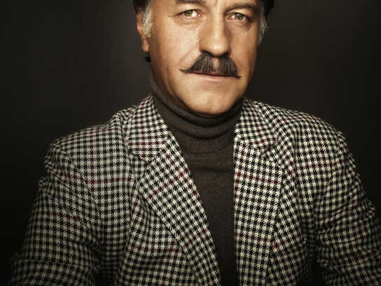
Description
Campaign for a fictional car hire company that claims to be cheaper and better than Sixt. But that simply doesn’t exist (“Gibsnisch”).
Landing-Page: http://www.gibsnisch.de
This NSFW professional campaign titled 'Gibsnisch' was published in Germany in June, 2008. It was created for the brand: Sixt, by ad agency: Jung von Matt. This Print medium campaign is related to the Professional Services industry and contains 3 media assets. It was submitted almost 18 years ago.
Credits
Advertising Agency: Jung von Matt/Elbe Werbeagentur GmbH, Germany
Creative Directors: Wolf Heumann, Timm Hanebeck, Matthias Rauschen, Bernd Kraemer
Art Directors: Martin Besl, Andreas Ruthemann, Sven Loskill
Copywriter: Peter Kirchhoff, Robert Ehlers
Graphic Designers: Vanessa Rabea Schrooten, Peggy Tsalikis, Felix Taubert, Leif Abraham
Photographer: Emir Haveric
Account Executives: Matthias Maurer, Janet Tischer
Production Company: Effekt Etage