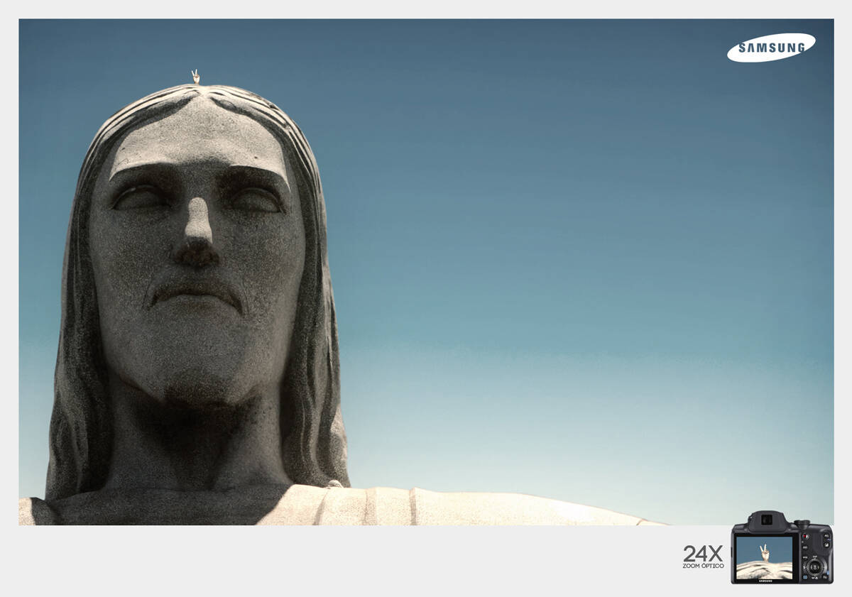
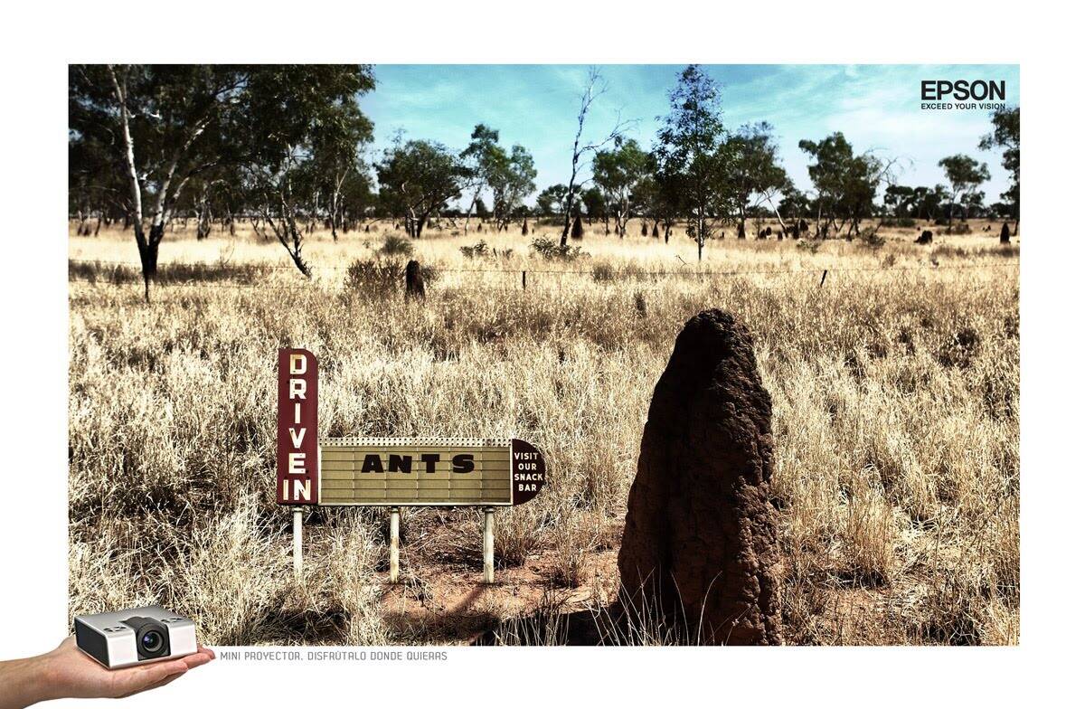
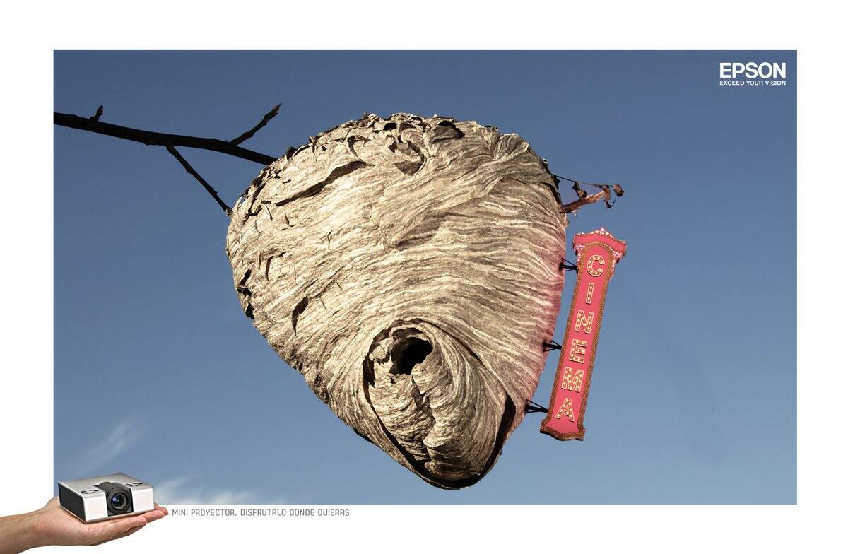
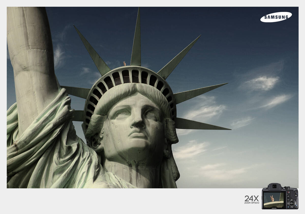
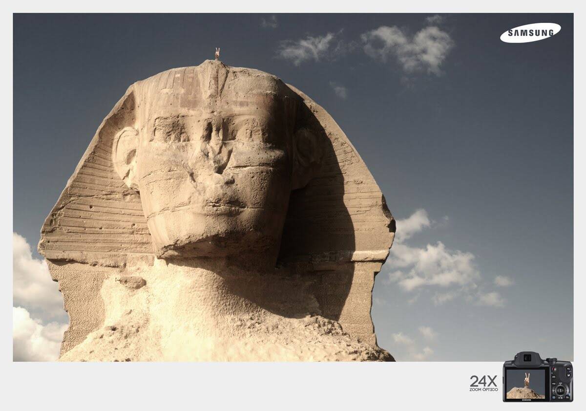
Samsung: Christ the Redeemer
Optical Zoom 24x
Advertising Agency: Excell Ogilvy, San Pedro Sula, Honduras
Creative Director: Carlos Escobedo
Creative / Art Director: Oliver Rodriguez
Copywriter: Q.ik Gúzman
Photographer: Caja de Luz
Published: July 2010


22 comments
Oh will this offend some people lol.
http://jackmancer.com/
http://twitter.com/jackmancer/
Great job.
I think it's a poor job. The hand itself still looks out of proportion (even with all the zooming in). It's very cute indeed, but still. What really bothers me, however, is its location; no tourist can be found where that hand is placed. It's just silly.
Yay. So now all ads are realistic?
Well, some wise man once said to me: you are over-thinking ads. Oh, wait! That was you!
Yep, that was me! If the hand was sticking out of, say, the Redeemer's mouth, I would have loved the ad!
Now that would be less creative I would say.
No! That would be not only a lot more creative, it would also be controversial.
Why? If tourists can actually get there (in the mouth), it would be just reality captured. Moreover, this gesture doesn't make any sense in the mouth...
atb2005, dude, hold on. Hold on.
You said the Statue of Liberty version wasn't cute, exact words, and then you said that this one, the same basic ad, is "very cute indeed".
You grill me on how the guy got up on top of the head of the Statue of Liberty, as if any logical breach is a buzzkill for you, then you suggest that the hand could come out of a stone statue's mouth instead. (!?)
And after displaying a pretty steady inconsistency of view-point about the creative of these ads, as illustrated above, you bash another user for seeming to be inconsistent in his reaction to the series. ("What do you mean you agree? From your posts for one of the other ads I get the feeling you love this campaign, Dzsoi.")
I don't care enough about this series one way or another to deploy a battalion to defend it, but the thing is, it's not going to take anything close to that. Just where is the rational consistency in your reaction to this series?
"Ubi hubave lubearned thubat ubanuby fubool cuban wrubite uba bubad ubad, bubut thubat ubit tubakes uba rubeal gubenubiubus tubo kubeep hubis hubands uboff uba gubood ubone."
-Lubeo Buburnubett
I was being sarcastic with the mouth, etc. Also, when I said "cute", I meant the hand itself, not the ad. "Deploy a battalion to defend". LOL You really crack me up at times with the way you write.. Dzsoi is a good friend (sort of) of mine on here. He knows I like him. He and I just banter.
Props to you. Sorry.
"Ubi hubave lubearned thubat ubanuby fubool cuban wrubite uba bubad ubad, bubut thubat ubit tubakes uba rubeal gubenubiubus tubo kubeep hubis hubands uboff uba gubood ubone."
-Lubeo Buburnubett
Whoever says it's bad either they are not creative or not professional.
its a nice idea, however, its exactly the same excecution for the 3 ads. It misses there.
GiBo
pretty funny campaign:)
http://www.behance.net/shortafella
poor idea
a CREATIVE drop
beautifully executed... love the idea.
ideas....30 minutes nahi toh free.
million time!!
Himanshu Prabhakar
Kind of funny - i think i like it!
graciós. res més.
Pau Marquès
(+34) 670 36 79 83
blogdepaumarques.blogspot.com
shouldn't the fingers be the other way around..... lol
should not see anything