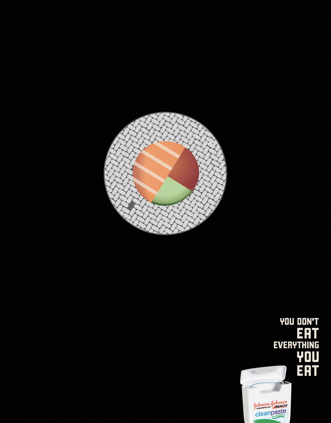
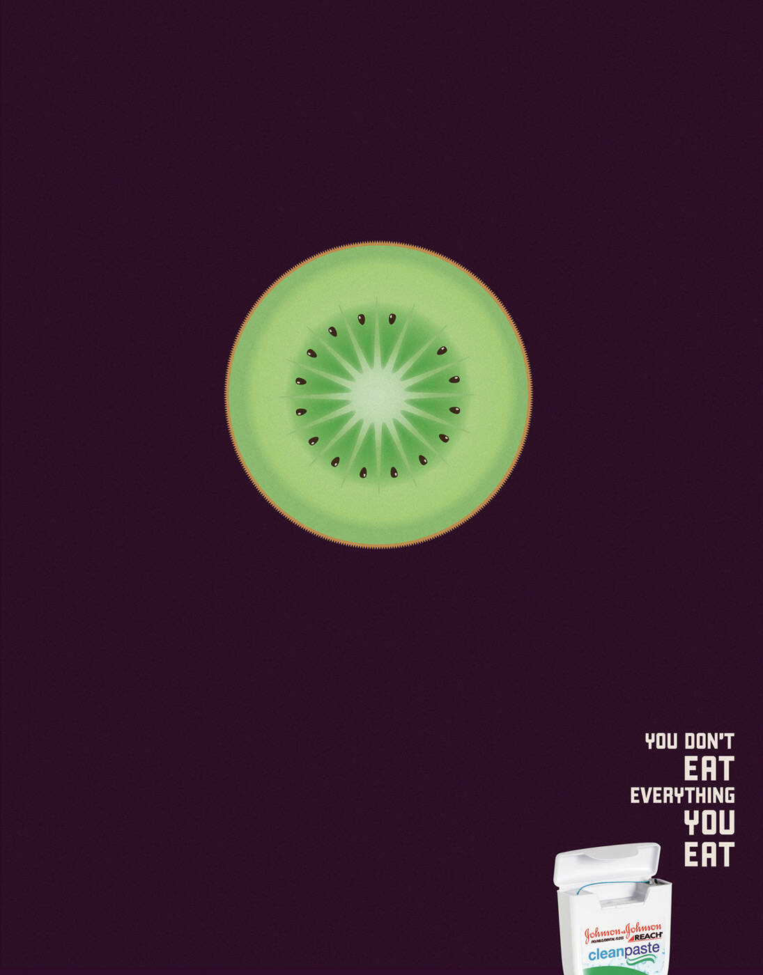
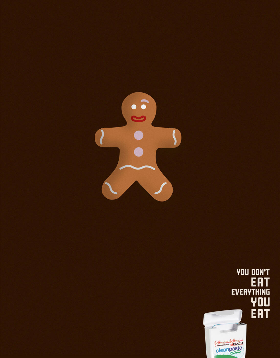
Ads of the World A Graphics.com site

Reach: Cookie

Reach: Cookie
Your rating: None Average: 6.5 (15 votes)

You don’t eat everything you eat.

Advertising Agency: JWT, Buenos Aires Argentina
Executive Creative Directors: Gonzalo Vecino, Pablo Álvarez Travieso
Creative Director: Diego Correa, Esteban García
Art Director / Illustrator: Juan Raimondi
Copywriter: Juan Besagni
Published: April 2009

Comments

Mandark's picture 281 pencils

it took me about 10 sec to discover the idea expressed by the headline. like the headline...the art..could have been better. and this is the best of the three. who's gonna stay and see that a seed from the kiwi is missing?

"U think it's perfect?! Press delete and start again!"

Domino's picture 39 pencils

sometimes people like to think and work it out for themselves, not just be told what the idea is.

Guest's picture

yes people like to work things out for themselves, but only when the idea turns out to be smart, not when it tries to be smart and fails.

Guest's picture

toooooo subtle guys, come on.

Guest's picture

I got it right away. But I think there are better things in this category.

Guest's picture

Come on guys, the idea is great, subtle and delicate, what did you expect? a fish without its tail????

And the illustration is pretty nice to me....

the_capywriter's picture 2895 pencils
3

once you see the product it's very clear. But the main thing of this ad is the headline. There's no real idea behind the visuals, you could make thousands of ads like these.
I just don't think the headline is stunning enough to make it a great series of ads, just based on that line.

- adsactly! -

sebato's picture 170 pencils

me parece genial!

Guest's picture
10

excellent!!!!!!!

Guest's picture

i like the idea and the art direction . they r very logic and simple .. no more too much spiced up ADs

Guest's picture
10

Powerful idea and art execution. It's a perfect example of a less is more campaign!

Guest's picture

The idea is very clear just because the product its INSIDE of it. This would not make sense for other products. Brilliant.

djvm98's picture 233 pencils

not really astonishing campaign, actually this third is the best rounded one, but meets pretty good the objective of attract you attention and make you to think for a moment about the meaning... that´s what´s missing in most of the ads nowadays! to make you think, reflect... to get the message

no matter if you have to think too long to get it, like in the first two ads, means message kept too cryptic...

Guest's picture

great line! good idea

BRANDS ADS's picture 8 pencils

SIMPLEMETE MINIMALISTA Y VENDEDOR

Post new comment

We highly appreciate your comments. When commenting please acknowledge the following guidelines: Be respectful and helpful. Do not spam or link drop. Please note that guest comments do not appear immediately.

 
  • Allowed HTML tags: <a> <em> <strong> <cite> <code> <ul> <ol> <li> <dl> <dt> <dd> <blockquote> <img>
  • Lines and paragraphs break automatically.
  • Web page addresses and e-mail addresses turn into links automatically.

More information about formatting options

Ads of the World is an advertising archive and community. The archive showcases campaigns from around the world categorized and updated daily. In the forum you can discuss your professional life and post your work for critique. The blog features advertising stories. Read more

On Demand Videos


On Demand Videos: Video tutorials for advertising pros and designers providing tools and information you can trust — and use — on your very next project. Subscribe today!