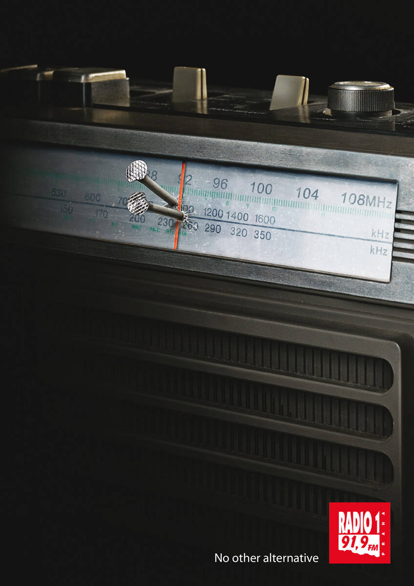
Radio 1: Nails
No other alternative.
RADIO 1 is the first independent privately owned radio station broadcasting in the Czech Republic. During many years of existence RADIO 1 has become an important cultural phenomenon. By not being afraid of being different and by exposing a whole new generation of artists (painters, authors, musicians etc.). Especially today it is the only „listenable“ radio for many of the Czechs.
Advertising Agency: Saatchi&Saatchi, Prague, Czech Republic
Creative Director: Jakub Hanzlicek
Graphic Designer: Michaela Maskova
Copywriters: Lukas Hvozdecky, David Podhola
Photographer: Jan Rambousek
Published: October 2009


Comments
no other alternative to get audience?
ooooooooooooooooooooooooooooooooooooooooooooooooooooooo !
Amazing/ Fantastic/ Brilliant/ Powerful/ impossible !!!!!!!!!!!!!!!!!!!!!!!!
i love it so much ! this is one of the best ads i EVER seen !
impossible is nothing !
is this your ad or are you being sarcastic?
come on...
ooooooooooooooooooooooooooooooooooooooooooooooooooooooo !
Amazing/ Fantastic/ Brilliant/ Powerful/ impossible !!!!!!!!!!!!!!!!!!!!!!!!
i love it so much ! this is one of the best ads i EVER seen !
impossible is nothing !
What do you drink ? Is really strong !
The ad is ok. Not amazing
I once had a similar idea for a radio station, but instead of nails, I just removed the radio tuner.
WOW!!!!!!!!!!
| Everartz |
Art direction and old school death metal.
www.everartz.blogspot.com | myspace.com/inkill
Cool idea
Alexander Bickov Personal portfolio | Twitter | Facebook | Blog
idea: good
photoshop: terrible
mmm....like the idea but the method..it's old... the copy is bad bad bad...
bad photoshop
nice & simple
Very good idea. But nails are not looking good, maybe it's too bright.
Good idea. But nails are not looking good, maybe it's to bright.
very goooooood
That radio looks 30 years old. Is it a classic rock station?
wonderful.............
For Czech Republic is not that bad.
***
http://ad-genius.blogspot.com/
Advertiser who won 10 or more lions in the last 10 years.
And I am not the real Juan Cabral, guys. So sorry for that!
too fucking good!!
Isn't it just 'No alternative'?
Two problems here: 1. You shouldn't use 'retro' radios for modern radio stations - it's just not cool anymore. 2. You don't need the copy line, just the logo. Obviously the ad only works if you use an old-fashioned dial, but like I said, you shouldn't do that to begin with. Trust me.
Es la misma idea de uno de mis primeros trabajos en la Universidad. Tenía 18 años.
Osea... amateur.
oh my god, in that country the people stills use this kind of radios
juan cabral....u r far too regional...everywhere...u r no good either
"no other alternative" is kind of redundant. actually you don´t need that explanation at all
right on...
Nice, the red indicator seems alive..
idea is ok copy could have been improved
-------------------------------------------------------------------
~ Quite obviously, I have gathered no moss ! ~
it looks like an dictatorship to me.
Yeah. Would be a great cuban radio ad.
PORTUGUÊS: http://augustocorreia.carbonmade.com I ENGLISH: http://augustoinenglish.carbonmade.com
Post new comment