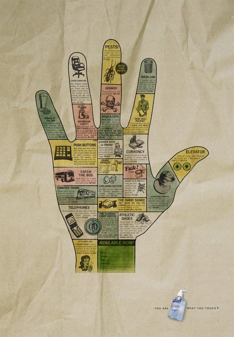
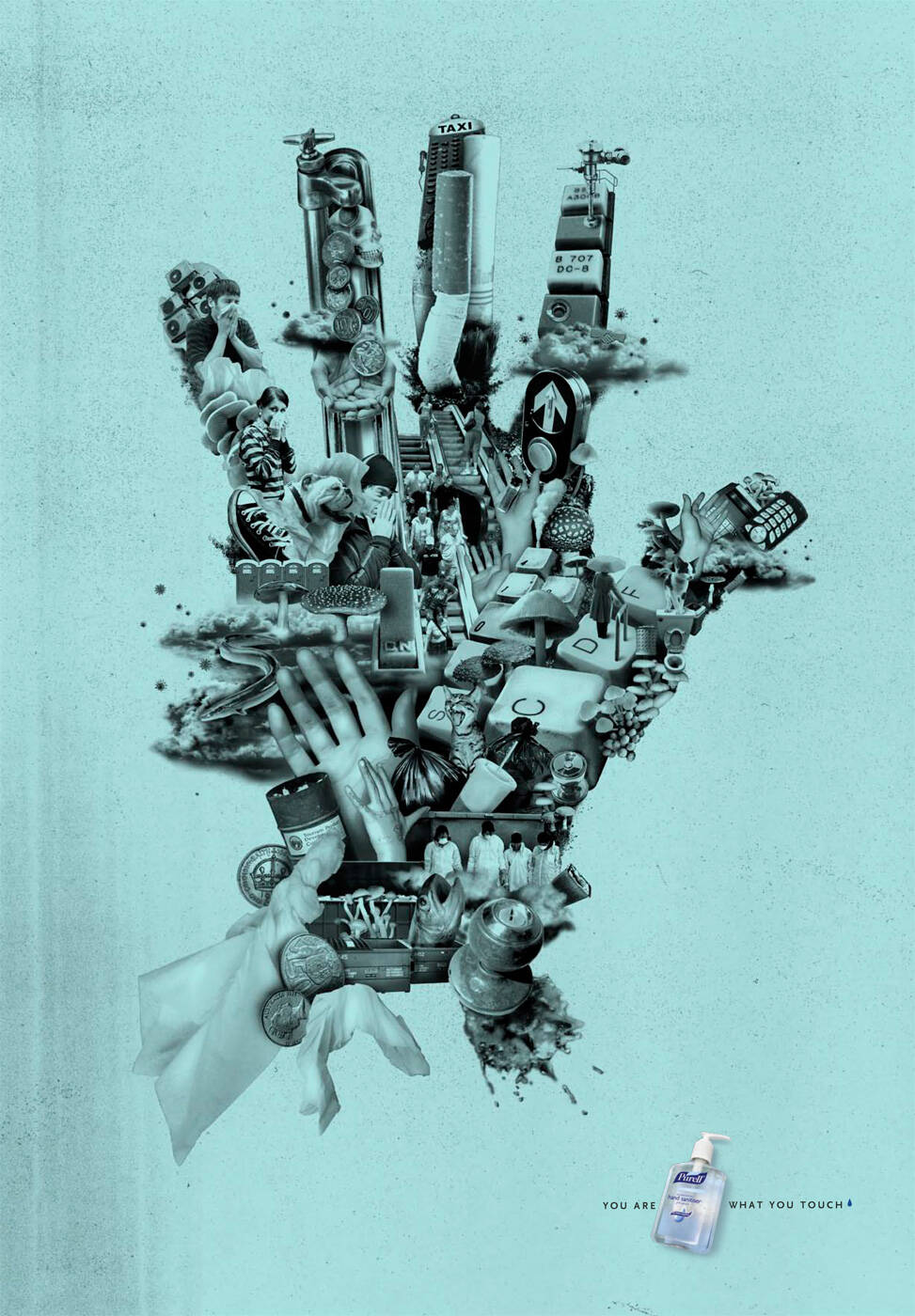
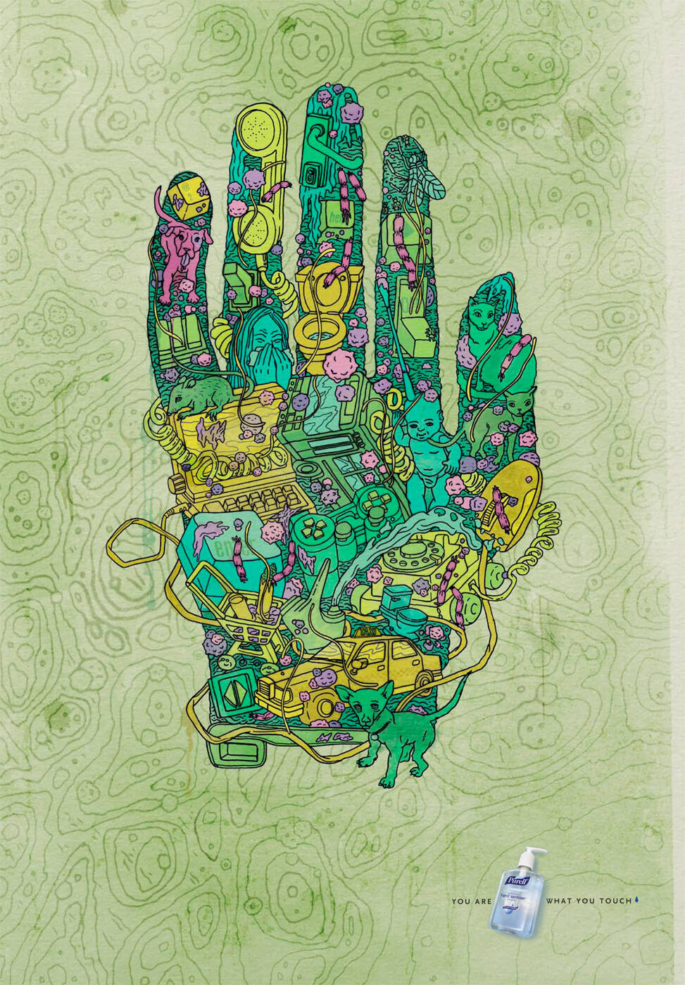
Ads of the World is an advertising archive and community. The archive showcases campaigns from around the world categorized and updated daily. In the forum you can discuss your professional life and post your work for critique. The blog features advertising stories. Read more
On Demand Videos
On Demand Videos: Video tutorials for advertising pros and designers providing tools and information you can trust — and use — on your very next project. Subscribe today!


Comments
These are fantastic, bravo to the art team.
(The old fifty-cent coin is a nice touch.)
compliments.
http://adsoftheworld.com/media/print/dettol_instant_hand_sanitizer_man
Ok, that's a shame but these are much more interesting.
yes youre right.
but this year in cannes i saw the same concept.
but i couldn´t finde the url.
Kinda same idea but this artwork is waaaaaaaaaay better!
The one linked looks like a rough draft compared to these. This one is much more emphatic (and successful) with getting the message out there.
a good example of the difference good art direction can make. this one draws me in, the older one is repulsive and badly photoshopped.
idea is a bit obvious, which I would say is the reason it's has been done more than once.
soopah cool.
Nice work! very nice, I like.
But im not sure about the line "you are what you touch"
Agreed. This text structure (you are what you ______ ) is far beyond overdone.
PORTUGUÊS: http://augustocorreia.carbonmade.com I ENGLISH: http://augustoinenglish.carbonmade.com
I'm not a visual-solution-for-all guy, but I don't know if it needs a line at all. It's doesn't add anything to this idea. Yes, it's been done. Rather closely, but there's no sense in not making an idea stronger, which I think these do. Plus,I doubt the team was like hey let's take that idea. It's works both ways. Smarter/quicker read is open to opinion.
great!!!
http://dgdico.com.ar/
Great art direction. These are really nice... has a Dali feel to them... Another example of how illustration is coming back big time.
Dooooooone...but this is a little better.
http://javoramirez.wordpress.com/
this one rocks.
Very good Art direction! (hours to work)... but, the copy (seconds to work)
Dude, the copy says it all. Its perfect.
:::MARK3R:::
Great art work
http://doodlewack.blogspot.com/
Está clarísimo. Me gusta!
great art, but theres a cannes winner with same idea and better execution.
no new idea..but excellent execution
Nice direction.
Good Idea ... well executed
brilliant.
same like you are what you eat!
Post new comment