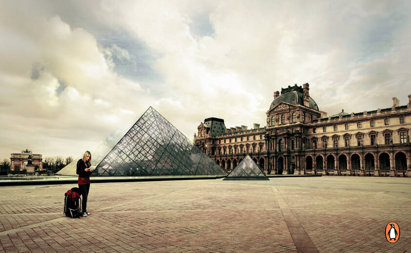
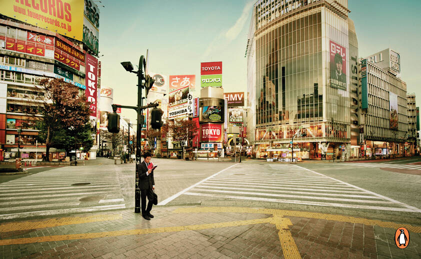
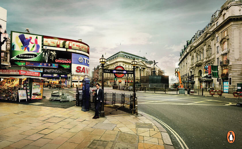
Ads of the World advertising archive and community showcases fresh creative campaigns daily from around the world. Read more
If you need a logo for your company or product you can get it done with us.
In our logo store you can pick from over 28,000 pre-made logos that will be customized to your name for free or you can post a contest for us for just $250 and our designers from all over the world will submit dozens of logo design suggestions to your specific needs.
17 Comments
some copy would be better in my opinion
=== Looking for concept/art creative to form a team to work in independent advertising projects. ===
Alexandre Brito
Personal Page | Blog | Vlog:Video | Plog:Print | Twitter | Facebook
Yeah bit lost without copy. Its like you're waiting for the pay off line
The others from this serie do need a pay off line.
But this one doesn't... very, very strong! The visual is amazing and is the message itself. Peace and silence.
What you see here is that famous crossing in Tokyo where hunderds of people cross the steert at any given time. But this time there is not a soul in sight, awesome!
No copy needed!
of course – NO COPY here. It's great; both – insight and execution.
http://www.mixcloud.com/miko1aj/
this ad is ambiguous in meaning...copy definitely required
Copy would have made it a lot better.
CG
At least something.. I don't know what's he reading, I don't recognize the logo or brand. Therefore I don't get the point. Besides, the silence... A web address would fit great with the logo.
not original
you don´t need a copy to understand that when you read there´s nobody out there, there´s no noice.
and the copy is the book itself
can someone tell me what Penguin Tokyo means? i thought this ad is selling Toyota or Tower Records...?nope?
archiwan, you're missing the point, mate. the figure is the key component of the picture. That, and the empty streets. i think it's pretty clear
in my opinion, however, the idea's pretty trite. yeah yeah, on books & escapes... blah blah blah
i like the manipulation work on the photo, but it's kind of the same thing with different backgrounds. you see one, you'v e seen them all... besides, all three people are standing. why? i don't see a reason why the girl with the backpack is not sitting on a curb or something. or one of the guys on a bench/steps. i guess the idea is that those books are so magnetic and enchanting, that they just stop mid-stride. only, they're not walking and that's obviously not the idea. ok, maybe this one looks like he's almost walking, a bit of a stiffer but for the sake of argument, i can accept that. howeva, the other two fellas are pretty static.
to me these people kinda look like they're waiting for a friend and since they're mighty bored, they opened a book. 20 seconds later the friend comes and they return to their more interesting lives.
i like those, but there's nothing exceptional about them.
In the quiet words of the Virgin Mary... Come again?
I agree.. If they were in the chair or something.. that would have been much better. I hate that they are standing. maybe even laying on the street would be enough..
i think it needs a good copy because there are so many steps to get the idea
mrckais
No need for a copy!!!! Do you know what penguin is?
Blog | Twitter
Escape into a book. Really nice, no need for copy at all.
Name: Erind Mati
Ocupation: graphical designer
Agency: B1 Advertising