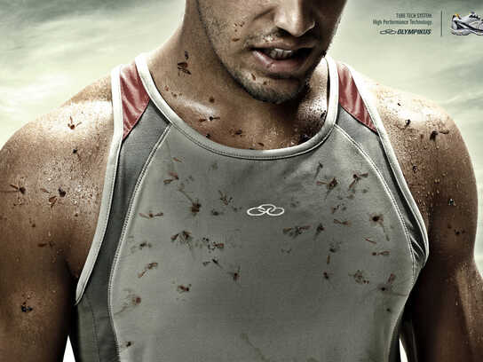
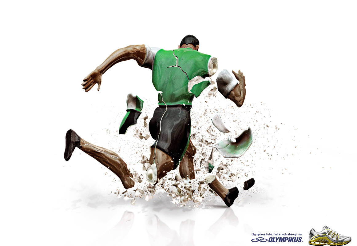
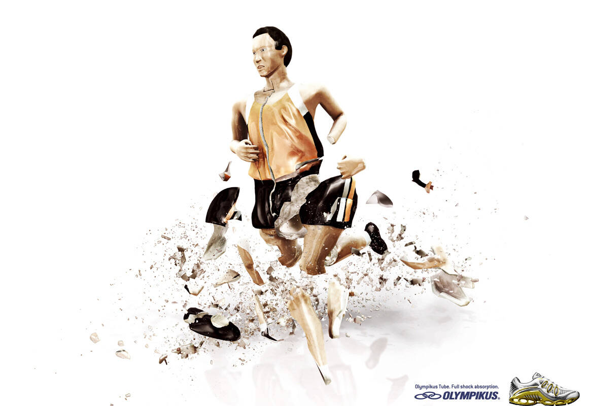
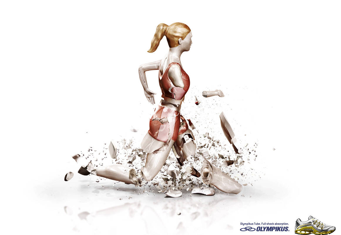
Olympikus: Runner 3

Olympikus: Runner 3

Olympikus Tube. Full Shock Absorption.

Advertising Agency: DCS, Porto Alegre, Brazil
Creative Directors: Roberto Callage, Regis Montagna
Art Director: Rafael Bohrer
Copywriter: Tiago Mattos
Illustrator: Casulo
Photographer: Claudio Menghetti
Published: February 2008

Your rating: None Average: 4 (13 votes)

Comments

Hmmmm........ graphics being the same,they are still different.
More appropriate to the previous category.
-----
http://indianadsblog.blogspot.com/
Indian Ads Update

onde esta a criatividade?
¿donde esta la creatividad?
Where are the creativity?

http://www.martin-klimas.de/

Please stop, four times the same comment!

jjad,

It´s OBVIOUS that both campaigns were based on Klimas' work.

The question is: why it´s not creative? Besides God, nobody has been created nothing in our History. We are all just reorganizing the same information in a different way.

This is not the first, and no longer will be the last case ART is souce for advertising. Just two exemples: remember Honda GRRRR and COG? Both Cannes' Grand Prix? Both had inspiration on art.

But the subject here is not that. It´s the coincidence between Loctite and Olympikus campaigns.

It´s interesting to see how the same graphic solution can be used to two completely needs.

I believe Olympikus is more effective, once the relation between the product and the artist word is not so obvious. But everybody is allowed to disagree.

MonsieurD.'s picture

I agree, only we have to try "taking" the inspiration, after that, is about transformation. I see these campaigns exactly the same. If I change their logo it'd work.

The Honda GRRRR GP Cannes, besides to have a good art, has a concept too.
Sorry but i disagree with you with that, sorry.

AlmapBBDO has done a much better campaign for the same attibute of Mizuno.

PORTUGUÊS: http://augustocorreia.carbonmade.com I ENGLISH: http://augustoinenglish.carbonmade.com

Hohum.......zzzzzzzzzzzzzz.

Almakos's picture

even though idea is stolen, but this particular pic is nice

------------------------------------
240x320 animated gifs http://i-portable.blogspot.com

Forced, obviously to incorporate the art direction. The concept is backwards!

Someone should have spent the money and had real people shattering. It would have worked much better in my opinion.
--
brandon

www.brandonknowlden.com

Rewind. Loctite Supeglue.

Post new comment

The content of this field is kept private and will not be shown publicly.
  • Allowed HTML tags: <a> <em> <strong> <cite> <code> <ul> <ol> <li> <dl> <dt> <dd> <blockquote> <img>
  • Lines and paragraphs break automatically.
  • Web page addresses and e-mail addresses turn into links automatically.

More information about formatting options