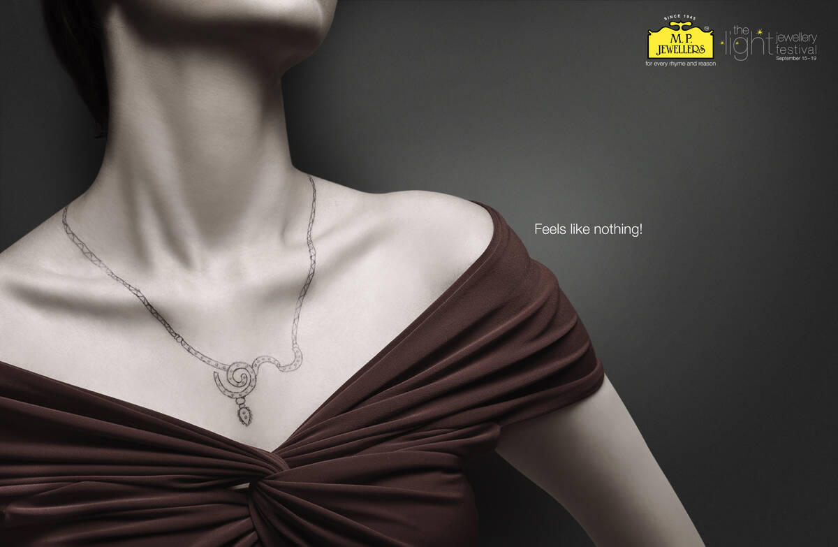
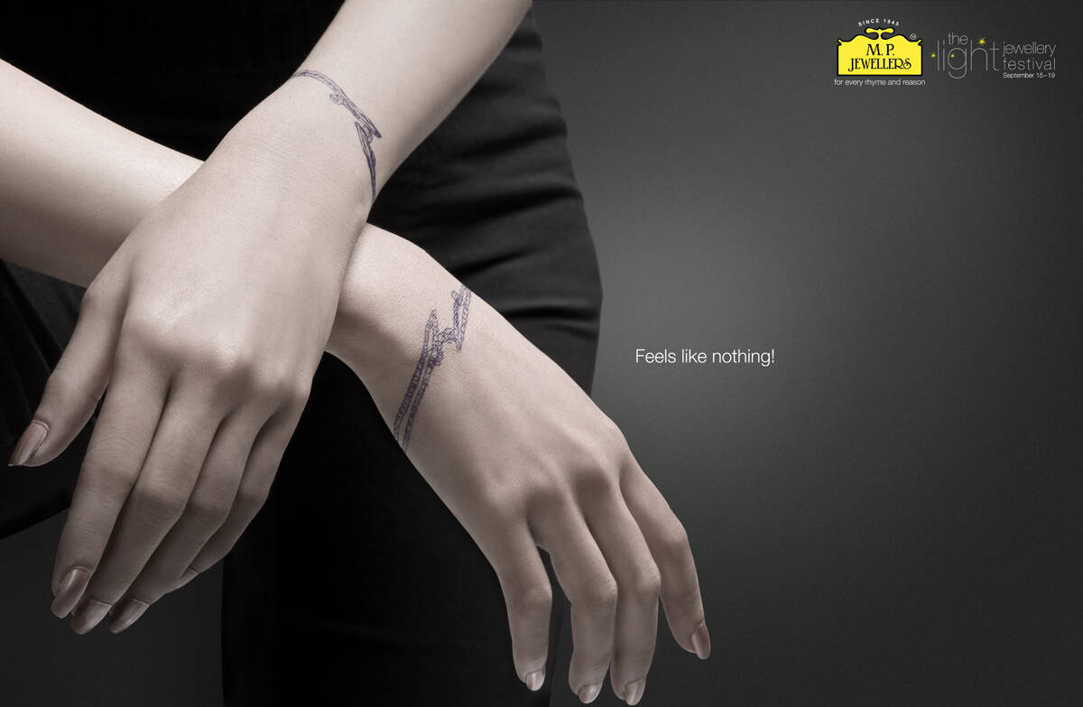
M.P. Jewellers: Hands
Feels Like Nothing!
Advertising Agency: Ogilvy & Mather, Kolkata, India
Creative Director: Sumanto Chattopadhyay
Associate Creative Directors: Sukhendu Mukherjee, Koustuv Chatterjee
Art Directors: Altaf Hossain, Partha Chowdhury
Copywriters: Alka Adhikari, Uttaran Chaudhuri
Photographer: Sanjib Ghosh
Published: September 2009


36 comments
That's a benefit?
+++
"I love some things, and don't love some other things."
SIRVAN
Oh my god!!! you have 12529 pencils!!!
DO YOU HAVE JOB???
DO YOU HAVE LIFE???
DO YOU HAVE FAMILY???
Keep trying, and you can catch up :)
Nice attitude, btw.
+++
"I love some things, and don't love some other things."
Done
do not always blame him. Considering today's gold price 'feeling nothing' is better!!
withalltherespects
Don't think we need a line.
e e no no it looks like marks after being kidnapped and tortured
yeah, thought so too!
what'sthat copy saying? so stupid........
looks more like stigmata.. :(
looks like stigmata to me..
www.wordsofbabel.blogspot.com
smaller the logo please.
Doesn't look like a bracelet at all.
---------
"Nihil sub sole novum"
feels like nothing..to me. better be using gold paint or silver paint rather than just a pen.
rehpani.. i'm wondering the same.
life is a playground
blah!
The sudden cessation of stupidity- Advertising.
so.......
the art is fabulous. mindblowingly good!
the concept sucks, tho'.
they showed me a picture & i laughed
dignity has never been photographed
B O R E D
(2 stars for a "correct" execution)
If a jewel feels like nothing than it is nothing
Fantastical artwork....a nice copy..n we have a delighting work. Afterall its Ogilvy!
Jewelry should above all be beautiful, which is not telegraphed in this ad. Quite the opposite actually.
This approach does not inspire me to buy jewelry.
The concept is good.But the bracelet should have been more catchy.
shack
gud, but if the jewe iz in gold or silver :)
Muneer Bhatti
muneerbhatti@msn.com
0300 2947 023
i\how will i buy jwelry?
I don't think not feeling the jewellery is a good thing. but is a good art direction.
why?
- dude, what is lighter then air but on your hand or other bodu part?
- emm, my TATTOOS!!!
- dude, you are genius, WIN!
--
tattoos have many side meanings, this looks more like barb wire
_____________________________________________________________
Creativity!
freakart.lv | Twitter
Agree with thedesignaddict. If this ad is for jewelry, then the highlight should be for bracelets. Nice hands anyway
i find this creepy, the tattoo looks more like barbed wire or some kind of torture device!
some thing wrong in the copy...
I agree both the art direction and copy need help. Possibly a lot of help.
www.mandyjunestinson.com | ninjabread.wordpress.com | wordjones
Perhaps underwear should "feel like nothing" but I would venture you'd want your jewelry to feel like something.
and is me? or does her fingers look swollen, perhaps she reacting to the ink
Before I clicked through to the bigger version, my first reaction was..... it's another wrist-cutter Ad.
www.jpmountford.com
true no need of copy, nice work
bvital
http://be.net/javednz
i like the concept even the copy but the way the art has been done is not compelling
i want my jewelery to feel like everything.. not nothing..
Considering today's woman, especially the young ones hanging around with itsy-bitsy clothings, and itsy-bitsy touch-me-not attitude, the design shown is quite light and should invoke curiosity for its 'lightness'.