Piano, Laptop, Camera
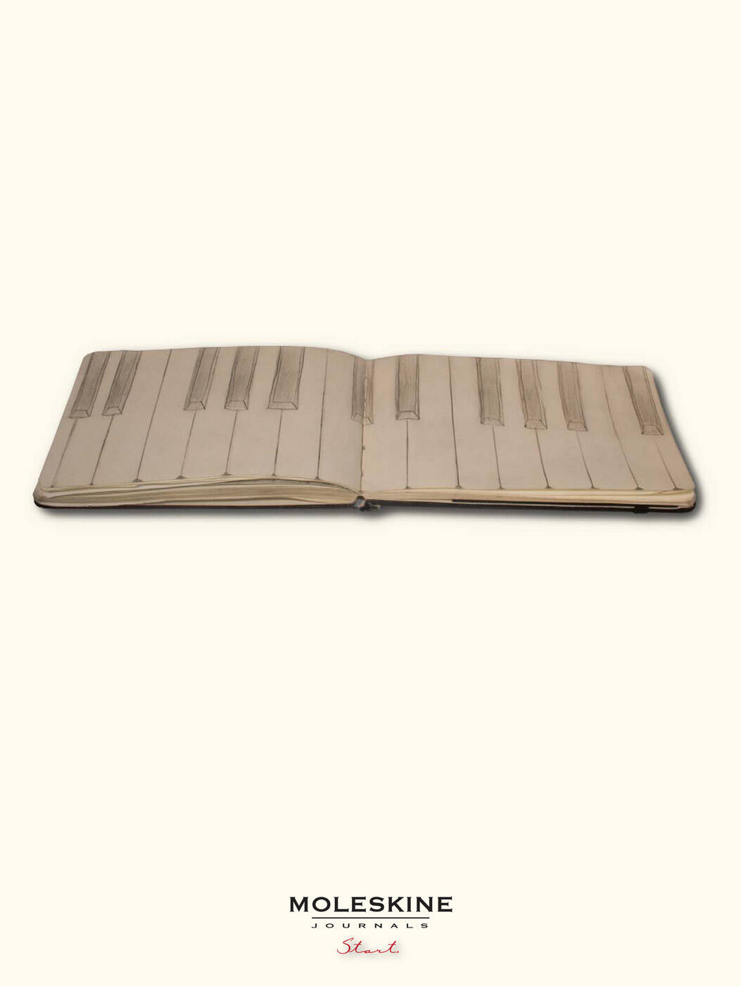
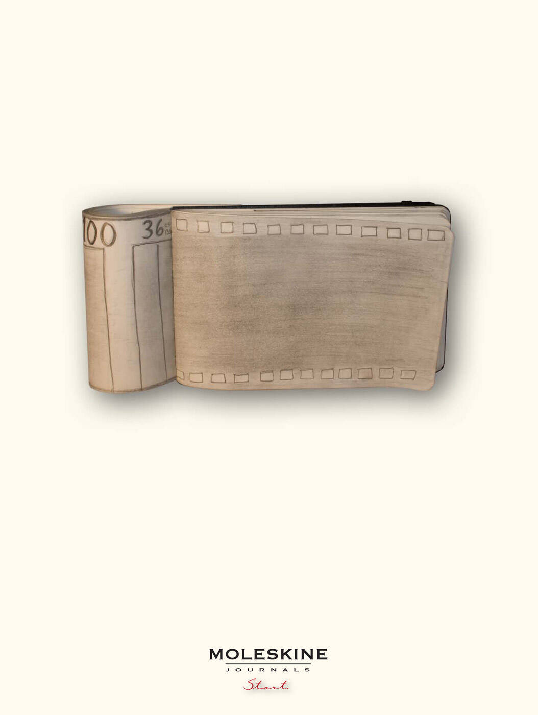
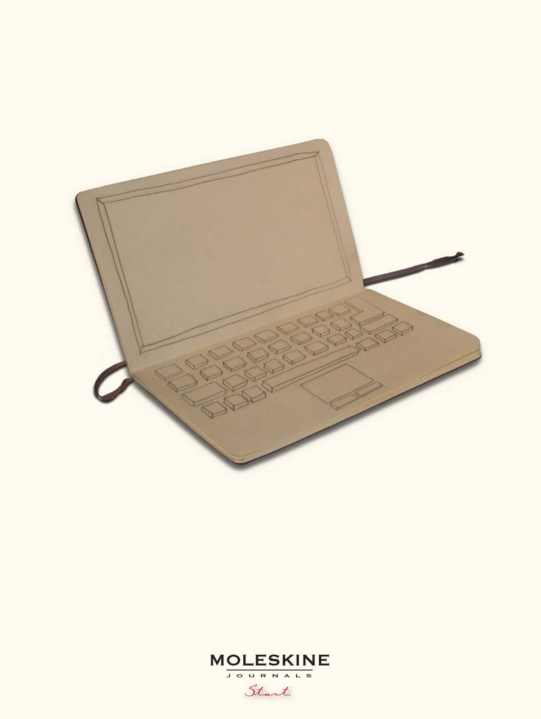
This professional campaign titled 'Piano, Laptop, Camera' was published on June 16, 2009. It was created for the brand: Moleskine, . This Print medium campaign is related to the Personal Accessories industry and contains 3 media assets. It was submitted about 17 years ago.
Credits
Art Director: Nick Wilde
Copywriter: Harry Truong