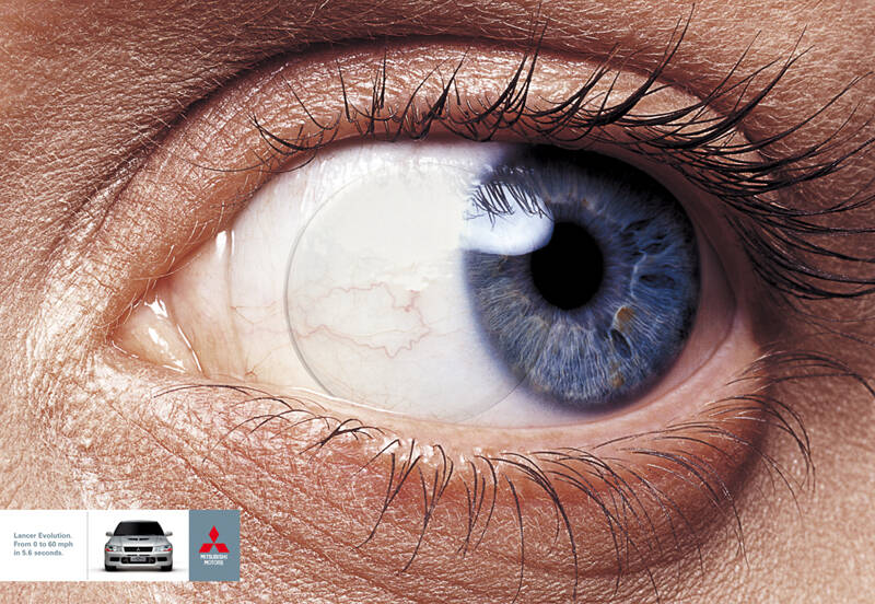
Submitted by Guest (not verified) on Sun, 2006-06-25 05:43.
I have a few comments however I do not want them to be mistaken for condescension or negativity. It is just a critique on what I think about what I see, Humbly.
First of all, I like the concept. ‘Going so fast it leaves your contacts behind’. Great. Love that beautiful blue Eye.
The make-up around the eye is smudgy; it just needs a bit of work. More importantly the blood shot eye should be air brushed; it is distracting, and unnecessary.
Looking at the Contact you will see an unwanted reflection in the top right.
Speaking of the reflection, I think a great way to incorporate the logo would be to show it as a very small reflection in the contact, slightly blurred on the left side to show fast movement.
I’ve read many comments on many ads similar to this > “the logo n car spoil it”.
Especially concerning the auto industry I find this a bit confusing. Conceptual Art is incredible, it is creative and eye catching, it requires talent and an open mind. And it sells. If the Product has no room in the ad then it really isn’t an ad is it?
Awards and Accolades are serious and excellent. It’s very rewarding to be recognized. However isn’t it supposed to be in the periphery?
If the Car and Logo or copy do not make it in the final cut. How does the Consumer know what they are seeing other than interesting Art.
Especially for Automobile Manufacturers, They get high blood pressure when a campaign wants to leave a photo of the Auto out, because the competition is so fierce that a Carmaker may only have One (1) opportunity to attract the consumer.
Consumers will tell you they buy for Reliability or utility, service maybe re-sale value. The fact is the highest percentage of buyers (not all, but most) buy because of how the Auto looks. How will they look driving it?
This is why the manufacturers want their Cars in the advertising. You See, You Like, You Buy, doesn’t REALLY matter if the Car takes 5.6 seconds or 6.4 seconds to get to 60 mph. (this is not an absolute but for the most part.)
Anyway I was going to say that’s my two cents, but I think it’s more like twenty five. Thanks for your patients.
Ivan, I am curious to know if this is Student work? I like it other than the need for a few improvements.
In my humble opinion.
Well hi Ivan.. i think putting the logo in there is crucial.. and well the presence of the car is vital! but this ad could have put the logo in a better way right? it doesn't merge with the picture
Comments
very nice
the logo n car spoil it i think .. perhaps a border with the copy far away
gr8 work
Super !
Karthik M.
> karthikm.gd@gmail.com
I have a few comments however I do not want them to be mistaken for condescension or negativity. It is just a critique on what I think about what I see, Humbly.
First of all, I like the concept. ‘Going so fast it leaves your contacts behind’. Great. Love that beautiful blue Eye.
The make-up around the eye is smudgy; it just needs a bit of work. More importantly the blood shot eye should be air brushed; it is distracting, and unnecessary.
Looking at the Contact you will see an unwanted reflection in the top right.
Speaking of the reflection, I think a great way to incorporate the logo would be to show it as a very small reflection in the contact, slightly blurred on the left side to show fast movement.
I’ve read many comments on many ads similar to this > “the logo n car spoil it”.
Especially concerning the auto industry I find this a bit confusing. Conceptual Art is incredible, it is creative and eye catching, it requires talent and an open mind. And it sells. If the Product has no room in the ad then it really isn’t an ad is it?
Awards and Accolades are serious and excellent. It’s very rewarding to be recognized. However isn’t it supposed to be in the periphery?
If the Car and Logo or copy do not make it in the final cut. How does the Consumer know what they are seeing other than interesting Art.
Especially for Automobile Manufacturers, They get high blood pressure when a campaign wants to leave a photo of the Auto out, because the competition is so fierce that a Carmaker may only have One (1) opportunity to attract the consumer.
Consumers will tell you they buy for Reliability or utility, service maybe re-sale value. The fact is the highest percentage of buyers (not all, but most) buy because of how the Auto looks. How will they look driving it?
This is why the manufacturers want their Cars in the advertising. You See, You Like, You Buy, doesn’t REALLY matter if the Car takes 5.6 seconds or 6.4 seconds to get to 60 mph. (this is not an absolute but for the most part.)
Anyway I was going to say that’s my two cents, but I think it’s more like twenty five. Thanks for your patients.
Ivan, I am curious to know if this is Student work? I like it other than the need for a few improvements.
In my humble opinion.
Nice comment!
I don't think it is student work, but I don't have the credits unfortunately.
Well hi Ivan.. i think putting the logo in there is crucial.. and well the presence of the car is vital! but this ad could have put the logo in a better way right? it doesn't merge with the picture
Great work! I like it!!!
Amazing. The white colour disturbing more.
very cool...
not so nice
very fast work
Done by Neogama BBH, Sao Paulo
Thank you!
No. Thank YOU!
That's a really cool thought. Wish I did it.
very nice concept but bad retouching. The eye could have been more clean and sexy.
Post new comment