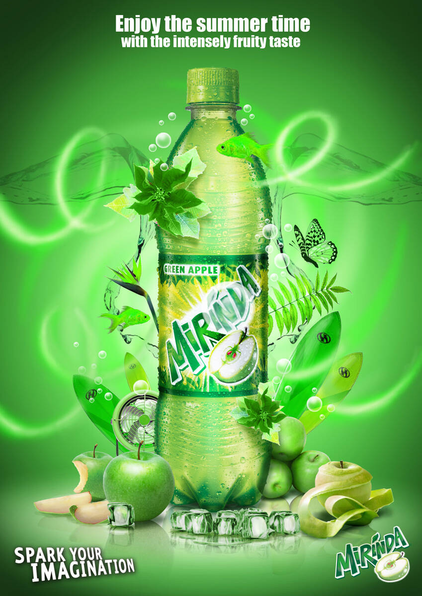
OMG, art direction sucks so much! Sorry, but you could of work couple of hours more and maybe, maybe you would have done it better. Look at the orange slice in the right botton. The reflexion is bad, bad... come on... And the water is symetrical in left and right sides of the bottle??? Why?? Lazyness? The only thing that makes sense is the colour composition. In the thumbnail it looked good to me.
i would go for a dolphin instead (Friendly Summery key object) .. and spending couple of hours on fine tuning all the maskings, reflections and the water splash dynamix , it's much alike the concept of "Coke side of life " but the elements are around the bottle " not out of the bottle as Coke " ;)
Comments
a goldfish?
My thoughts exactly
Is the goldfish a strong relevance to summer ?? ... moreover Concerning the art direction, is that the final artwork !!!!!! , but overall looks nice
Sameh Haggag
Senior Art Director
FP7 Cairo Egypt
fuck off....
Fruity taste and gold fish dont mingle. Art direction needs cleaning up. Too scattered and without focus.
love anything creative
http://addot.blogspot.com/
this is a world class ad
you must be so proud
Great use of the photoshop cs3
keep the good work
silver or min. bronzo in alrame7
but it needs more than one gold fish
thanks a lot for your great comment ...
Amr el Sharkawy
the fish are stinking up the other wise vibrant creative
very nice art direction :)
where the hell is the idea?
There is none... nothing but art direction.
art direction?
MattCrump.com
trippy stuf.. love it ;)
bad art direction
oooooooooh no!
-----
http://indianadsblog.blogspot.com/
Indian Ads Update
This is bit cliche. Keep thinking! What other ways could you advertise this product?
-Natalie
www.topolewski.net
How 'bout a shark instead of the goldfish?
OMG, art direction sucks so much! Sorry, but you could of work couple of hours more and maybe, maybe you would have done it better. Look at the orange slice in the right botton. The reflexion is bad, bad... come on... And the water is symetrical in left and right sides of the bottle??? Why?? Lazyness? The only thing that makes sense is the colour composition. In the thumbnail it looked good to me.
"Let's keep it clean!"
Not that great. Sorry.
I'd much rather enjoy an idea.
i would go for a dolphin instead (Friendly Summery key object) .. and spending couple of hours on fine tuning all the maskings, reflections and the water splash dynamix , it's much alike the concept of "Coke side of life " but the elements are around the bottle " not out of the bottle as Coke " ;)
Sameh Haggag
And the winner is.....Not this one.
copy seems pretty stale and not imaginative. Is joestamp the designer?
70s
agree
Sameh Haggag
Post new comment