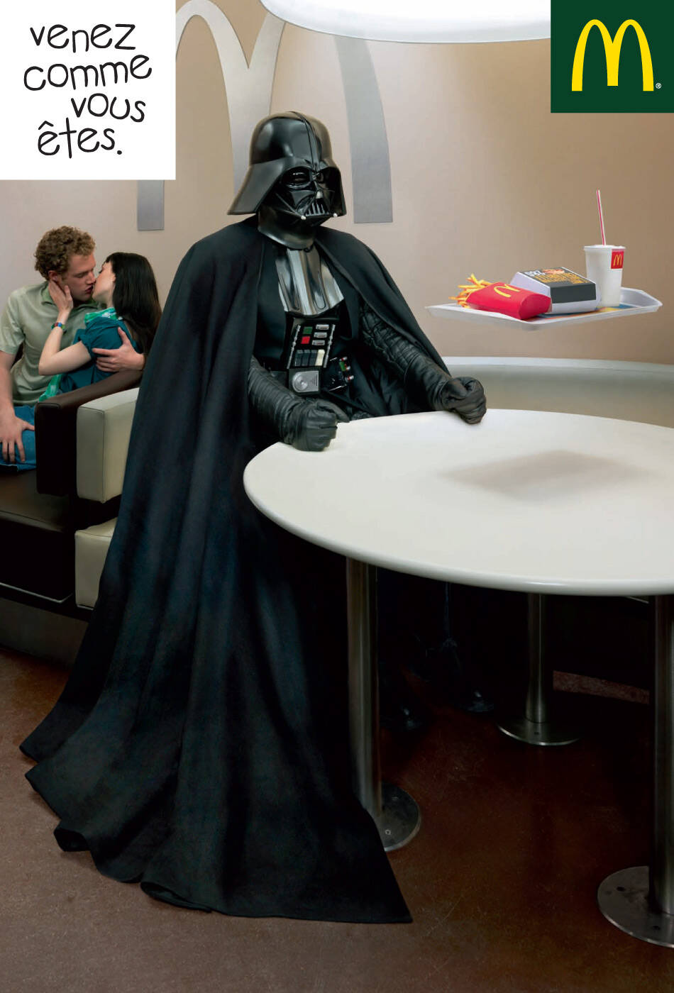
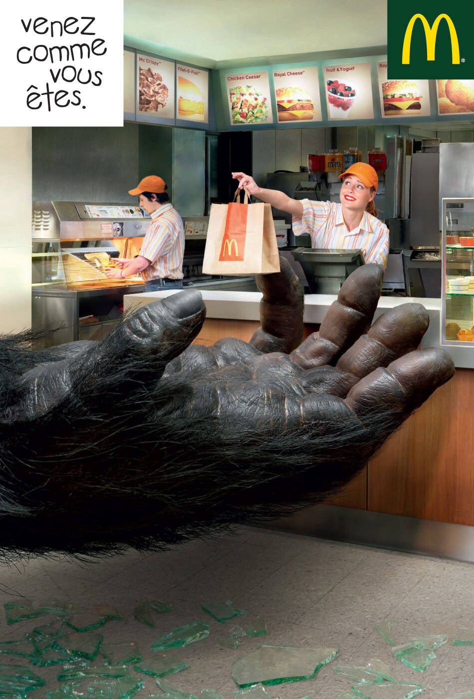
McDonald's: Come as you are, King Kong
Come as you are
Advertising Agency: BETC Euro RSCG, Paris, France
Agency Supervisors: Xavier Royaux, Christophe Defaye, Eugénie Lefebvre
Creative Director: Stéphane Xiberras
Art Director: Jean-Michel Alirol
Assistant AD: Pierre Boutin
Copywriter: Dominique Marchand
Producer: Murielle Bruneau
Art buying: Stéphanie Giordano
Photographer: Vincent Dixon


14 Comments
Hmmm, that broken glass at the bottom is really bad. Way too large.
yup!
what's the concept? I don't get it!
i thought i was the only one
horrible
What´s the idea behind this campaign? Somebody?
I hate this so much! Specially the idiotic idea of switching to a green background... wtf??? This is not McDonald's. Great concept btw..... NOT! It makes me sick!!! I feel like a yellow logo for a FOOD RESTAURANT over HUNTER GREEN...
:::MARK3R:::
don't like the art direction
=== Looking for concept/art creative to form a team to work in independent advertising projects. ===
Alexandre Brito
Personal Page | Blog | Vlog:Video | Plog:Print | Twitter | Facebook
The broken glass is sized too large.
Funny average ad
Muy poca comida para king kong? jaja
this version is so different than darth vader's .. there is some action here mean while it was so lame in that one..but it still doesnt mean that the concept is that powerful
| Everartz |
I actually enjoy the concept a bit, but that broken glass on the bottom is pretty horrible. How can you have such an intense King Kong hand and then be so careless with the look of that glass...ruins it for me.
NOOOOOOOOOOOOO... WHYYYYYYYY.......????
Common, it's better to have giant ape rather than giant plastic food hanging around the city.
The glass looks really, really terrible. Not a strong concept either.