Long jump, Run, High jump
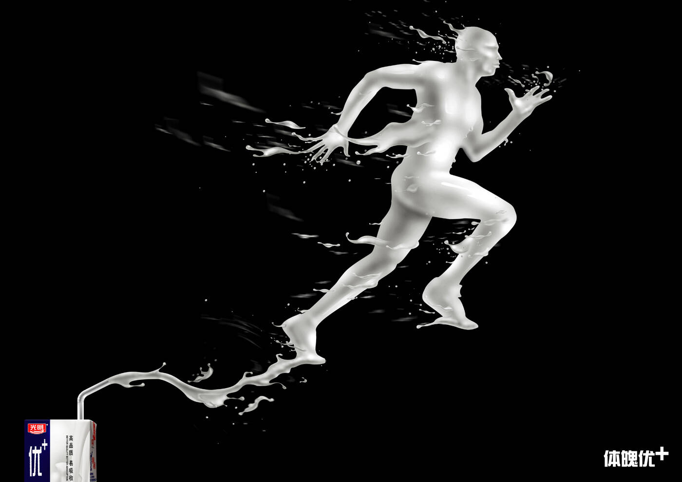
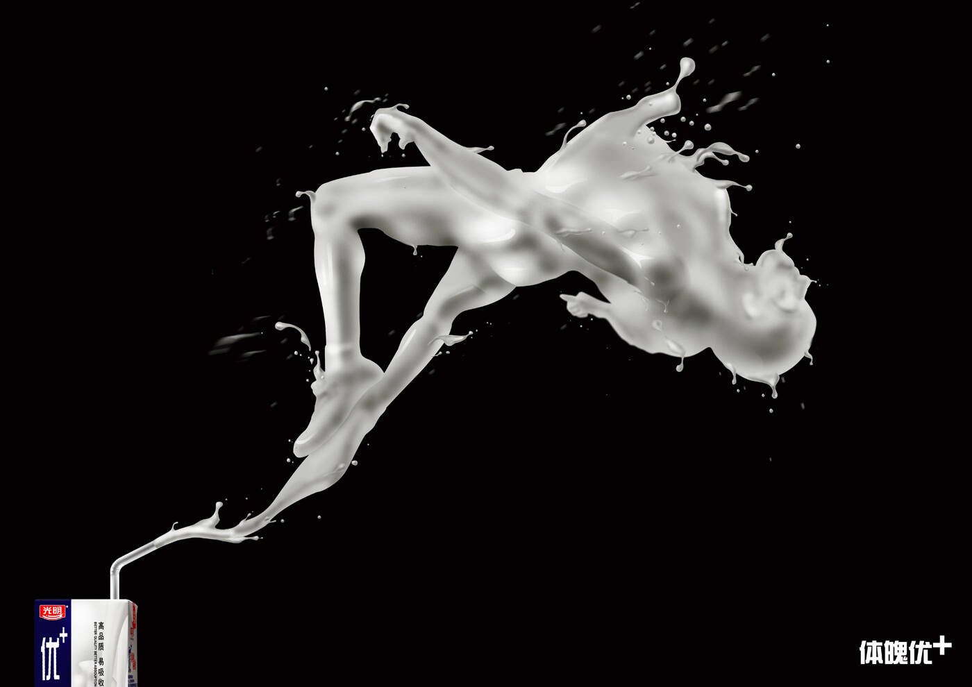
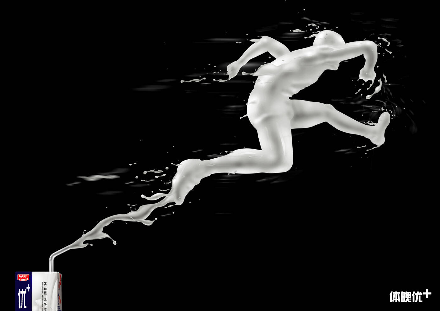
This professional campaign titled 'Long jump, Run, High jump' was published in China in March, 2010. It was created for the brand: Light, . This Print medium campaign is related to the Drinks (Non Alcoholic) industry and contains 3 media assets. It was submitted over 16 years ago.
Credits
Creative Director / Illustrator: Sheng Xiao
Copywriter: Xu Pan