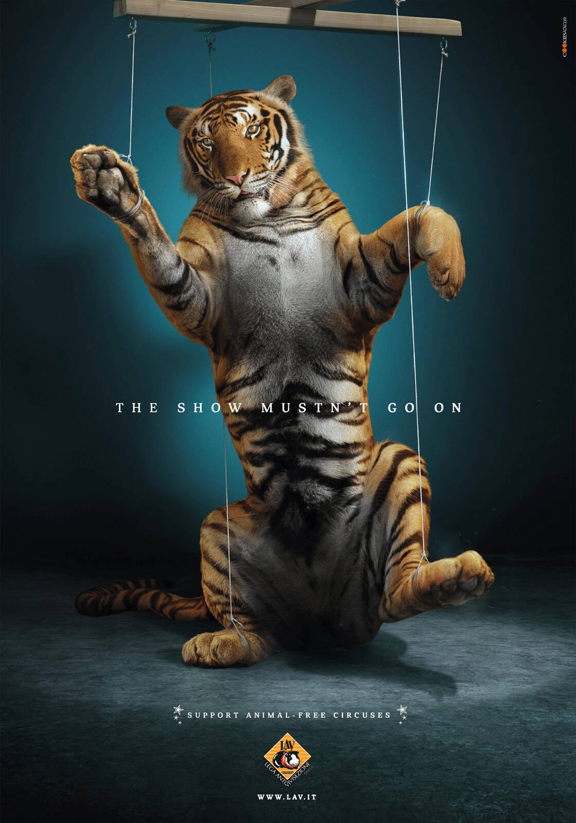
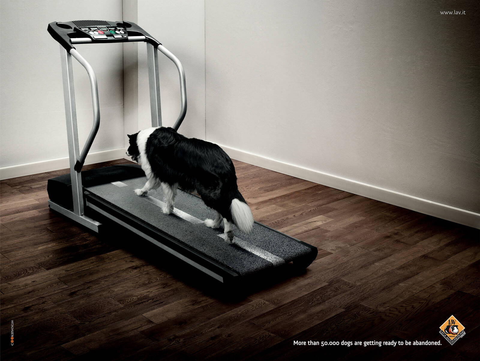
LAV: Treadmill
More than 50.000 dogs are getting ready to be abandoned.
Advertising Agency: cOOkies adv, Milan, Italy
Creative Directors: Francesca Mudanò, Alba Ronchi
Art Director: Andrea Di Castri
Copywriter: Massimo Guastini
Photographer: FM Photographers
Published: June 2010


32 Comments
Absolutely heartbreaking, and beautifully done. I've been waiting a long time to see this sector treated properly, and you're hitting it absolutely spot on. Perfect, just perfect.
Wow Gerry, I've never seen you this generous. Is this one of your softer days? Or are you just taking the Mickey out of all of us...?
Absolutely serious LeeH, I love this. Maybe my animal-loving side is coming to the fore, and I guess that's what the ad's intention was, but I really felt properly punched in the face with this one. An instant hit like that's rare for me to feel, so I thought a 10 was in order.
Eye-catching visual. But what is the message?? - The copy says nothing clear (why 50 000 and not 75 000??) and lacks a call to action.
http://adbuzzer.wordpress.com
Yes, yes and yes. There will be an emotional tide of people left washed on the shore of their own open wallets, you're absolutely right. Agency? Can you fix this NOW?
Great art, solid message. Like.
La linea della carreggiata sul tapis roulant rovina tutto.
Che bisogno c'era di metterla ragazzi?
Peccato, occasione persa.
(E poi siamo proprio sicuri che sia uscita? Mah).
The road line on the tapis roulant ruins the idea. Next.
I'll be very gentle. The road line makes it a road. Makes it a homeless dog. Makes it work. Otherwise it's a dog on a treadmill. Which is a dog exercising.
Next.
Yes, it's a domestic dog exercising and preparing itself to be homeless.
You haven't understood the idea. That's why you like it. And stop smoking please.
(Smetti di fumare grazie).
"I haven't understood the idea" and "please stop smoking."
Daddy?
First impression I had was a lazy dog pet owner leaving dog unattended on a treadmill.
Road line or not, it's still a dog exercising indoors to me, on a treadmill.
Seen it a lot. Type in 'dog treadmill' in Google. Or...
http://www.youtube.com/watch?v=-4CtNhl1lFg
Blank out the surroundings for a second. See a dog alone, walking down the road, homelessly. Let the connotations of homelessness seep in. Now look at it again.
sì, Manuela, è uscita. Togli pure il mah.
Per il resto sei ovviamente libera di dare tutti i pareri e i consigli che vuoi :)
Ciao
massimo guastini
This ad is not a "fake".
that shadow on the wall was unneeded and the entire scene looks saturated with black intensity!
but still the idea and the thought is solid thou..
| Everartz |
Disagree. It's a dark subject, and I think the lighting is entirely suitable.
the composition could be better. he is not going in the future (right side), he is actually going backwards, to the past.
it would be also more impressive, if he is running and not walking kinda slow.
http://jana-eger.com/illustration.html
A dog with nowhere to go rarely runs, unless it's fleeing danger or chasing prey. And I'm pretty sure they kept the dog in the middle precisely because some countries drive on the left, some on the right, so the imagery could be used everywhere.
So nice to see you fight for your favorite ad. I'll give YOU ten stars for your determination, Gerry.
Bad.
me not like
Stop photoshop now!
RG
Couldn't agree more with you, RG.
B E A Utiful... I love the ad and it is extremely well shown. I seriously am in love with the concept. Superb Work!!!
And then GOD said...
Let there be creativity!!!
death of artist...thats wat happens wen u create an ad..the viewer is free 2 intrepret his way...curious pencil and filipello manuela interpreted 2 diff ways
I can't believe how many bad reviews this is getting...it's good going on great.
The art direction might not be excellent, but it does it's job well.
Heads out of asses, please.
Great. Extremely clear.
jajaj its baaaadddd
www.barcreativo.com
I am not 100% liking the concept. Nice photshop job, buuuuuuuuuuuuuuuuuuuuttttttt........
I am not feeling like other posters.
Sorry, this one is a bit too convoluted for me.
Too good and too bad. Too good is the parallelism, its classic. And as the problem with the classics, not everybody enjoys Hamlet or Odyssey. From a connoisseur's point of view, its a champion, from the communication point of view, it has challenge to overcome.
shahid
Brilliant!
That's a real concept, smartly thought and well executed. I don't like position - seems too close the LAV logo - and font of the headline only, that is too rounded. I'd prefer a more aseptic one, not only becouse the message is dramatic, but also becouse of the image processing (dark and sad). By the way, that's a great ad from a great team. Congrats.