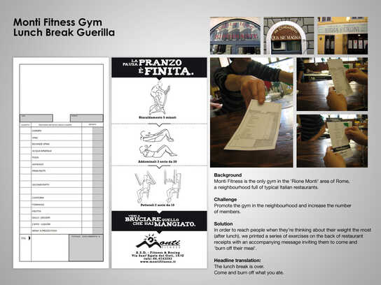
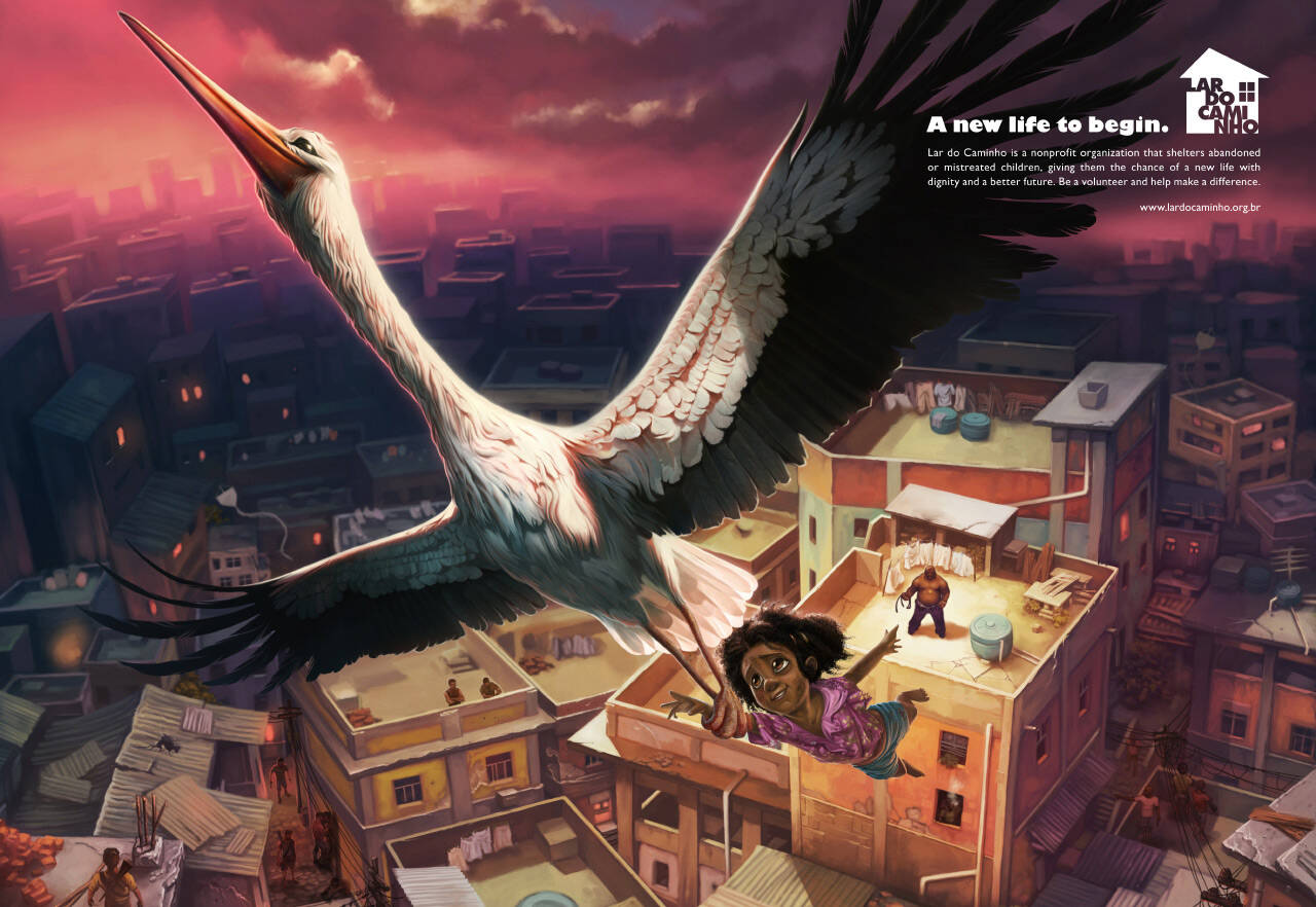
Lar do Caminho: New life
A new life to begin.
Lar do Caminho is a nonprofit organization that shelters abandoned or mistreated children, giving them the chance of a new life with dignity and a better future. Be a volunteer and help make a difference.
www.lardocamingho.org.br
Advertising Agency: Giovanni+DraftFCB, São Paulo, Brazil
Creative Directors: Ricardo John, Adilson Xavier
Head of Art: Bj Yung
Art Director: Gilberto C.Barros
Copywriter: Luiz Kanadani
Illustrator: Seagulls Fly
Published: February 2010


29 Comments
Great concept!!!!
And the way you show it, is even better!!!!!!!!!!!!!!!!
Thumbs up to you, mates!!!!!!!!!!!!!
See you at road...
I like that it's showing the positive results of the organisation's work. It isn't trying to shame people or saying "if you don't give us some money, this kid will starve." Hate when they do that. Here I'm much more likely to feel that I want to be a part of the positive results - so it's more likely that I would donate.
i like this. a lot
:::J:::
I love this stuff, so meaningful. Thanks for sharing!
If you want to get rich quickly & stay rich forever!
CHECK THIS OUT: http://securehost.profitasonl.click2sell.eu
I really like the expression on the face of both the stork and the girl.
"If I had asked my customers what they wanted, they would have said a faster horse." H. Ford
ditto ..first thing that i noticed and loved :)
Amazing
Agree, very nice execution and great art direction!
Stunning! I love the fact that they chose the white stork as the bird, uplifting the kid. In Western culture, the white stork is a symbol of childbirth or new life. I agree that it's refreshing to see an ad that focuses on what the life of this little girl (or boy) would be like from now on, not on what his/her life was before. Too often public interest campaigns like this one show children crying or looking emaciated... Again, this campaign focuses on the positive or on what's to come.
superb art direction, amazing details.......... added to my favorites!
withalltherespects
like it sooooooooo much, talented illustrator here!
Ahmed Bahaa
http://behance.net/bahaa
http://www.Shing0o.deviantart.com
Beautifully done. Photorealistic rendition wouldn't have done it justice
Nice artwork, good concept... Stork is given her second chance to give the kid a better life this time.
I like the art direction and colour scheme but let me tell you why a stork is a wrong bird for redemption. Historically, storks use to feed on leaves and insects but now most are in alliance with the vultures. At least in the Kalahari in South Africa, they feed on dead animals. Again a stork's talons might hurt the kid. Use a white pigeon in stead.
Stork is the bird who carries the newborns to their families in western culture dear. Kids are told they are "brought by the stork".
White pigeon is more like an international symbol for peace, right?
Right, so it's like if children are not treated well, the stork comes back for them. is that it?
Well, I still feel the kid might be hurt by the talons. Maybe he should be somwhere comfortable on it's back.
Obviously the kid, as you can see, is hanging by a tread.
better than getting whipped i suppose...
:::J:::
i like the illustration
very good, a social ad i really love!
nice it is..
F*cking amazing, best pro bono ad for a long long time! Agree that showing the benefit of the organisation should be the new way of such advertising. Hats off, dudes!
Stunning illustration. great concept! 10/10
Beautiful.
Warm and beautiful...I love.
I've noticed a trend where some people don’t comment on a work that is generally accepted as good only on the work they can pull down wit their nitty-gritty minds.
Complement as well as you criticize.
Beautiful...simply beautiful!
Love it. Noticed the stork heading up in to the light, away from purple poluted air and suffering.
www.areasdeluz.com
amazing
well conceptualized!!
Great!!