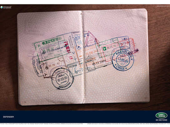
Land Rover: Colour Swatches
Advertising Agency: Y&R Johannesburg, South Africa
Executive Creative Director: Liam Wielopolski
Creative Director: Ian Franks
Copywriter: Leon Kotze
Art Director: Rory Welgemoed
Advertising Agency: Y&R Johannesburg, South Africa
Executive Creative Director: Liam Wielopolski
Creative Director: Ian Franks
Copywriter: Leon Kotze
Art Director: Rory Welgemoed
Ads of the World advertising archive and community showcases fresh creative campaigns daily from around the world. Read more
If you need a logo for your company or product you can get it done with us.
In our logo store you can pick from over 28,000 pre-made logos that will be customized to your name for free or you can post a contest for us for just $250 and our designers from all over the world will submit dozens of logo design suggestions to your specific needs.
11 Comments
Ultimately, what makes "Land Rover: Colour Swatches" engaging is not the colour swatches. It's the accumulation of little details, like the geographic coordinates and colour names.
Colour swatches is an overused device in advertising. Seen it far too many times. The names of the places are more interesting than the colour swatches. Should've resisted using the colour swatches. Very repetitive... show a colour and give it a destination name.
Kinda cliche.
Private joke for art directors ;-)
@ Manoma,
That's not true.
For example, if you ever been tasked with choosing a colour of paint for your bedroom wall, swatches wouldn't be unfamiliar.
Ok may be i'm a little hard on my judgment, but the hidden side of my reflexion, is that i think that announcement is very cold, for a "dream car"...
And the question is : what do we choose, the color of the journey? or of the vehicle? Here that seems the second.. and that's a little poor (in my opinion of course).
In the same time, on the same page, for the same brand, i love this : http://adsoftheworld.com/media/print/land_rover_defender_passport
I dont think you're hard I think you're right. Swatches are not widely used. Many might not know what they are for.
-------------------------------
www.scorchidentity.com
Brand Design | Logo Design | Brochure Design | Website Design | Branding Packages
Colour Swatches are very fashionnable in adv these days :
http://www.joelapompe.net/2011/03/22/saab-cabriolet-audi-leagasdelaney...
http://www.joelapompe.net / http://www.facebook.com/joelapompe.officiel / http://twitter.com/joelapompe
These are instantly recognizable as paint chips. Nobody would miss it.
www.marketingman.ca
www.twitter.com/brookjohnston
Pantone again? ; /
Nice idea. and if i was prepress operator looking for suv, this would be -spot on!-