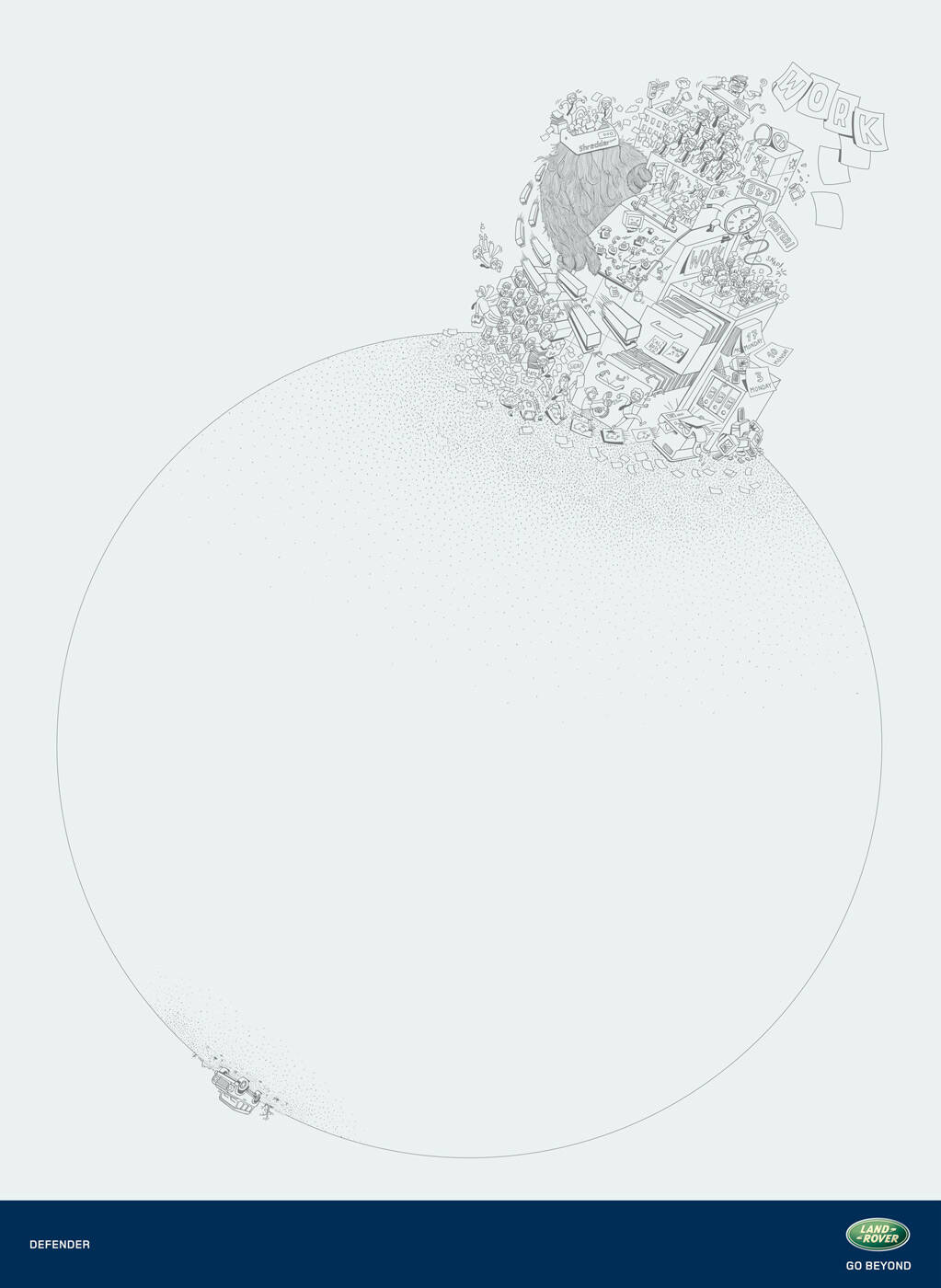
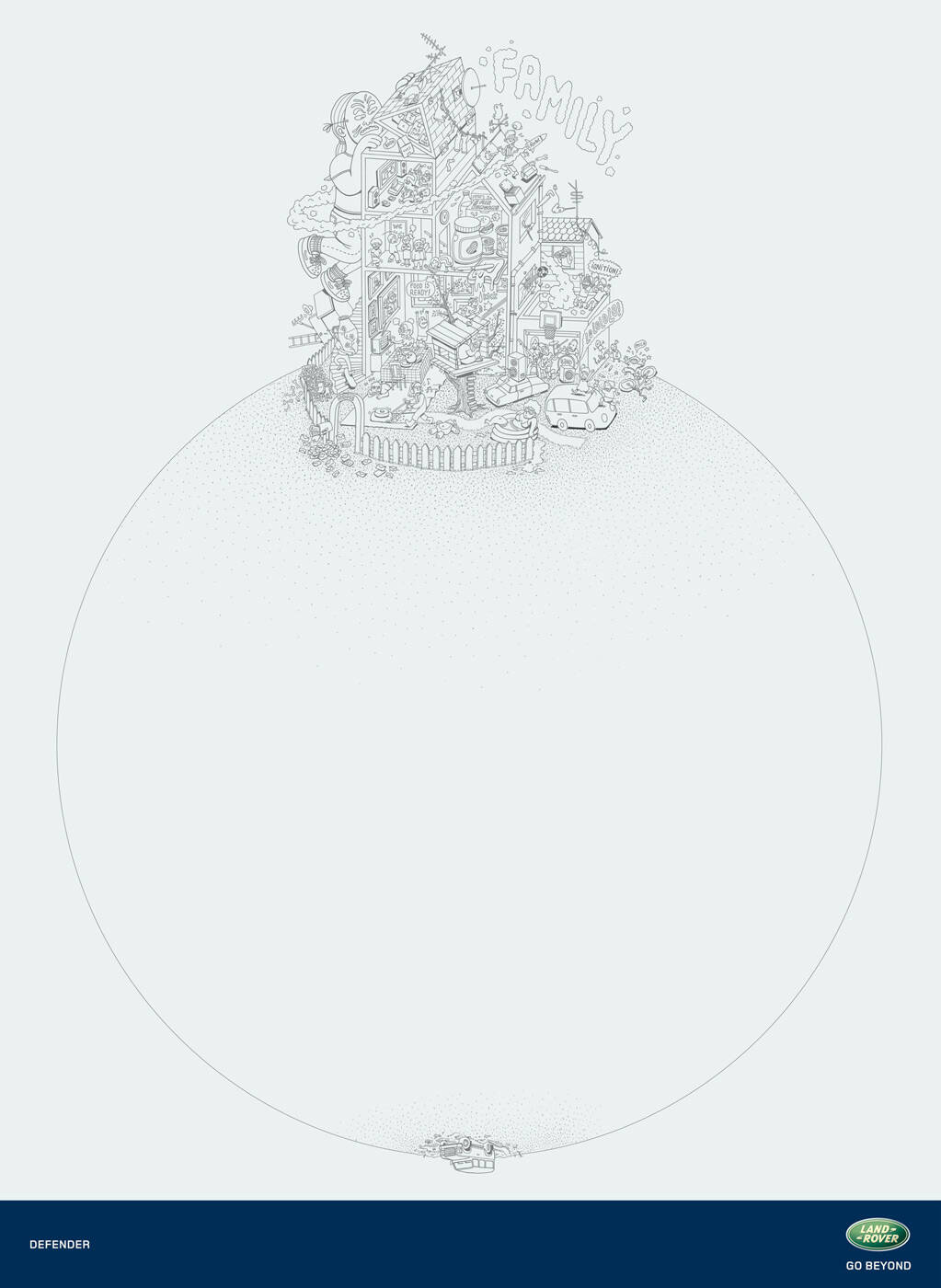
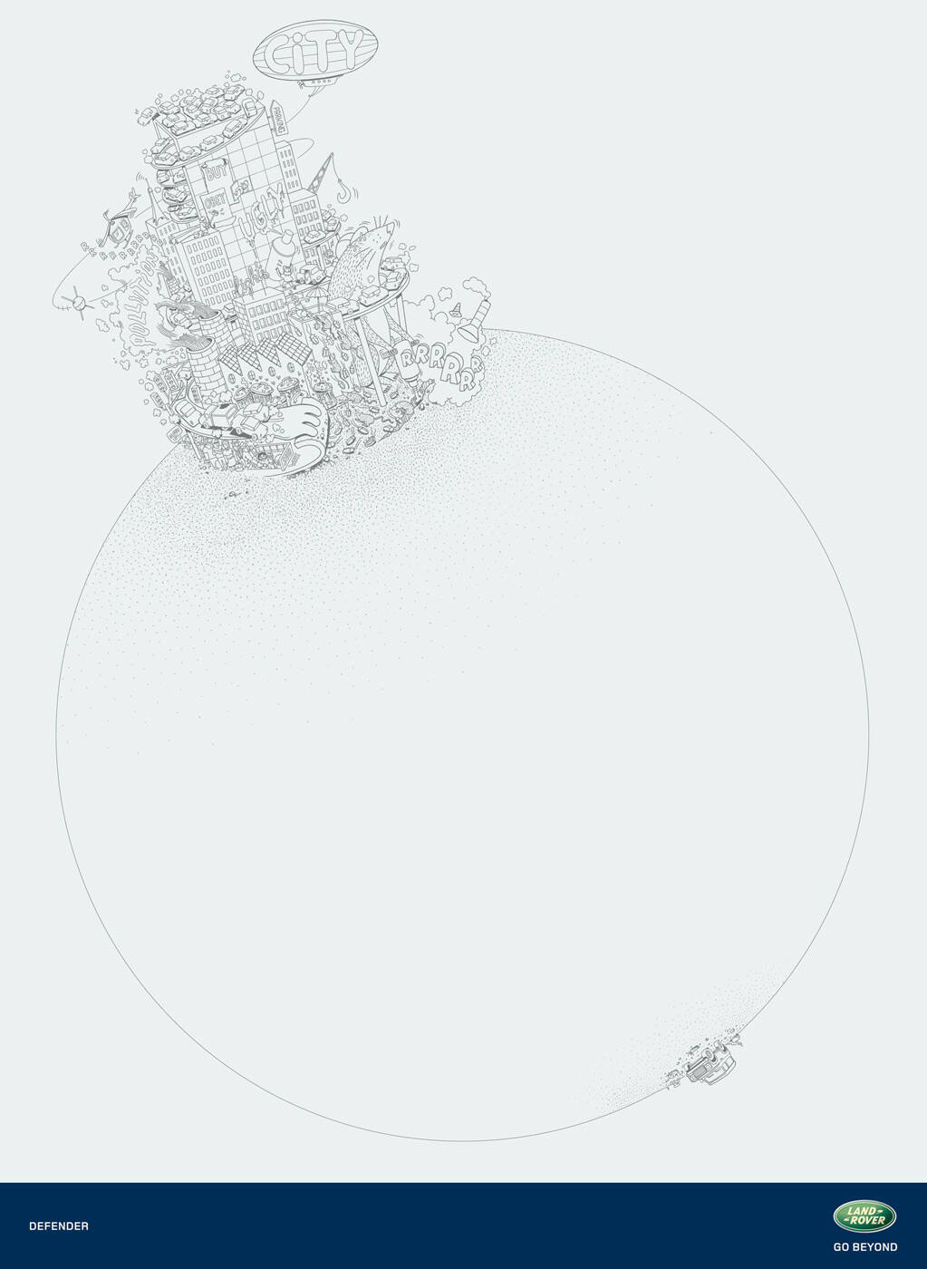
Land Rover: City
Defender
Land Rover
Go beyond
Advertising Agency: Young & Rubicam, USA
Global Chief Creative Officer: Tony Granger
Land Rover Global Creative Director: Graham Lang
Creative Directors: Guillermo Vega
Art Directors: Guillermo Vega
Copywriter: Icaro Doria
Account Manager: Lucie Harries


23 Comments
..just think this woould have been a way nicer execution had color been used.. pretty interesting scene, just think i'm working a bit harder with everything made like it's sketched out in pencil.
Cute.
This campaign needs not only some color (it looks monolithic as is), but also some copy.. With or without color, I think it's a bit too artsy for Land Rover's target market.
Copy hmmmm... like.. get away from home / the city / work? Wait... the visual exactly says that already!
I don't like riddle-ads, but this is so easy to get without explanation imho. Actually, the idea is very basic and literal.
Only thing that makes this ad interesting is the art direction - any copy would kill it.
Hmmm.. I think you shouldn't be so condescending. Different people may interpret something in different ways, especially when they know very little, if anything, about it. Most people on here seem to be commenting on the quality of illustration only (good art, love the illustration, etc). That being said, we can agree to disagree about the copy.
I am sorry, I didn't want to be condescending, I just like less serious debates with a bit of humour.
People commenting on the quality of illustration means this ad needs a copy? How is that?
For me, the fact that everybody understand the ad (no 'wtf', no 'pls explain!') proves that no copy needed.
On one side of the globe, there is the bad, ugly, densed city, on the other side of the globe, there is a car.
With the logo of a well known car company on the print, it is easy to connect to the only car on the drawing.
Far away from the city which is bad. If that is not basic, I really don't know what is basic.
No offense, but how do you know that EVERYBODY understands the ad? Actually, I can easily prove you wrong. Show this ad to at least 20 people (and when I say 20 people I don't mean creative types), and I bet that very few will get it.. immediately (within seconds, since no one's got the time to stare at an ad for minutes).
What may seem basic to you may not seem basic to everyone else. I too am "amazed" that many people still don't get the Pampers ad (the one where the baby's dreams are wetted/washed away), but I am not saying "Gee, it's so basic. You should get it!" The only thing I can do is just explain the ad :-)
Well, I am not that egocentric, 'no copy needed' commenter, intellectual snobbish type, but we should set a standard (which is pretty subjective of course) and say: we won't treat the target audience more stupid than this level. If we want to make EVERYBODY understand every ad, we would force ourselves to do pretty boring, lame works.
Ok. Please feel free to contact me through this site to further debate the (de)merits of this campaign or any other.
Like the art. It will be better if you use brown textured paper and multiply the drawing.
I think its an interpreted clients brief, nice artwork though
Do you think that it was an accident?!
Pleeeeeeeeeeeeeeease.................... apply your ideas and filters on your own 'textured paper' .
withalltherespects
just commenting on this to reach the 1000pt mark;)
"The best comment of the day"
withalltherespects
It looks like earth if everybody would drive that kind of cars...
I like it a lot.
Cool. I like the illustration.
nice art
I like this style of picture. Support it.
I love
I don´t know... good ilustration with a week idea behind.
Is this GCCO the same creative that did Bic infinity?
Whow!
Not BAD! Good concept and good illustration