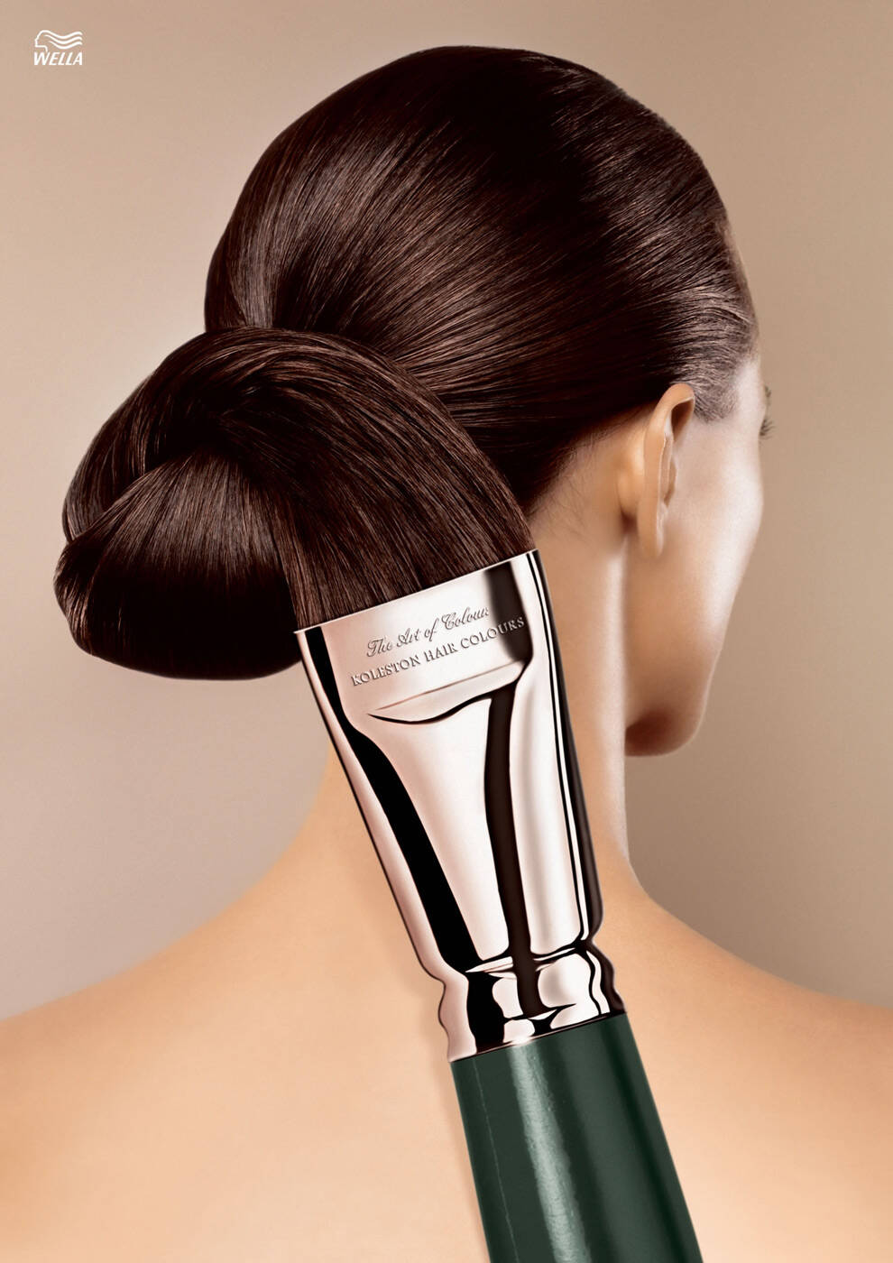
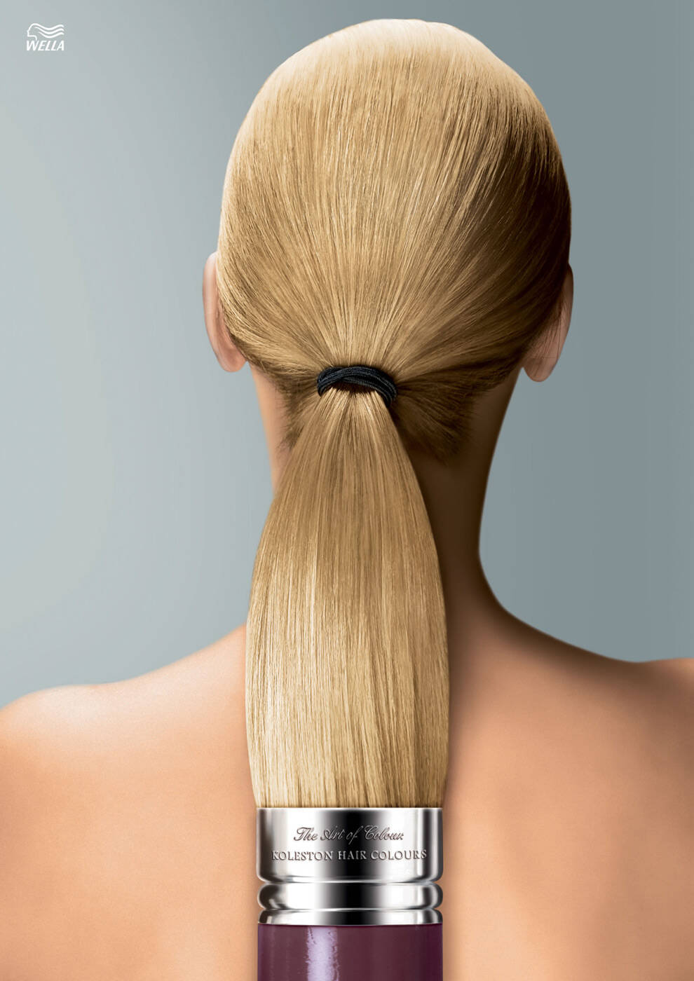
Koleston: Brush blonde
Advertising Agency: Leo Burnett Frankfurt, Germany
Chief Creative Officer: Andreas Pauli
AECD: Kerrin Nausch
Creative Directors: Andreas Stalder, Ulf Henniger von Wallersbrunn
Copywriter: Benjamin Merkel
Art Director: Daniela Ewald
Photographer: Stock


29 Comments
Student level photoshop.
Great idea but it may look better, the shadow behind the paint brush is not realistic.
Done.
http://adsoftheworld.com/media/print/lowell_blonde
link one is more sophisticated
-------------------------------------------------------------------
~ Quite obviously, I have gathered no moss ! ~
I think this one reads faster. The linked one is a step more lateral.
8* good stuff!
www.praxisadvertising.com
Still not as good as "lips".
____________________________________________________________
I have thousands of pencils and $1.50 so I'm off to Starbucks
done but still good
Good art, it looks nice.
<---------------SexInAds------------------>
http://www.facebook.com/sexinads
http://sexinads.tumblr.com
Good but: http://adsoftheworld.com/forum/exhibition/sitra_mall_ad
What hath God wrought
good campaign
24/7 Instant Human Translation:
http://www.translia.com/affiliate/mahmoud --- http://www.onehourtranslation.com/affiliate/mahmoud84
nice.
10/10!!
| Everartz |
Yeah, the photoshop is not good, this was already made...
But it is cool.
good idea !
nothing is impossible!
very nice
idea is very cool.............
Veerendra Moodi
and waht about curly hair??
And what about bolds? jaja
Please, don´t be annoying.
Dear Germans, relax. These things happen. We did a campaign just like you, but before. The ideas are there and are looking to get. This is not plagiarism, but follow the same creative thinking. Sign that the idea is good. Best Regards. Eduardo Basque and Nelson Doretto.
http://adsoftheworld.com/media/print/lowell_blonde
This would make a great cover to The Peanut Butter Solution on BluRay! Am I right?
I'm right.
Ummm... the colour comes from the stain or paint, not the actual brush fibers. The only thing this makes me think is that your hair would be as soft as a brush - which isn't a good thing as human hair is generally softer. Another not-thought-out idea.
Problem is good paint brushes are either made of horse or camel hair. That doesn't make soft hair...
Nice concept, bad execution.
I'm here doing this, but feel I should be there doing that. But to do that, I have to be doing this. Does this make sense or do I have to explain that?
Dont overanalyse this. Simple and good. Makes me stop. Work done.
http://www.flickr.com/photos/24034638@N03/
HA! Don't overanalyze it? Dude - as creatives that's our job. Clothing choice, background shots or even something as simple a detail as eye colour can make or break a campaign. If you don't analyze/dissect/bangyourheadagainstawall you're in the wrong business. ;-)
good idea, bad execution...
not enticing enough to buy the product that conveyed on, the copy not talking more than "brush for blonde hair"
However I can understand why they place shadow under the hair. They tried to reinforce the shape of brush perception more.