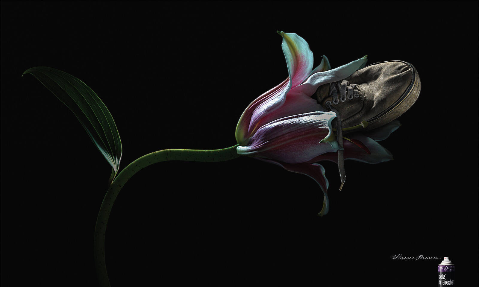
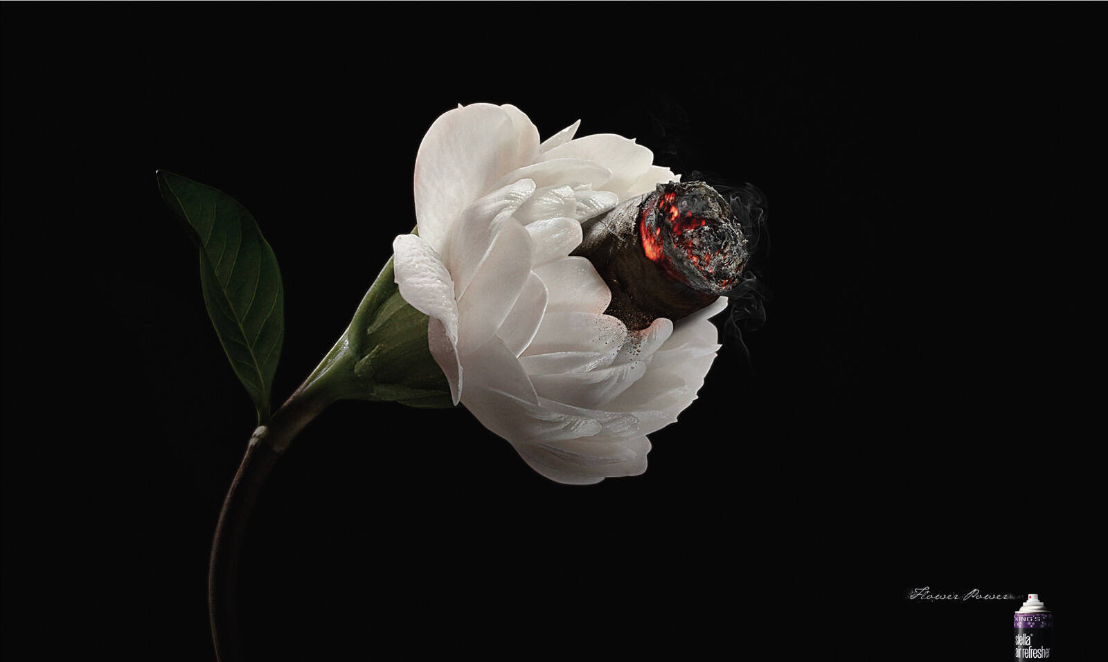
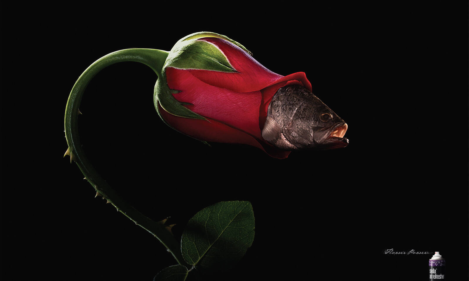
King's Stella: Jasmine
Flower Power
Advertising Agency: McCann, Thailand
Creative Director: Theerapol Koomsorn
Copywriter: Theerapol Koomsorn, Sorn Manawanitcharoen
Art Director: Akaroj Vorabunpott
Photographer: Chubcheevit
Studio: Chubcheevit
Flower Power
Advertising Agency: McCann, Thailand
Creative Director: Theerapol Koomsorn
Copywriter: Theerapol Koomsorn, Sorn Manawanitcharoen
Art Director: Akaroj Vorabunpott
Photographer: Chubcheevit
Studio: Chubcheevit
Ads of the World advertising archive and community showcases fresh creative campaigns daily from around the world. Read more
If you need a logo for your company or product you can get it done with us.
In our logo store you can pick from over 28,000 pre-made logos that will be customized to your name for free or you can post a contest for us for just $250 and our designers from all over the world will submit dozens of logo design suggestions to your specific needs.
12 Comments
Lovely. Maybe it would have worked better with a background that wasn't black but I really like it.
http://jackmancer.com/
http://twitter.com/jackmancer/
Good effect, bad concept. The product is "trying" to hide something that stinks... the result is the mix of bad scents and flowers... in my mind, this generates a smell is even worst...
The background contributes to this sensation.
Yes seems to be a question of cover up vs eradicate. NIce image, bad strategy.
I'm liking what Jack is saying up there I like it as well but I wonder how it would look if the background wasn't black maybe a better choice :)
@Guest: I agree with you from an "interpretational" point of view. But as a normal reader of a publication, 1 of that mass audience targeted, would I be thinking of it and over analyzes it that much? I don't think so; I think it works; it is simple and delivers the message. I see this one as the best of all three and I agree with Jack on the black background part
Great image. Mixed message.
Write a wise saying and your name will live forever – Anonymous.
http://www.anonymousauthor.co.nz
www.twitter.com/@anonauth
Would have worked better as a TV ad showing the flower eating the cigar. As it stands it looks like the flower is smoking and it doesn't really work.
lol thought EXACTLY the same!!! Concept is nice but very hard to express on a printed ad.
Awesome!
Himanshu Prabhakar
Wow, a smoking flower.... And what's that small thing near the right down corner? Bad strategy indeed.
Yeah, this one works better. Agree about changing the background. The black reinforces a "dark/weird connotation".
I like the concept. Execution could have been better. To answer the above comment "what's that small thing ...", it's the product they're advertising–spray air freshen container.
pjn