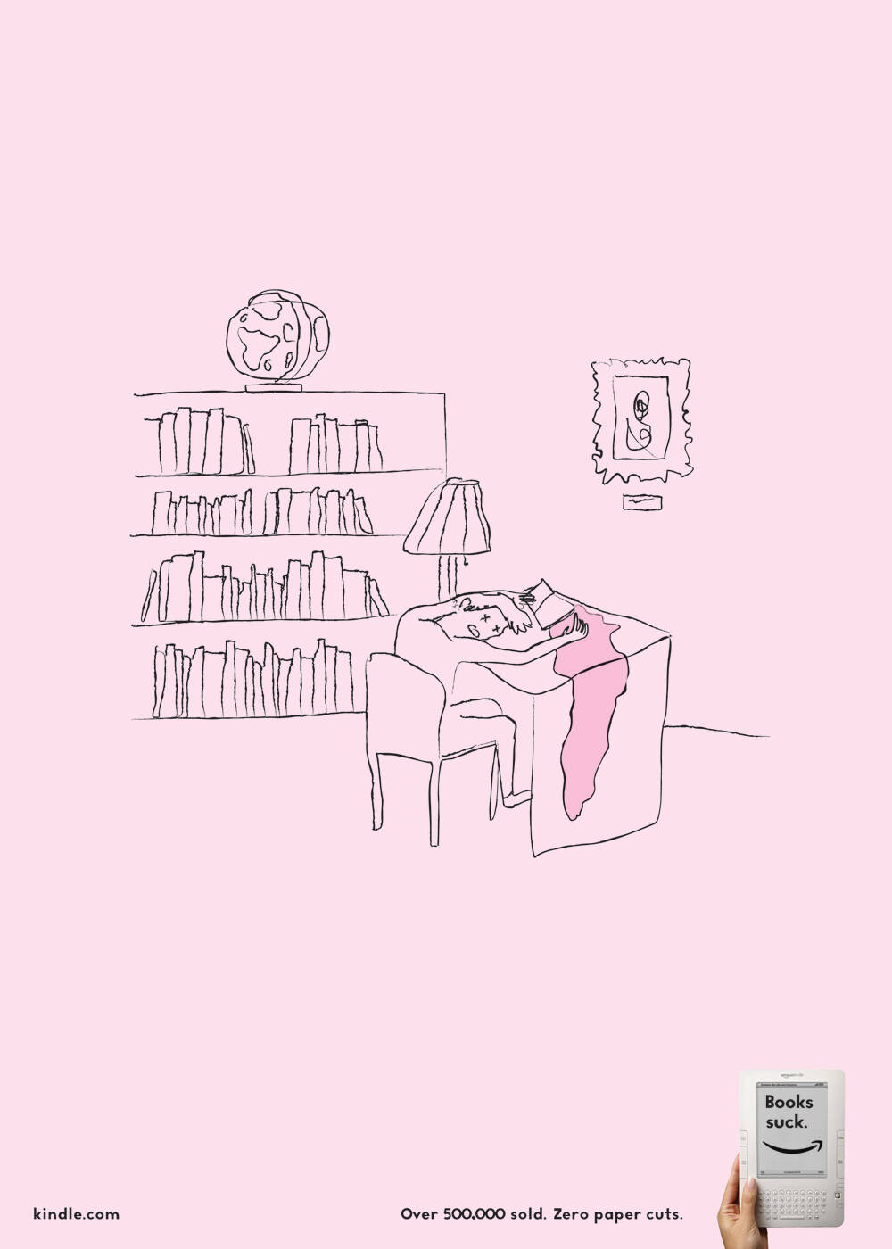
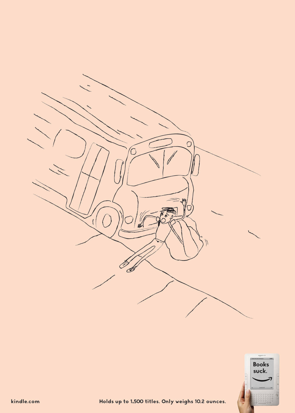
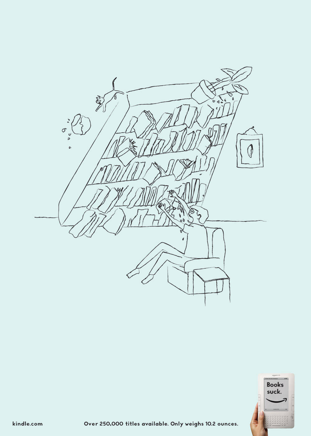
Kindle: Bookshelf
Advertising School: Adhouse NYC, USA
Teacher: Kevin Doyle
Art Director / Illustrator: Derek Love
Copywriter: Kristopher Blake
Advertising School: Adhouse NYC, USA
Teacher: Kevin Doyle
Art Director / Illustrator: Derek Love
Copywriter: Kristopher Blake
Ads of the World advertising archive and community showcases fresh creative campaigns daily from around the world. Read more
If you need a logo for your company or product you can get it done with us.
In our logo store you can pick from over 28,000 pre-made logos that will be customized to your name for free or you can post a contest for us for just $250 and our designers from all over the world will submit dozens of logo design suggestions to your specific needs.
17 Comments
If it wasn't for the "books suck" part, I would like this a lot more.
you are late! HAHAHAHAHA
This campaign is already in Brazil.
Link?
No link?
Me like!
Ok. Look This!
http://guerra.carbonmade.com/projects/55937#14
The translation is: "Reading can be dangerous".
Similar Ads! Almost identical
Like it, simple, very fun!!
No.
+++
"I love some things, and don't love some other things."
embarrassing.
Why? Can't think of somthing better?
You don't have to be.
This is quite a good little campaign.
The only problem with this is the "books suck" thing
according to many kindle reviews people reccommend using kindle AND books. So i think that this just makes them sound pompous. And i hear the kindle is not that good.
Not as good as 'paper cut'.
But, better than 'bus'.
LOOOVE IT
However i don't agree, I don't think books suck, i like books, but this is good solid and creative advertising
Nah, it's not doing it for me. "Books suck" is a terrible strapline. Shame, because I love the illustrations and the idea of books killing you.
Hold on a minute, to all you people who think this is great
These Creatives are handed a brief to advertise a somewhat...revolutionary piece of Technology, that helps saves wood being used for paper, un-necessary printing, backlight made for easy reading, adjusting type size for better visibility, store as many books as you could need, so on and so on
AND THEY COME UP WITH YOU MAY GET PAPER CUTS FROM BOOKS, AND THE OTHER SHIT......DON'T GIVE THE CLIENT THERE MONEY BACK, I WANT IT BACK FOR COMPENSATION!!!
Good Lord, the guest is right!
The paper cut one is nice. But I think they should've stayed with the 10.2 oz angle. Not having to deal with books taking up space and hauling them around is a more motivating factor to at least check this out.
Very true the 10.2oz would have better way. Cute illustrations but some how it doesn'e work... Could be better, if it was made in the relation of weight.... The guest is right...