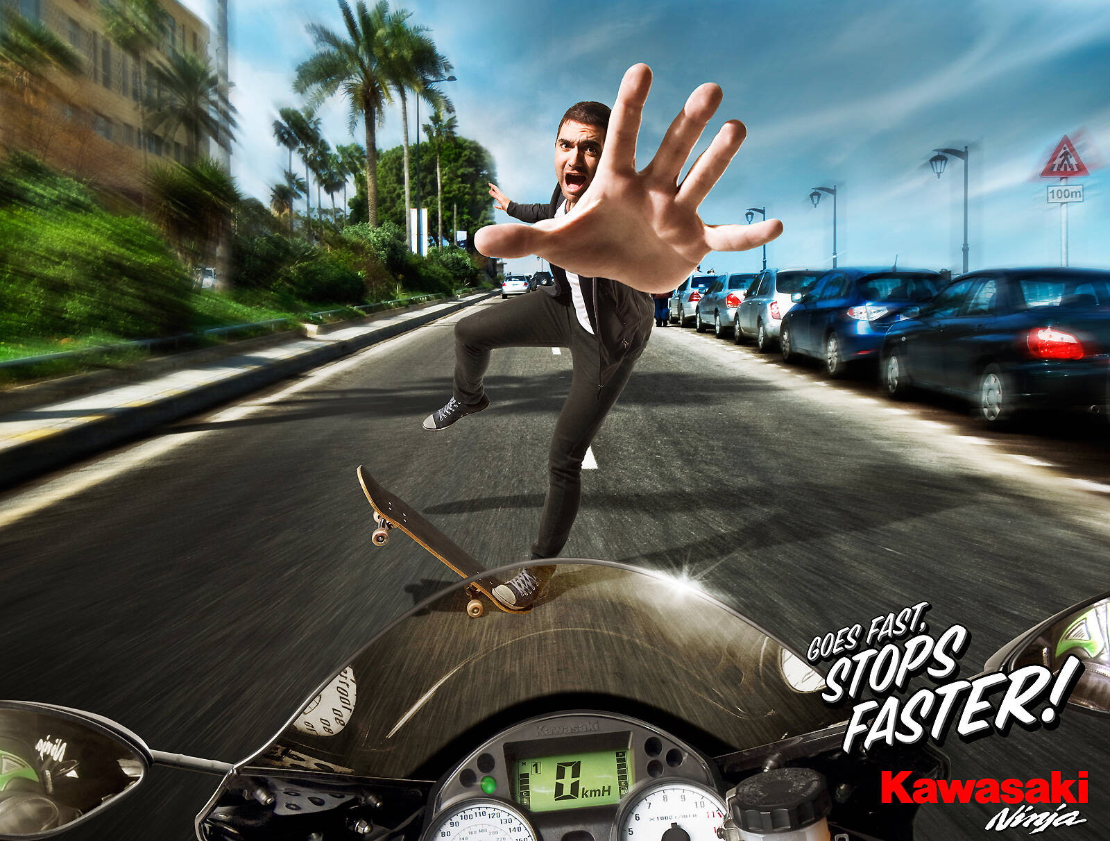
Kawasaki: Skater
Goes Fast, Stops Faster.
Advertising Agency: Impact BBDO, Beirut, Lebanon
Executive Creative Director: Walid Kanaan
Senior Art Director: Hovsep Guerboyan
Copywriter: Marie-Noelle De Chadarevian
Illustrator: Ruben Furio
Photographer: Astrid Challita
Published: March 2011


22 Comments
nice visual, but it doesn't need blur if he's 0 KM/h
Critics are easy.
Spot on. And if he's been 'going fast', he's very likely about 20 metres further down the road at a post-somersault pavement wedding.
0 km/h means he's stopped so it makes sense
A speed blur like that to me means he's stopped suddenly (kind of like the copy suggests); if a biker brakes that quickly he's either skidding through the skater or somersaulting over them, surely.
Somersaulting. I know you can't see him but that's because he's invisible.
nice art direction.
the cast looks like he just killed bruce lee
coz i said so
Who killed Bruce Lee?
Water manipulation objects, fauna, & flora: http://www.dreamstime.com/-rcollection10766-resi239750
i did hehe
so bad...so first idea...so done...
Quite really.
bad photoshop, very smart and cunning copy
zzbottom
Overall i like, but the selling point is a little bit weird, because if i gonna buy this Bike, i would buy it for speed and the brakes will be the least on my list!
TAMER SAMY
www.leapstudios.net
its good art direction.. but the idea... i dont like
www.barcreativo.com
see as art direction is concern prospective of shadows is wrong when the bike is moving towards the kid shadows should be in the opposite side.
Thats what I want 2 say. rest ITS A GREAT WORK. ALSO GREAT CONCEPT.
MK Misra
As art direction is concern prospective of shadows is wrong, when the bike is moving towards the kid, shadows should be in the opposite side what I want 2 say.
Rest ITS A GREAT WORK. ALSO A GREAT CONCEPT.
MK Misra
I like the copy and the image surely attracts attention, so it's a pretty strong print!
http://adbuzzer.wordpress.com
Stop telling that Art Direction is good, we got students reading in here ! ^^
Very bad art, i'm sorry. You don't need that blur as dadada said, it makes no sense. Plus, the man face is very contrasted, whereas his pant and his hands are not.
Plus the shadow of his right leg is the same length as the shadow on his left, even though his left leg's touching the ground, plus...
so you stop like that and you end turned around... so bad
Shadow is off / shadow is on, blur is off / blur is on, blah blah blaaaah!
It's simple, funny, and takes a fresh new angle in selling bikes. what's not to like!
@ prof totally agree
Work more than wonderful
But there is an error that the speedometer, the speed must be high and is not zero, in this case will be turned off and there is no danger.
Good job.
The idea is great, execution is ok, photoshop is bad
To a British, removal companies are people moving home. To an American, they are people hauling trash. Words don't have meanings without people's understanding.