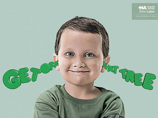
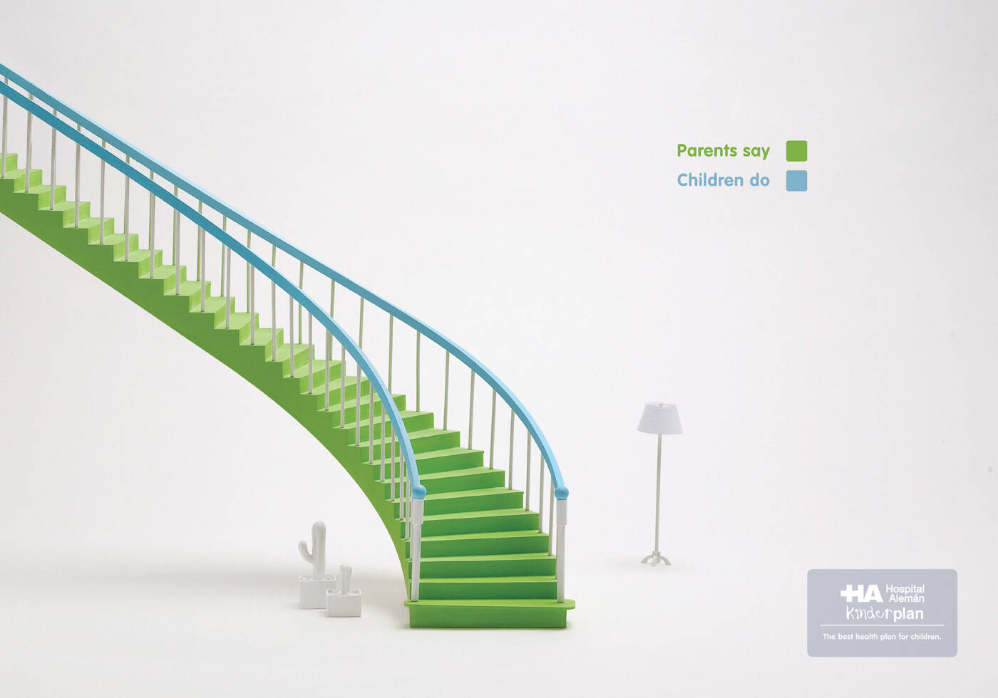
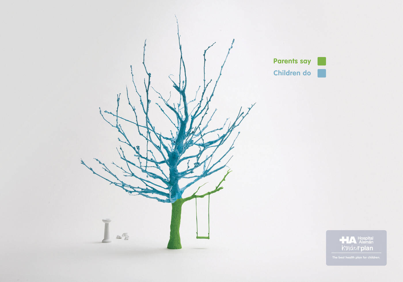
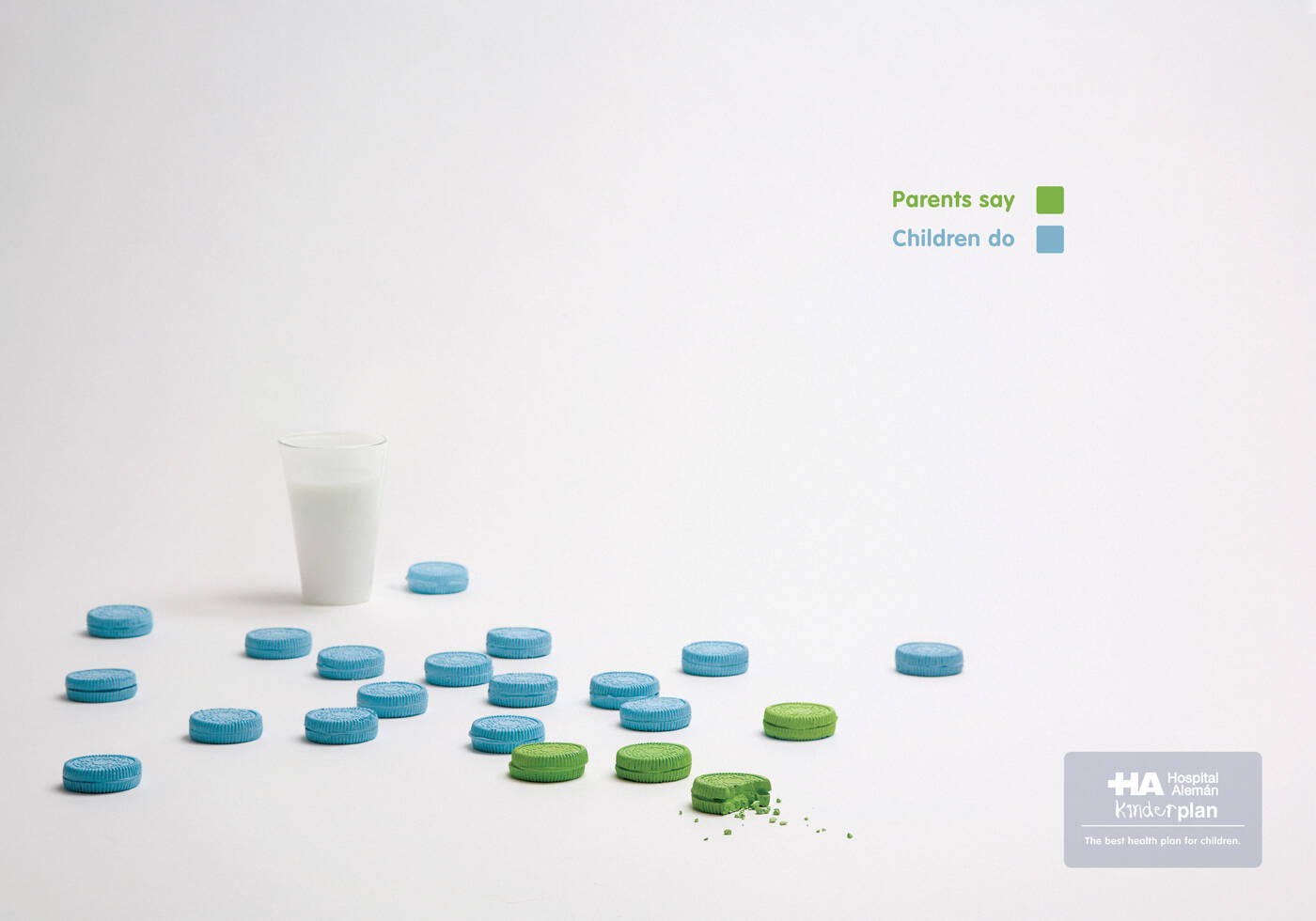
Hospital Aleman: Stairs
The best health plan for children.
Advertising Agency: Del Campo Nazca Saatchi & Saatchi, Buenos Aires, Argentina
Executive Creative Directors: Mariano Serkin, Maxi Itzkoff
Creative Team: Lucas Panizza, Norberto Vatrano
Head of Art: Pablo Romanos
Photography: Buenavista


36 Comments
¿Eso qué?? pura síntesis.
Sos más intransigente que tu comentario.
Seguí participando.
Muy buen aviso.
Me parece buena la búsqueda, pero para mí, faltó algo para hacerlo más interesante, nose bien qué. ¡Igual bien chicos!
Una de las campañas más inteligentes que he visto últimamente.
joancordoves.blogspot.com
www.joancordoves.blogspot.com
you have to see more champaigns then...
what do you have to say about this? what's your problem with this? what could be improved? what would you've done better?
Think it for a while.
Then, in anytime, it will come to your mind as an idea.
And maybe while you see those champaigns also see some wines, and liquors...
I really like this great use of color and gets the massage across clearly - not sure if you need the light and/or cactus
apples
Agreed that the cactus and the tree look a bit out of place (but I do get the injury connotation to them). But I do like the simplicity of the campaign and the white background. I think a natural environment would have mind for to many distractions, especially because the use of color is such a major impact of the campaign.
love it! love it! love it! way to go!!!
this one is great. love it.
prefer the tree one
Reckless. Ruleless.
damn. these are great. we'll be seeing more of these in the shows.
nice campaign guys...oh dear, mommy and daddy are fighting 'gain!!!
FU**ING AWESOME!
really nice
this is the best
Inteligente!!!!
Muy inteligente y bien ejecutado.
Oh...
i got it. really nice.
U hav done a great mind exercise.
muy buena idea, gran arte
I like it, well done guys
•Nela•
•Nela•
I like it, well done guys
•Nela•
•Nela•
Eso qué? lo dicen los mexicanos. Ustedes de qué pueden hablar? A comer chile
Muy bueno, simple y directo. Muy claro
buena
I loved this one the best.
Admittedly, I had to look a little longer at these ads before I got it. At first, I thought it was just another ad with a clever statistic chart.
However, looking closer at this piece, I realised the pure genius behind it - using legends in a totally different way. I appreciate that.
A beautifully and cleanly executed thought.
u can smell novelty if it is blended with simplicity and exclucivity. well done. in fact, very well done.
la vi hace unos días en adlatina, trabajo en otra agencia grande de argentina, y esta campaña me gusta! felicitaciones!
bueno...
i like it.
it is really good idea if you have any idea my website logo let me know its www.dgvolcano.com i would like to use your imagination for my website.if you help me
nine.colour@gmail.com
Thanks
Colour
Oro en Cannes
me encantaaaaa
me encantaaaaa
这套稿子很干净,很好啊,相信有过小孩子的人更有共鸣的说!!
Excelente!! Ah! y los genios creativos que participan con comentarios tan elevados, sepan disculpar.