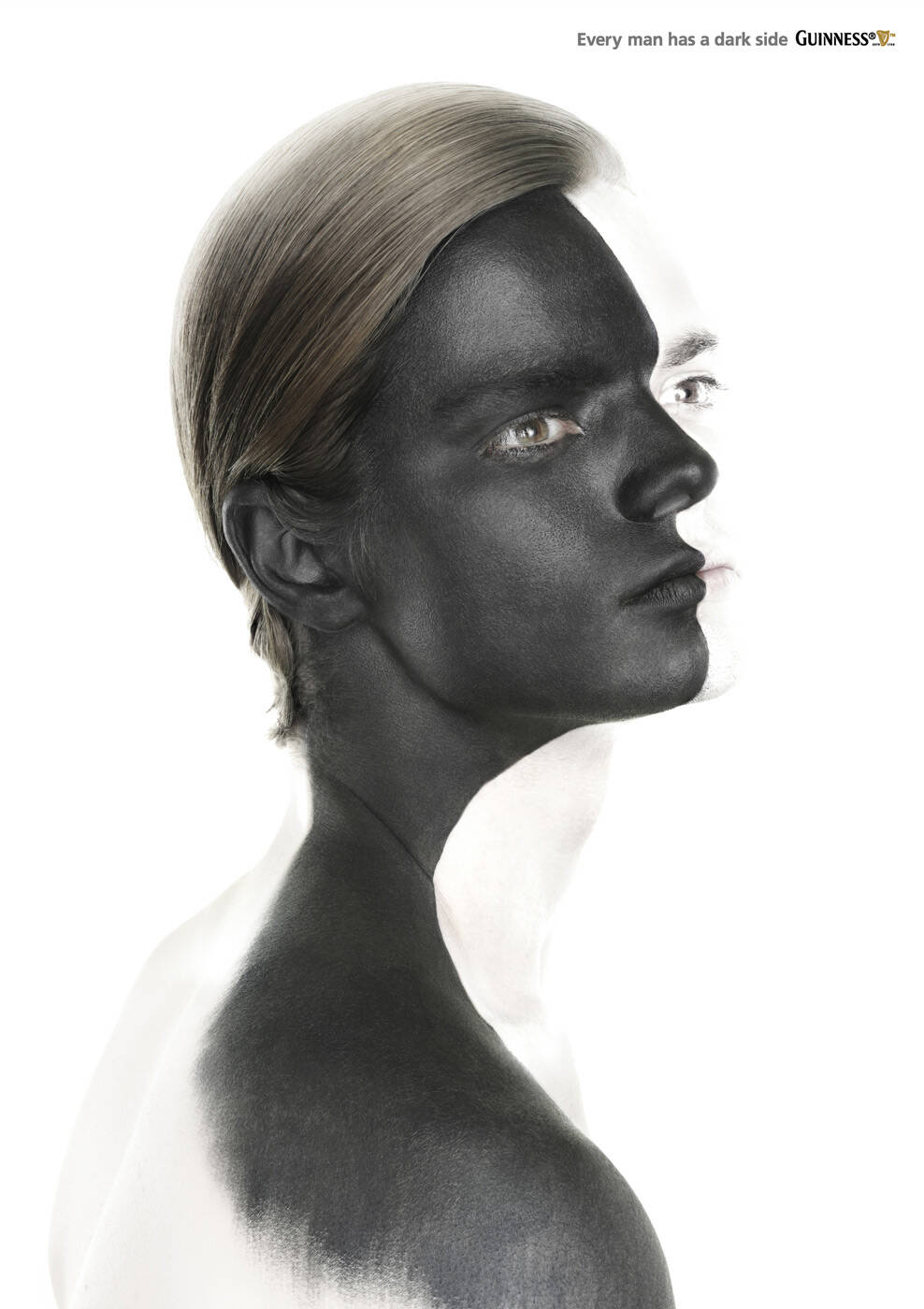
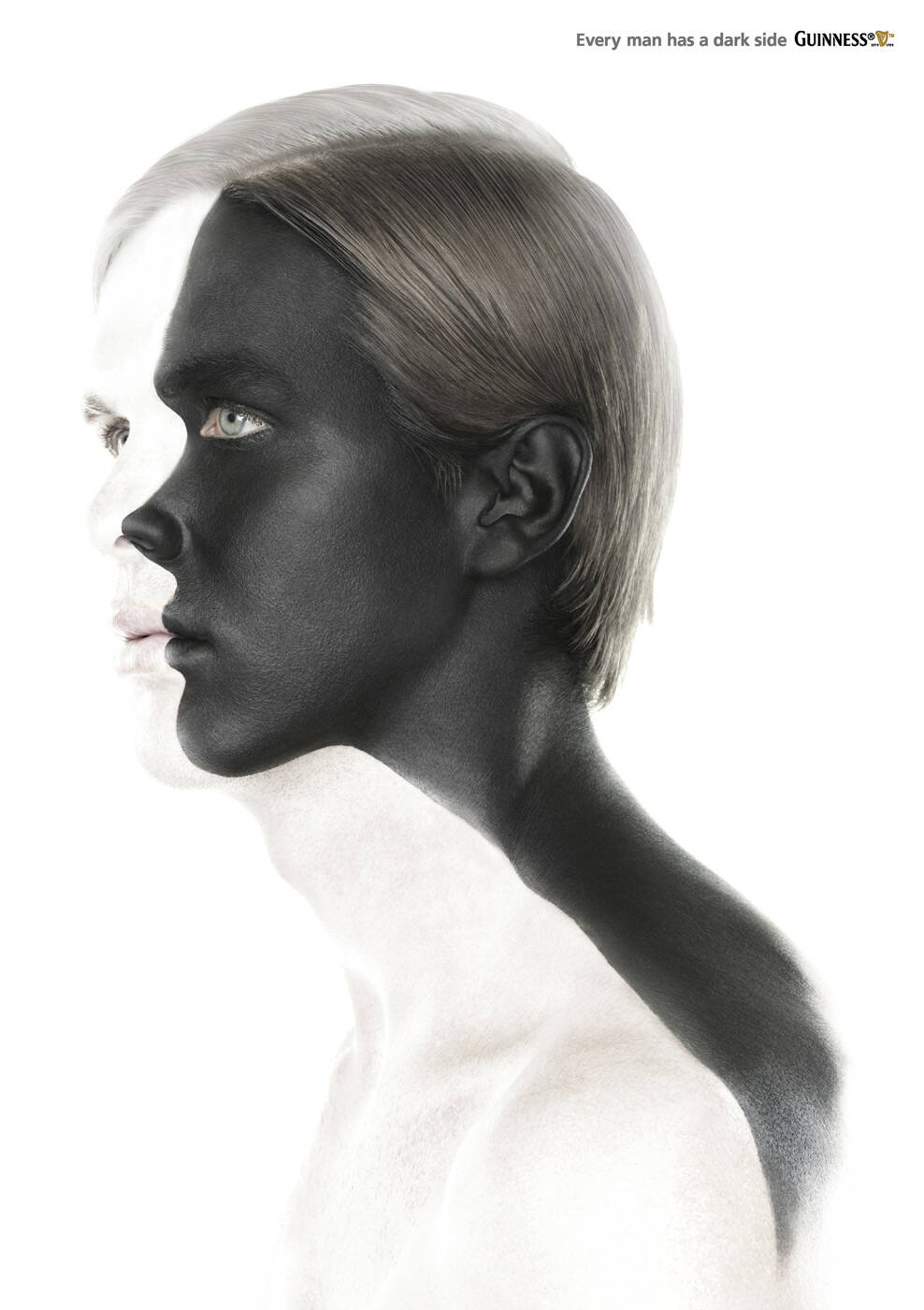
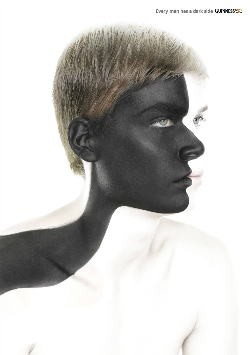
Ads of the World A Graphics.com site

Guinness: Rory

Guinness: Rory
Your rating: None Average: 2.9 (28 votes)

Every man has a dark side. Guinness

Advertising Agency: BBDO Shanghai, China
Creative Directors: WF Leong, Andrew Lok, John So
Art Directors: Yohan Si, WF Leong
Copywriters: Andrew Lok, WF Leong
Illustrator: Edwin Ho
Photographer: Edwin Ho
Additional credits: Rick Doerr
Published: September 2009

Comments

Dzsoi's picture 4558 pencils

Sorry for being rude, but I can't believe someone spend money for such a lame, old, boring idea.

www.jackmancer.com's picture 731 pencils

Rude? Not really, you're damn right.

mikeelrapido's picture 859 pencils

I agree, it's no Guiness style at all...

<--------SexInAds-------->
http://sexinads.tumblr.com

Aphex's picture 184 pencils

Black or white? Oreo? Kiss? 2 face? Batman begins? Crazy melanine? New campaign ipod, PSP, Benetton? DUH???? Sorry, but "this is it". NEXT!!

"Si eres buen copy, presiona alt + F4"

silvi's picture 1464 pencils

Ar4t is good, but concept is too far

theanc's picture 2458 pencils

Before opening the thumbnail I thought it could be a great idea. But it's not.

Marlus Lau's picture 176 pencils

I bet it´s a fake ad.

Guest's picture

Worst Guiness ad I've seen.

Tommy G.'s picture 85 pencils

The colors must be inverted. We don't see the white part, taking the photograph on the other angle would be better.

Weird choice you did...

alexander_bickov's picture 1638 pencils

Great art

Alexander Bickov Personal portfolio | Twitter | Facebook | Blog

Guest's picture

made for chinese market; guiness goes great with chicken feet.

Honest Dave's picture 182 pencils

gay.

Just my one cent.

satrianee's picture 452 pencils

and? what an intelligent way to criticise an ad

tirthomitro's picture 1000 pencils

the disappointment that one faces after seeing the actual ad
by clicking its thumbnail version is h u g e!!!!!!
and that too GUINESS...
maaan, advertising's changing a helluva lot.
& not all towards betterment...

everartz's picture 5344 pencils
2

in fact this is a scary ad, and not appealing at all...

| Everartz |
Art direction and old school death metal.
www.everartz.blogspot.com | myspace.com/inkill

Guest's picture

terrible

daredevil.99999's picture 5 pencils
1

No insight at all, bad art, bad idea, bad concept

Grrrr's picture 284 pencils

It's... ugly, isn't it?

Tuyo Jydtep

daredevil.99999's picture 5 pencils
1

yes damn ugly, an ad without an strong insight

pulautikus's picture 61 pencils
3

good execution tho excelling on being sooo..oooo literal. takes the edge off guiness.

Guest's picture

is this a man's picture????

rolling.stone's picture 1164 pencils

i appreciate the basic insight

-------------------------------------------------------------------

~ Quite obviously, I have gathered no moss ! ~

gravity's picture 154 pencils

great art, but that's not an ad...

it should be presented in a photo exhibition, not in a magazine. because it's definitely not doing the communication.

Post new comment

We highly appreciate your comments. When commenting please acknowledge the following guidelines: Be respectful and helpful. Do not spam or link drop. Please note that guest comments do not appear immediately.

 
  • Allowed HTML tags: <a> <em> <strong> <cite> <code> <ul> <ol> <li> <dl> <dt> <dd> <blockquote> <img>
  • Lines and paragraphs break automatically.
  • Web page addresses and e-mail addresses turn into links automatically.

More information about formatting options

Ads of the World is an advertising archive and community. The archive showcases campaigns from around the world categorized and updated daily. In the forum you can discuss your professional life and post your work for critique. The blog features advertising stories. Read more

On Demand Videos


On Demand Videos: Video tutorials for advertising pros and designers providing tools and information you can trust — and use — on your very next project. Subscribe today!