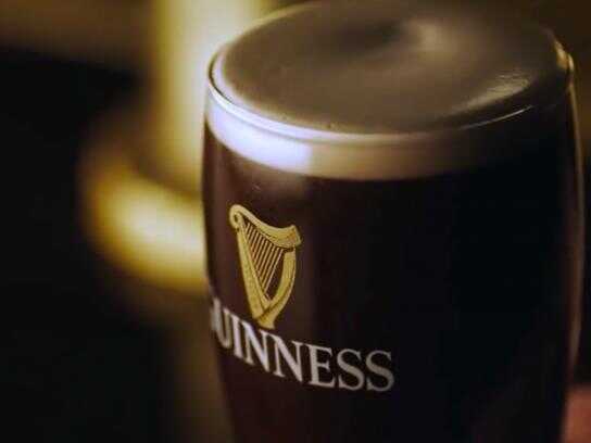
Ads of the World

Ads of the World™ an All Creative World site

Guinness: Halloween

Guinness: Halloween
Your rating: None Average: 7.4 (113 votes)

Celebrate Halloween with Guinness. October 31st.

Advertising Agency: Tempo Advertising
Creative Directors: Adrian Preda; Bogdan Costin
Art Director: Dan Costea
Copywriter: Alina Rosioreanu
Photographer: Valeriu Catalineanu
Other additional credits: Mr. C & Diana Stancu
Published: October 2009

59 Comments

Honest Dave's picture 233 pencils

Nice photo. Ugly type.

Guest's picture

WTF are the car keys doing in the ad???
Did the client see this?

john.lighttern's picture 216 pencils

The keys has nothing to do with the ad... they forgot to take it away

The ideia is in the mirror: the glass has no reflect.

dthlb72's picture 495 pencils

I think it should be the other way round where the guinness is in the mirror... ( i know ghosts or vampires don't have reflection ). No harm right? Since nobody met a ghost yet... :P

Guest's picture

i like the dont drink and drive message in it. but i doubt a lot of people will undertsand this one.

Guest's picture

Not sure to understand...
The glass looks fake : molasse with whipped cream. Was it volunteer? If so, why?

I'm getting tired of Adsoftheworld, this website is not intended for professionnal anymore

Guest's picture

I get the 'vampire joke' but it's not very well done.

Guest's picture

I'm thirsty and watching this ad....no good

Guest's picture

I like this. Not sure that the average Joe will get it though.

Guest's picture

type face does not suit the overalls

Guest's picture

english as a second language much?

Guest's picture

haha

talshuv's picture 8 pencils

Not immediate enough.

fersvax's picture 1224 pencils

Boring

FER.

Guest's picture

Kickass

Jesterbrand's picture 146 pencils
1

It's amazing... did nobody look at this before it went to print? this ad would NEVER be in the US for one very specific reason...

they left the car keys in the shot with the beer which almost insinuates to drink you guinness before you go out to party. seriously... very bad form.

Shingo's picture 404 pencils

you forgot to show the drink in the mirror!!!!!!!! LoL

Guest's picture

That my ignorant friend IS the idea!

tanvir hassan raju's picture 423 pencils

http://tanvirhassanraju.carbonmade.com/

Great......nice observation bro@jesterbrand........like in my country.....some of the NGO's and our local ministry do....ha ha ha....u cant do it!! ..u cant show tat!!...n bla bla bla.....whtever...after all this is an ad...mman...

tanvir

gravity's picture 183 pencils

idea is yummy!

typo is bad, i agree. and the scene could be "darker"...

and i didn't get it, why the keys are so neccessary to be in the shot in a very eye catching position.

dthlb72's picture 495 pencils

See, in the real world there's the beer & the keys, that's before anything happen....
and in the mirror would be showing a dead man standing looking at the beer (which is not in the reflection, not on his side)
it appears that the mirror is the future of what's going to happen.... creepy isn't it? :P

Guest's picture
7

Clever, i love this ad and the beer. 7/10

Andrea Afeltra's picture 96 pencils

Not good as the beer. And the keys doesn't help to have a good message

martois's picture 67 pencils
5

Its a good idea and i like it. If they had simplified the shot it would have been more obvious that the pint is being used as a visual metaphor for a vampire, i got it within a few seconds but clearly some people didn't which means the advert isn't working as well as it should be.

Carbon neutral branding, graphic design, web design and digital agency based in Manchester UK | www.carboncreative.net

Graphic design Manchester | Website design Manchester

beingofageoldgrace's picture 316 pencils

why the keys....WHY?

Guest's picture

this ad it's not about the damn keys!!! it's about guinness the vampire! nice! :)

Guest's picture

I guess you're not so good with type...that's too bad...and I GUESS YOU DIDN'T LEARN THAT ONE EXPLANATORY ELEMENT IS ENOUGH, IN THIS CASE, THE CLOCK SHOULD'VE BEEN SUFFICIENT ENOUGH. The keys are amatoresque. And the third thing...you don't photoshop the beer, its the center of attraction. God! The Guiness doesn't look like this in a transparent glass. And the foam is fake...what the hell did you use, whipcream? Come on, and the idea is so old...is this ad even real? And who's Tempo?

Guest's picture
1

a wider angle would've done it. This is kind of first semester advertising technical approach.

Guest's picture

the reflection in the mirror need not have had that house fly kinda thing, what's that??

Guest's picture

the beer is dressed as a vampire... wonder why no one got it!!!!!!!!!!!!!!!!

Juan Cabral's picture 713 pencils

How such a lame ad receive so many comments?

***
http://ad-genius.blogspot.com/
Advertiser who won 10 or more lions in the last 10 years.
And I am not the real Juan Cabral, guys. So sorry for that!

Guest's picture

with such lame comments...

Guest's picture

Thhis is a very bad ad! Terrible art direction! The beer has no texture, it is not appiling and the car keys!!! That besides that the beer is on a bed room or a place like that. Very low print/poster for a beer that is always suprising us with their ads. BAD... BAD... BAD... How a creative director could aprouve something like that? Very bad!!

Spider's picture 264 pencils

Thhis is a very bad ad! Terrible art direction! The beer has no texture, it is not appiling and the car keys!!! That besides that the beer is on a bed room or a place like that. Very low print/poster for a beer that is always suprising us with their ads. BAD... BAD... BAD... How a creative director could aprouve something like that? Very bad!!

To many comments... problably are the team trying to safe this old, bad print!

Guest's picture

it would have been better if the reflection is shown in the mirror without the glass on the desk

Guest's picture

very good

shortafella's picture 1033 pencils

respect
smecher printu

shorty

hopa, scuze

Guest's picture

keys are there for understanding better that everything is reflected except beer.

mark3r's picture 1385 pencils
2

Art direction is terrible. Bad idea to use car keys next to an alcoholic beverage. The crazy thing about it is that the concept is great. Shame.

:::MARK3R:::

Guest's picture

Vampires don't reflect in mirrors. That might be the idea behind. And as for the keys: I don't think they tell any story – much ado about nothing.

silvi's picture 4174 pencils

If you drink, then drive. So you kill yourself on halloween night. Thats poetic.

adbrandetc's picture 66 pencils

Coming from someone who did design a Guinness ad awhile back for the same thing.. Besides writing about it where's the oogly boogly :)? http://www.elephantik.com/ads/guinness.jpg

I did that in 2007 for a local northeast US market it probably ran in a few small newspapers because I did it last minute.. and I wrote the copy to it as well.

adbrandetc's picture 66 pencils

Sorry it spammed on me I just hit it once.. admin can you fix that?

adbrandetc's picture 66 pencils
8

Ok it took me like TEN times to get this new one and now I totally respect it. The Glass is missing in the mirror.

Guest's picture

Didn't need the car keys.

WillyLatasa's picture 618 pencils

I think is cute...

"Bright ideas bring better results"

Guest's picture

Really good idea...execution is horribly disappointing. Could have been a great ad. Keep trying, you have good concepts. That's a start.

AmOgodzzz's picture 834 pencils

It took me a while to get the point of this ad: the glass has no reflection, therefore it's a ghost.

What I did notice right away, like many other commenters, was the car keys. Like @Jesterbrand said, it does insinuate that it's okay to have a few pints of Guinness and then drive to a party.

@ Guest 21:24, if there's a don't drink and drive message here, I'm just not seeing it. Somebody would have been canned if they let this go to print in the US.

Tears of Polaris's picture 2 pencils

A little bit do not know

ibeg2differ's picture 420 pencils

Took me a while to understand this ad. I didn't get it until someone mentioned that Vampires don't reflect in mirrors. I wonder how many people are aware of that fact?

WillyLatasa's picture 618 pencils

Basically the target, people who celebrates halloween and enjoy horror movies, like me, lol!

"Bright ideas bring better results"

Guest's picture

missing mirror reflection? Done to death!

Guest's picture
9

It took a while, but wow!

sgre2504's picture 137 pencils

I like the idea, it's kinda of funny

Roshan Quintus's picture 623 pencils
6

I LIKE(S)

bite me

opposite of u's picture 305 pencils
3

lame...

Guest's picture

Couldn't it be that you will meet a horrifying death when you drink you Guiness' at Halloween and then drive? That's how I interpreted the car keys. The mirror-image is well executed.

Ads of the World advertising archive and community showcases fresh creative campaigns daily from around the world. Read more

Recommend us on Google