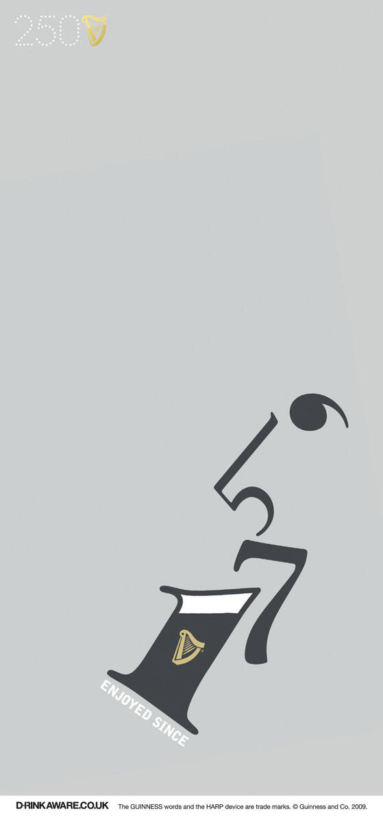
Guinness: Enjoyed since 1759
Advertising Agency: AMVBBDO London, UK
Executive Creative Director: Paul Brazier
Art Director: Chris Kelly
Designer: Steve Davies
Copywriter: Rob Webster
Account manager: Andrea Flamini
Advertising Agency: AMVBBDO London, UK
Executive Creative Director: Paul Brazier
Art Director: Chris Kelly
Designer: Steve Davies
Copywriter: Rob Webster
Account manager: Andrea Flamini
Ads of the World advertising archive and community showcases fresh creative campaigns daily from around the world. Read more
If you need a logo for your company or product you can get it done with us.
In our logo store you can pick from over 28,000 pre-made logos that will be customized to your name for free or you can post a contest for us for just $250 and our designers from all over the world will submit dozens of logo design suggestions to your specific needs.
30 Comments
aw...numbers do transform!...so does the harp!!....but the fluid in 1 maintains ....reminds me of ...'IF YOU CAN READ THIS..blah blah blah....also please do not miss the rectangle inside a rectangle...transformed. It cant be more simple and is simply a creative thought gone longing for a breath of fresh air...open space..did the bearer of this thought find it? Paul/Chris....wonder what Rob did in here!?..Maybe it was a sweet line "enjoyed since 1759" of Rob which was transformed by Paul/Chris...simply..or is it the company slogan? and I bet Steve wanted to add a 'something more simple'!..good ad and a good teamwork!
GREAT!!!
CANNES MATERIAL
excellent idea,great ad!!!
Very nice!
Beautiful.
Yeah not bad... simple and nicely done... I'll go with Grace It's Beautiful....
It's a WINNER all the way.
RAM KATE
a visually very strong idea. guiness does it everytime.
they showed me a picture & i laughed
dignity has never been photographed
cool
but cannes material?
J'hesite
Cool, but difficult idea
Alexander Bickov - Freelance web designer | Twitter | Facebook | Creative ideas
Hehehe... I don't know maybe I'm missing something here... I can read enjoyed since 1759, but what I see out of this forms is a man on the toilet :/
Please tell me what is so great about this idea.
I am so glad it's not just me that saw the man on the toilet!
I dream of a day when chickens will be able to cross the road without being questioned regarding their intentions.
That's all I could see, too! Took a while to figure out the form of a man drinking a glass of Guinness.
I saw the same first, then a man drinking. Good, not so good!
Superb!
This is so not working. Nice?! Please.
This is so not working. Superb?! Please.
i've seen other guinness ads better than this one, i think this is really dificult to understand, is good, but not that good
mrckais
done for the type museum
http://www.articlesandtexticles.co.uk/2007/09/28/typefaces-type-faces-... this is aserie of witty postcards, but there´s also a campaign with the same images
i've seen other guinness ads better than this one, i think this is really dificult to understand, is good, but not that good
mrckais
I think it's alright. Good job by extracting a visual from the numbers, but other than that, it's ok.
I see a regretful man sitting on the can, who obviously had had too much Guiness.
Great visual
n this is what we call creativity..
Looks like someone's taking a dump. Sorry.
What's happened to the great ads the Brits used to do?
great
EXCELLENT!!! winner!
great
recycled idea of making a shape out of numbers... nothing new