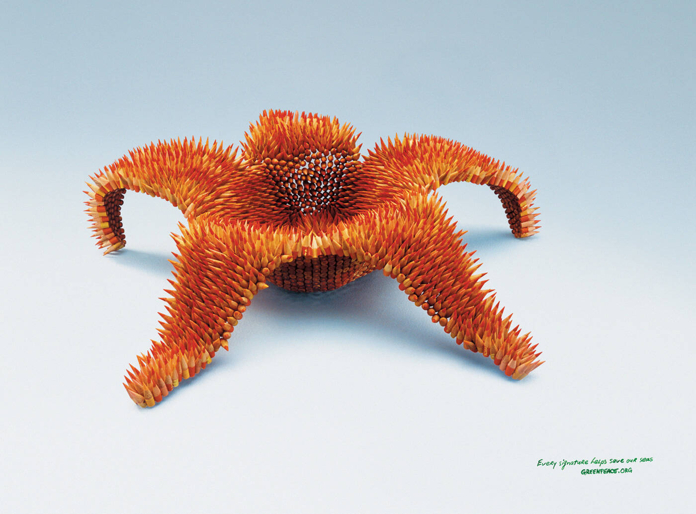
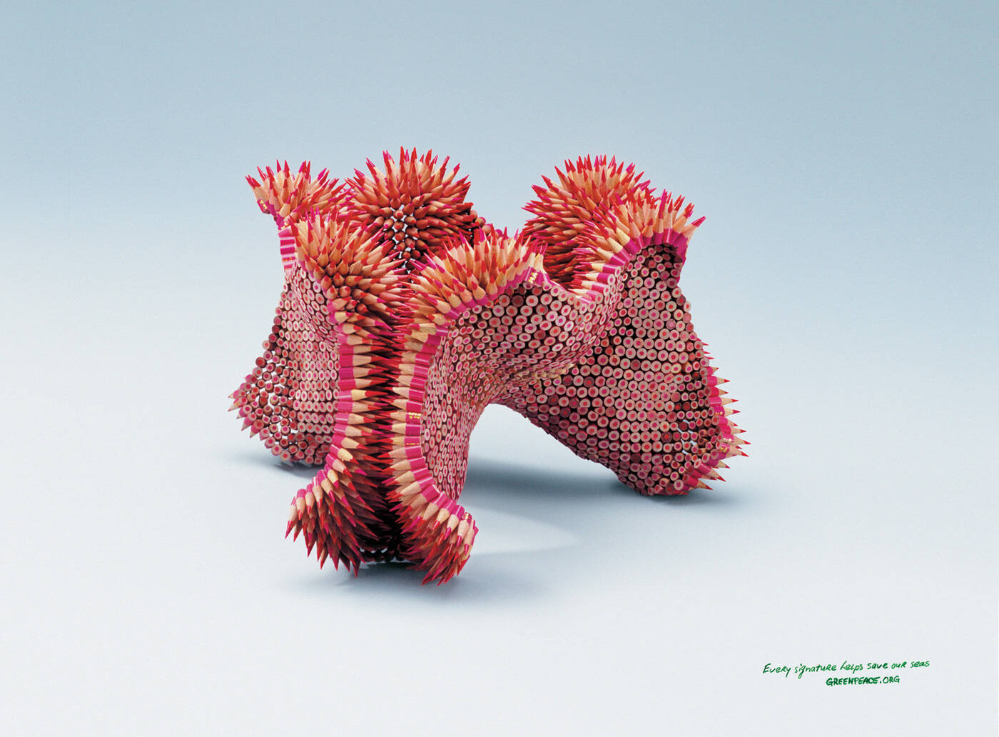
Ads of the World is an advertising archive and community. The archive showcases campaigns from around the world categorized and updated daily. In the forum you can discuss your professional life and post your work for critique. The blog features advertising stories. Read more
On Demand Videos
On Demand Videos: Video tutorials for advertising pros and designers providing tools and information you can trust — and use — on your very next project. Subscribe today!


Comments
Ooooooh!! Killer!
:::J:::
not killer
the idea or the line using signatures are quite done already.. by both students and agencies
still nice tho
:::J:::
Nice hard work!
Nop, the idea seems to be just borrowed interest from the sculptures of Jennifer...
http://www.jennifermaestre.com/
Borrowed would be an understatement.
http://www.jennifermaestre.com/portfolio.php
"Advertising sucks... ever so gently."
"A good advertisement is one which sells the product without drawing attention to itself." - David Ogilvy
she's stated as an AD. they probably saw the work and thought to use it for Greenpeace, contacted the author who seemed to agree and get it published.
so what's the problem?
Have to agree with kateter, her name is on the list so she gets the credits she absolutely deserves. Great art!
Just that the ads seem retro-fitted around the art.
"Advertising sucks... ever so gently."
"A good advertisement is one which sells the product without drawing attention to itself." - David Ogilvy
And you're just so sad that you didn't think of it before?
Shock, Horror! Advertising that uses the creative talents of an artist as execution (and even credits her as an AD?!?!) What is the World of advertising coming to?
At the best it is lame and uncreative to use the style of an artist. The creatives should be the artists of their ads. As always if people use stuff they see on the internet this particular illustration style has already been used by other agencies. So You all get Your work finally on joelapompe.net. Well done.
"The creatives should be the artists of their ads."
really? so creatives should DOP themselves, do the editing themselves, draw a graffiti themselves if they need it in the background, do the make-up themselves, do the 3D animation themselves etc.?
so what is creative business? tiranny of the team or colaboration of various talents?
This is not what I meant. If the artist has already created works which were built out of pencils this idea is already done. Where is the creativity in using this idea again? Putting a logo on it?
but the agency gave it the NEW idea. before putting claim and logo on the visuals it was just fascinating artwork with different meaning. now it's the advertising idea.
the artist says this on her website:
"It all comes from one idea I had for a box with a secret compartment that would contain a pearl. The box would be shaped like a sea urchin, made of silver. In order to open the box and reveal the secret compartment, you’d have to pull on one of the urchin’s spines. The idea was of something beautiful, sculptural, but that you wouldn’t necessarily want to touch, and that also held a secret treasure."
putting logo and claim on it changed the whole context, you see?
It was not only "just fascinating artwork with different meaning". This is conceptual art. She speaks about the meaning and intentions of her art pieces. The "advertising idea" made around the art pieces is shallow and boring in my opinion. What makes me wonder repeatedly is that the artists in this and other similar cases are willing to cooperate with agencies.
OK, now you're going in totally subjective way.
now it's a matter of taste. I think exactly the opposite.
but... your opinion, my opinion, agree to disagreee :-)
Yes. I wanted to write that as well. :)
stunning, but i dont like the emptiness in the artwork :S
--
Everartz
| Everartz |
Art direction and old school death metal.
www.everartz.blogspot.com | myspace.com/inkill
I am so bored with cool ideas thrown onto clean, white backgrounds. What's the point of having AD's if that's going to be the format for everything?
Junior Copywriter blood thirsty for work. Will remove fangs for interview.
www.ChristopherDGilbert.com
while i don't totally disagree with you, i think that's part of the point here. the uncompleted ocean scene means there's more work to be done. because more signatures, means more ocean would be saved (and more ocean you'd see in the ad).
if there was a completed picture, then logically, that would mean they have enough signatures to have saved what they set out to, and what would be the point of the ad then? the white here makes perfect sense as a call to action.
| think small |
The point is to know when to use which treatment. Not everything works with white background.
But who's going to save our colored pencils?
http://justkiddingbutseriously.wordpress.com/
Yeah, let's cut down trees to make colored pencils so we can save the sea!!
but if you sign too much everything disappears (according to this idea)
amazing art, but nobody sings with colored pencils...
Agreed
all i can say is: I luv it
I like it. :)
____________
Read and write a comment Ad(dicted)
____________
Visit me and write a comment: Ad(dicted)
congratz...excellent work!!
Gorgeous, but borrowed (stolen?) concept. Please at least credit the artist who created these amazing sculptures (as art, not as advertising) that are being used. To the rest of the creative team, good find.
http://www.jennifermaestre.com/portfolio.php
She's clearly in the credits.
who the fuck signs a petition in colored pencil?
Good point, but the concept would work equally well with pens. Wood is just a more natural texture to use.
really not communicating the wanted message.
congratz jennifer, your work is beautiful.
http://www.jennifermaestre.com/
the ad is... ok.
its from a artist!!!!!!!!
stop steal ideas from artists pls
before accusing read credits, or at least comments, that You'd know what's really happening in here.
brilliant work
Very nice art direction. Very clean. Very simple. Very impactful. Good work.
Beautiful art Jen... can't say the same about the direction MR Art Director.
Great art! Simple and clean.
-Natalie
http://www.nataliemarion.com
Unfortunate immitation of Amnesty's, indeed. There, signatures were saving lives. Here, crayons are saving the seas. Oh-kay, if u say so.
superb campaign!
http://harshikcreations.blogspot.com/
It'd be different if they commissioned her to make something new for them. But to just pop a logo and a line on art is poor quality.
An absolutely stunning campaign! Well done.
Transom Draught - Always check the level of the water behind you.
Post new comment