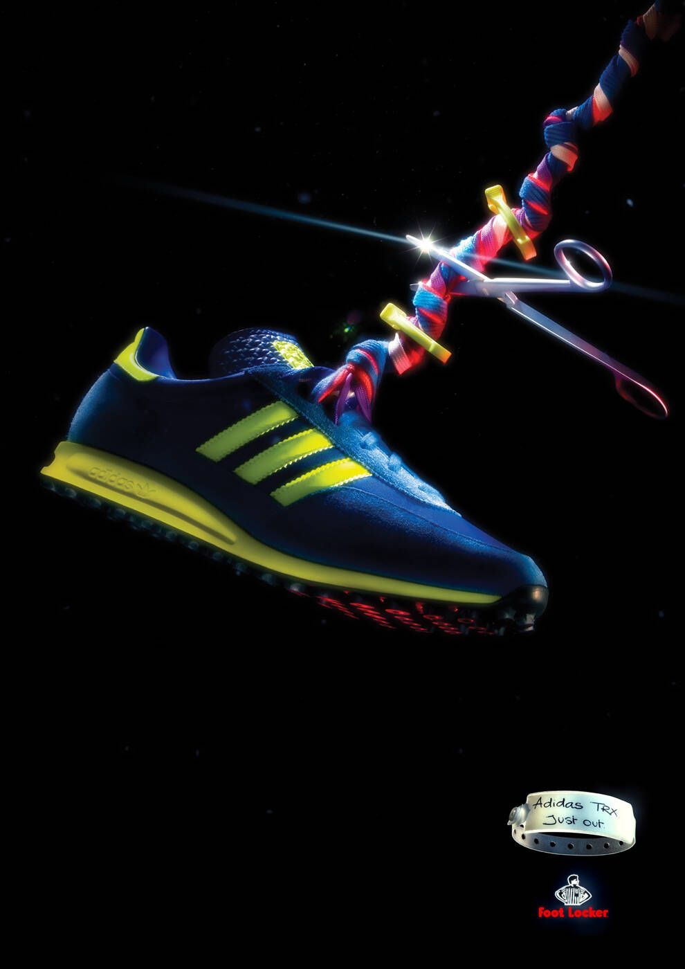
Ads of the World A Graphics.com site

Foot Locker: A new arrival

Foot Locker: A new arrival
Your rating: None Average: 6.6 (28 votes)

Advertising Agency: SapientNitro, Brisbane, Australia
Creative Directors: Nancy Hartley, James Burchill
Art Directors: Cristian Staal, Ralphie Barnett
Copywriter: Marianne Harvey
Photographer: Jesse Stevens
Retoucher: Justin Overell
Account Manager: Kate Robertson

Comments

Ad_Man's picture 816 pencils

Love the whole series.
The art direction is really sweet.

Think it for a while.
Then, in anytime, it will come to your mind as an idea.

www.jackmancer.com's picture 731 pencils

this one isn't really clear if you havn't seen the others

Fony's picture 6 pencils

shoes au gratin?

cozz20_1's picture 73 pencils

These are very attractive ads.

I'm curious who the audience is, though. Looking at the campaign, it appears it is 30+ year old married men and women employed in a creative field with at least one child in the household. There is no other audience this would be effective in.

Regardless of the audience, the concept is not persuasive and gets in the way of showcasing a very beautiful line of sneakers.

shahidali's picture 1262 pencils
1

nice wrist watch

shahid

everartz's picture 5352 pencils

seems weird thou

| Everartz |
Art direction and old school death metal.
www.everartz.blogspot.com | myspace.com/inkill

Guest's picture

Art decoration. The idea is nice, but why the space age setting, and weird photoshop filter effects. It would of been so much more effective if it was shot in an actual maternity ward,
on the hospital bed, etc.

But hey, what do I know?

automatik's picture 259 pencils

ya ya go ahead make love to teh shoes

You Are What You Expect

Guest's picture

I love the art direction, and tool operation as well.

gravity's picture 154 pencils

loved the art direction? take a closer look...

view angle of the shoe doesn't match the box...

you can't easily focus on the shoe because the watch and the rings on man's hand grabs too much attention...

...other than the fact that the watch is on his right hand instead of left, and is upside down.

all that shining and glowing in the air looks like it has been photographed with a dirty lens, or in a very dusty room.

glowing on the box, on the shoe, in the air, everywhere is shining with artificial ps lighting.

in my opinion, that's rather overstating than art direction...

Guest's picture

I trust here that all the haters do not understand sneaker culture. These are nice. Shoes from the future. Cool!

Post new comment

We highly appreciate your comments. When commenting please acknowledge the following guidelines: Be respectful and helpful. Do not spam or link drop. Please note that guest comments do not appear immediately.

 
  • Allowed HTML tags: <a> <em> <strong> <cite> <code> <ul> <ol> <li> <dl> <dt> <dd> <blockquote> <img>
  • Lines and paragraphs break automatically.
  • Web page addresses and e-mail addresses turn into links automatically.

More information about formatting options

Ads of the World is an advertising archive and community. The archive showcases campaigns from around the world categorized and updated daily. In the forum you can discuss your professional life and post your work for critique. The blog features advertising stories. Read more

On Demand Videos


On Demand Videos: Video tutorials for advertising pros and designers providing tools and information you can trust — and use — on your very next project. Subscribe today!