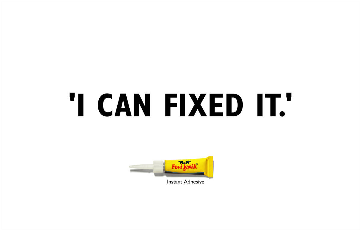
Ads of the World is a commercial advertising archive and community showcasing the best and most interesting creative work worldwide. More

New service from AotW: Ads of the World Research with over 2 million ads.
Advertising Agency: Ogilvy & Mather, Mumbai, India
Creative Directors: Piyush Pandey, Abhijit Avasthi
Art Directors: Samir Sojwal, Akshay Thakur
Copywriter: Dharini Shah
Photographer: Makarand Shiraskar
Comments
Ivan, are you serious? What are you posting?
C'mon. It's from O&M. It can't be that bad. ;)
true, its not that bad. but you know..unfortunately sometimes we see certain ads and a big chunk of our judgement comes from when we find out what agency. Sometimes we see 'ok' ads but when it's from Saatchi or O&M then we go oh wow that must be really good. But anyway only sometimes, an idea is an idea but it does add credibility to find out what's the agency
Sometimes I post ads from big agencies just to inform you guys about what is being done at big ad houses.
It's not bad at all. I love it.
www.advertisingportfolio.blogspot.com
its not that good too!
your work is your identity.
http://harshikcreations.blogspot.com/
this is not making any sense to me!
it should have been posted in the forum and all the replies were" try harder"
--
Everartz
it´s ok
Guys!High time to apply for a creative job in O&M...Dont miss the oportunity,...i'm leaving for it ...O!god, where the hell i kept my college portfolio...
was this piece entered by the agency themselves? hope not.
Where's the idea?
awesome, by the way )))
This is great! Unfortunately none of you seems to get it... and then throwing around bad comments and discussing the agency is easy...
Idea is very simple though. See yourself as the person saying this line. Before you start speaking something is broke and needs to be fixed. By the time you finished saying this line, the job is already done. So simple and so good ;)
exactly! i don't know why is everyone being so cynical n not getting the idea... simple yet superb and effective according to me. Moreover, its released... i've seen these up on hoardings myself. good job folks!
~ old habits die hard, older ones never do ~
ya, I thought it was clever, fun way of illustrating how quickly it does the job.
I understand the idea but i ALSO understand that the target audience needs to get it to. If a bunch of creatives used to taste and judge advertising have troubles getting this i cant imagine a C would make of this.
The mayority of people not getting this doesnt mean that this people are wrong but that the ad has trouble in his reading.
How come a comunication that doesnt get trough its "simple and so good?"?
agree totally with capywriter... its simple and brilliant...
Well, I love the copy on both of these. If people say these are bad they need to re-read it.
No idea why there were two art directors involved though. White background, bottle of glue, copy paste. I'm a copywriter and I could've done this.
Say that to the guy fliping newspaper pages on the train. Wait you didnt get it! Go back! Re-read it!
Sorry!!! I was wrong the evaluation...this is a great work!!!!!
Brilliant. Love it.
He use KISS( Keep It Simple, Stupid) method. Hehehe
I like it a lot.
-Tung
--good idea is enemy of great idea
succint,intelligent,communicating.mebe not award winning..soWHAT?
Intelligent ads are the need of the hour.
Simple. Like it.
Brutal simplicity of thought.
Correct me if i’m wrong, but my clients would love it if a reader was to turn the page back for another look at their product.
Reminds me a bit of the Economist style of advertising.
typographic.net
i agree 100% percnt wth baz....can't turn d pg here...can barely wanna scroll...it's brilliant. dis is brilliant piece of copywrite stuffs...this shud go to books.
www.theadheaven.blogspot.com