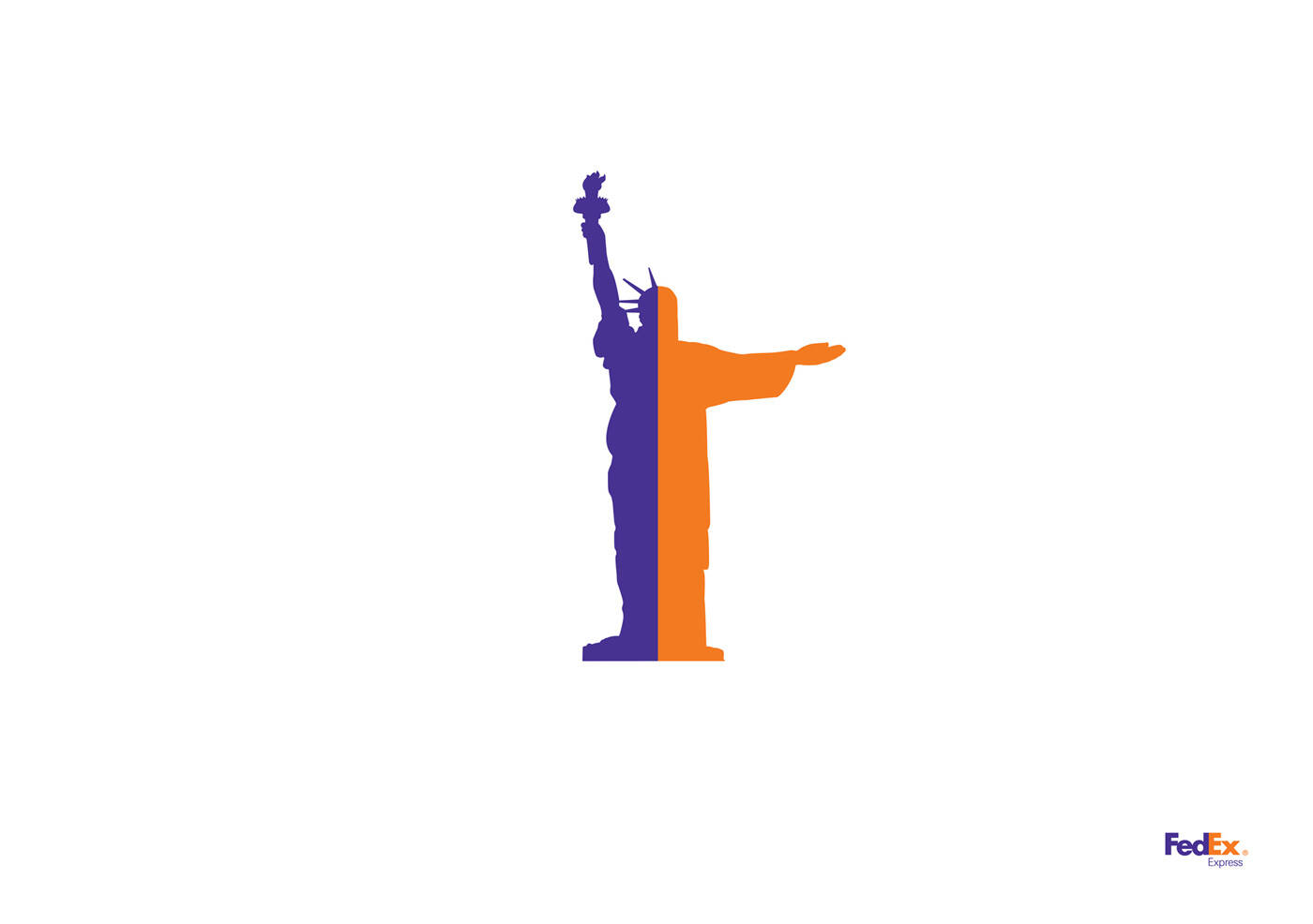
FedEx: Statue of Sugarloaf
Advertising Agency: BBDO, New York, USA
Chief Creative Officers: David Lubars, Bill Bruce
Executive Creative Directors: Greg Hahn, Mike Smith
Copywriter: Matthew Brink
Art Director: Adam Livesey
Illustrator: Kathleen Hanna
Via: ibelieveinadv


Comments
great!
http://jergold.blogspot.com
superb
Damn!!!
I have the same thing in my portfolio - but for an airline compamy...
great great, that's all I can say =)
Man ! this is awesome.
They merged the Liberty Statue and Christ the Redeemer.
M Munir Bhatti
http://twitter.com/munirgee
http://facebook.com/munirgee
http://youtube.com/munirgee
http://xperts.net.pk
Thank you SO MUCH for your detailed explanation of this ad. Because you know what? I didn't know what the FUCK I was looking at before you told us!!
What is "Liberty Statue" by the way???
: (
He means "The Statue Of Liberty", which is in New York. A very iconic "American" statue.
But for the record, what you're looking at is a simple melding of 2 country's iconic statues (US/Brazil). Because FedEx, in case you didn't know, travels between those two places. And only FedEx can combine those two things. Which is why this ad is so BRILLIANT!
It tells us things we didn't know!
OMFG!
Teh CREATIVITIEZ! !!!
;)
+++
"I love everything"
Hahahaha!!! You're too much! ; )
I know exactly what he meant. And I damn well knew what I was looking at. I was being facetious, sarcastic and pain-in-the-ass all at once! I just thought it was hilarious he was explaining the obvious as if nobody could tell what the visual represented.
And for the record, The Statue Of Liberty is NOT in New York.
It's in New Jersey!! LOL
So are you saying DHL or UPS don't deliver from NY to Rio?
What makes FedEx better than their competition?
That's what the ad should be about.
Simple and great message
AWE -fucking-SOME!
Oinks.... Liking it!!
great, simple, very nice
Very nice idea
Alexander Bickov Personal portfolio | Twitter | Facebook | Blog
nice way to put it.kool
sue
yeah. nothing more to say
cheers,
dlue
really nice idea!!
fedexcellent
done, with jeep
chemunoz
done, with jeep
chemunoz
ndio!! yiko mzuri
good but not great.
Great!
Can't quite put my finger on where I've seen this before. Wait, yes I can.
http://adsoftheworld.com/media/print/jeep_husky_camel
Makes sense, since both campaigns were done by BBDO.
I don't think recycling your own ideas is so bad. Unless you make a habit of it.
www.hellofawzy.carbonmade.com
yeah but done (in photography) in 2007 for Telefonica "long distance calls" (corcovado mixed with Liberty statue)
http://www.joelapompe.net / Facebook : Joe la pompe / http://twitter.com/joelapompe
Yeah but can you campaign that out?
Snap.
Love this... congrats...
it is nice. the only thing I don't like is that it reminds me JEEP.
nice work
It´s nice, but we all know BBDO and Fedex are capable of doing better.
Well done! Really love this. Very simple. Clean. Direct. Not easy to do cool stuff on this brand, but you have.
WOW. So simple. So easy. So strong. Like it a lot.
Beautiful. I want see more versions.
Love it.
great!!!
muy claro y simple.
congrats!!
Idea is not new, but it's the simplicity that wins.
"Everyone advertises products. Everyone directs creatives. Everyone services accounts."
http://www.linkedin.com/in/acele | http://www.youtube.com/ace85 | http://www.facebook.com/ace85le | http://ace85le.livejournal.com | http://twitter.com/ace85le
like it. 5 4 U
this is the power of simplicity
-------------------------------------------------------------------
~ Quite obviously, I have gathered no moss ! ~
Awesome!
this is really good work: simple, clever. bravo!
amazing work well done
www.thecuriousbrain.com
FedEx is just between USA and Brazil?
Copy lost, please return.
oh my god. what a ridiculous comment!
i really like how the new shape mimics an airport lineman performing ground signals to an aircraft = FedEx Express.
All this ad "says" is that FedEx goes between New York and Rio.
The fact that it says that simply, and visually is GOOD. But it's not awesome. This "melding" of the icons from different cities/cultures/products technique has been done a zillion times over the years.
Man, you guys are an easy bunch.
+++
"I love everything"
Agree sirvan.
Alright.... "Statue of Sugarloaf".... no no.
Christ the Redeemer is NOT on the Sugarloaf.
Ergo, this is wrong.
Creative is clean and art direction is good as well; you can clearly know from the colors that it's a FedEx Ad, and lots of people are aware that Status of Liberty is in USA and the Redeemer is in Brazil; but what does the Ad announce here, from communication perspective; is this a new route from FedEx? Are they reinforcing their position for this service/route? Are they the only courier service between NY & Rio? I didn't get the communication message here;
Exactly. And that's the problem.
+++
"I love everything"
simply............ owsome
Everything has been said. Except one think: this looks like a policeman coordinating the traffic.
Have to admit I didn't instantly see Christ the Redeemer... Just me?!
Although not exactly original it's nicely executed and does communicate the idea of crossing distances/borders - which is what FedEx do...
Communication message isn't explicit but if nothing else that makes you think, which isn't such a bad thing, is it?!
Would definitely be better as part of a series.
I love the simplicity of the concept but it is visually attractive.
All your comments are based on the agency who made it. This is student work, and by student I mean a "one off". I would love to see more executions of it.
Great execution. Simplicity rules.
PORTUGUÊS: http://augustocorreia.carbonmade.com I ENGLISH: http://augustoinenglish.carbonmade.com
Simply.Great!
Brilliant because:
- it's simple, direct
- it makes the company's product seem simple, direct
- no other delivery company could do this. It's attached to the brand. Just perfect because it's authentic.
wow, beautiful ad...
Post new comment